TokyoYard Project
VI/Experience
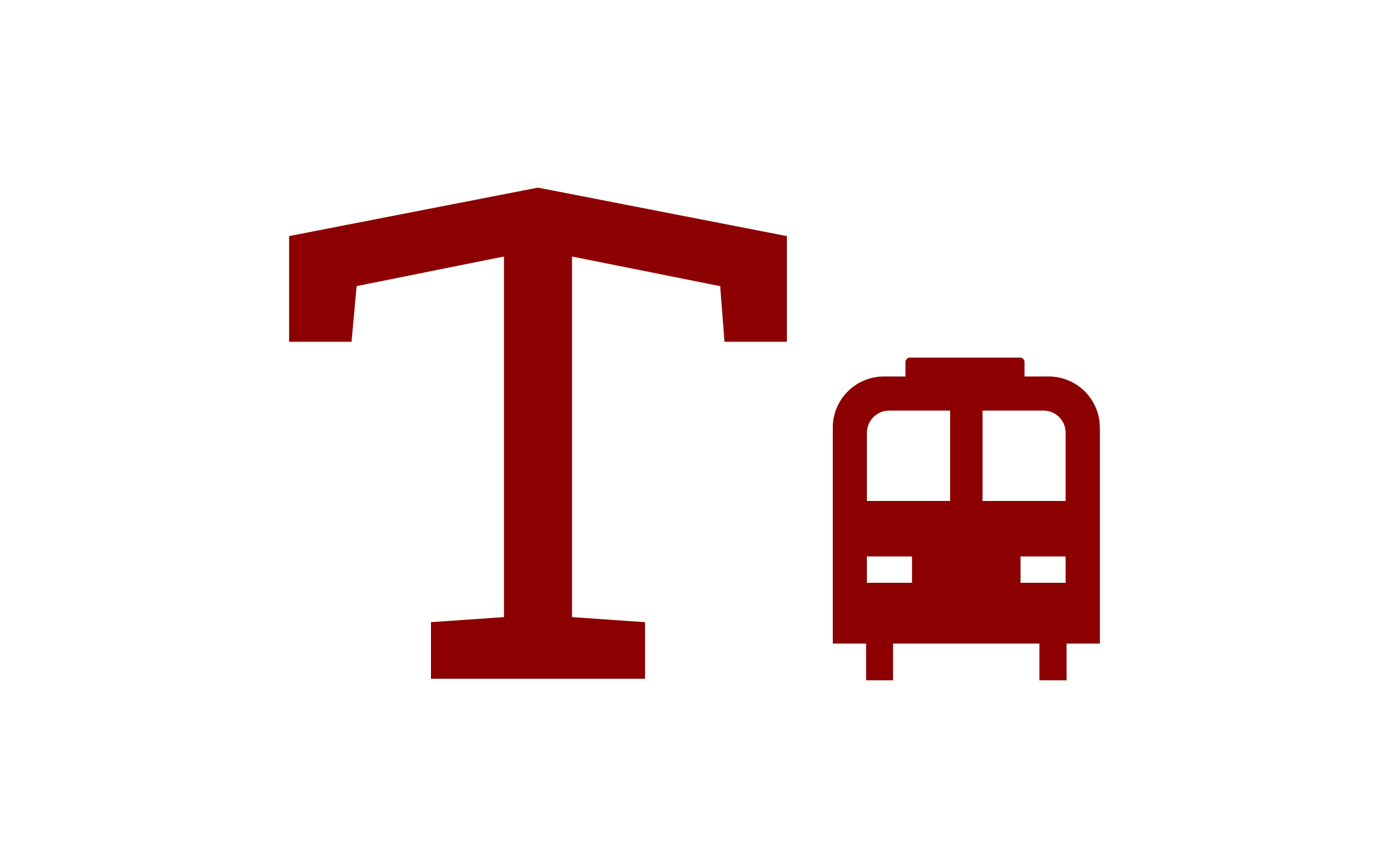
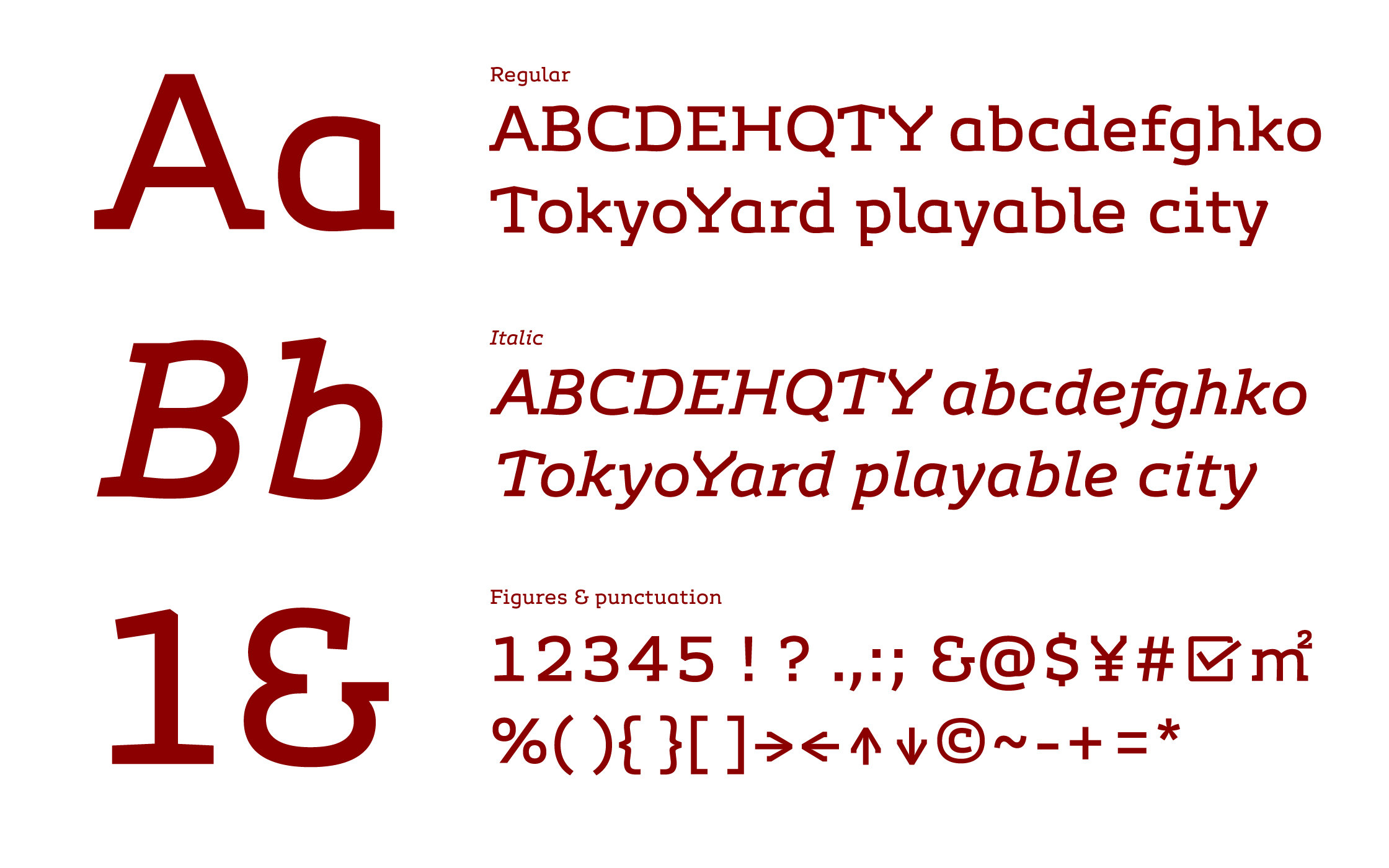
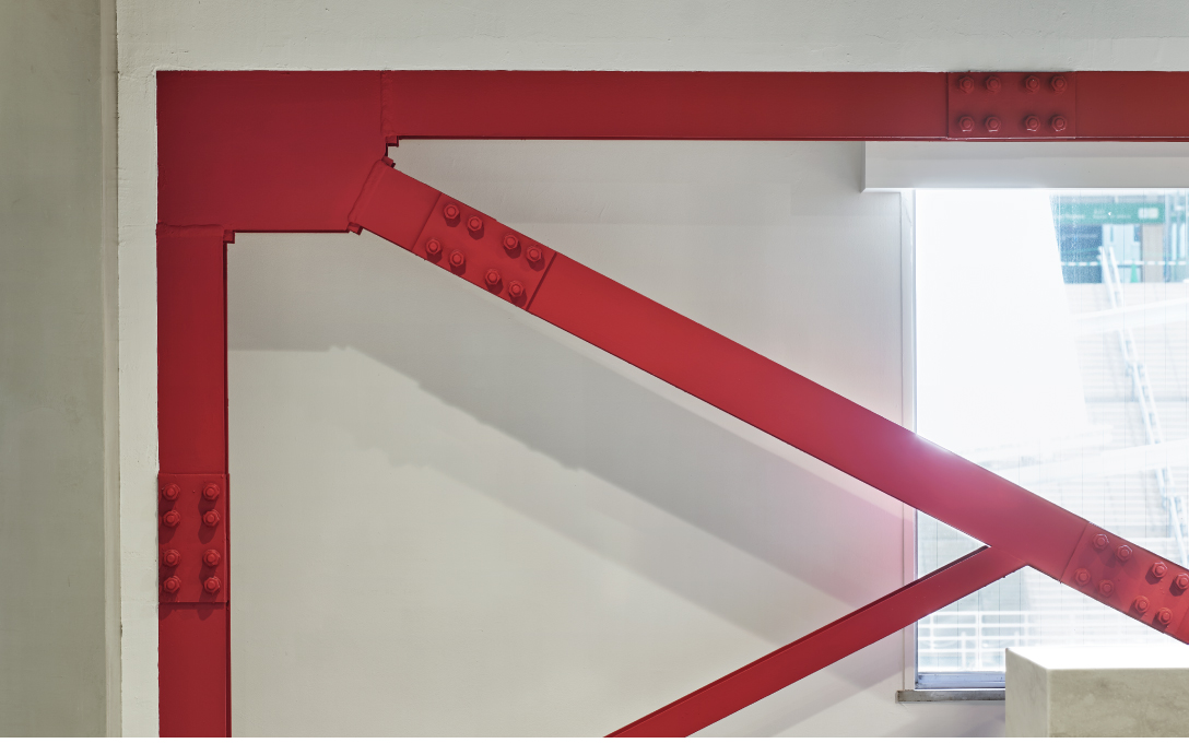
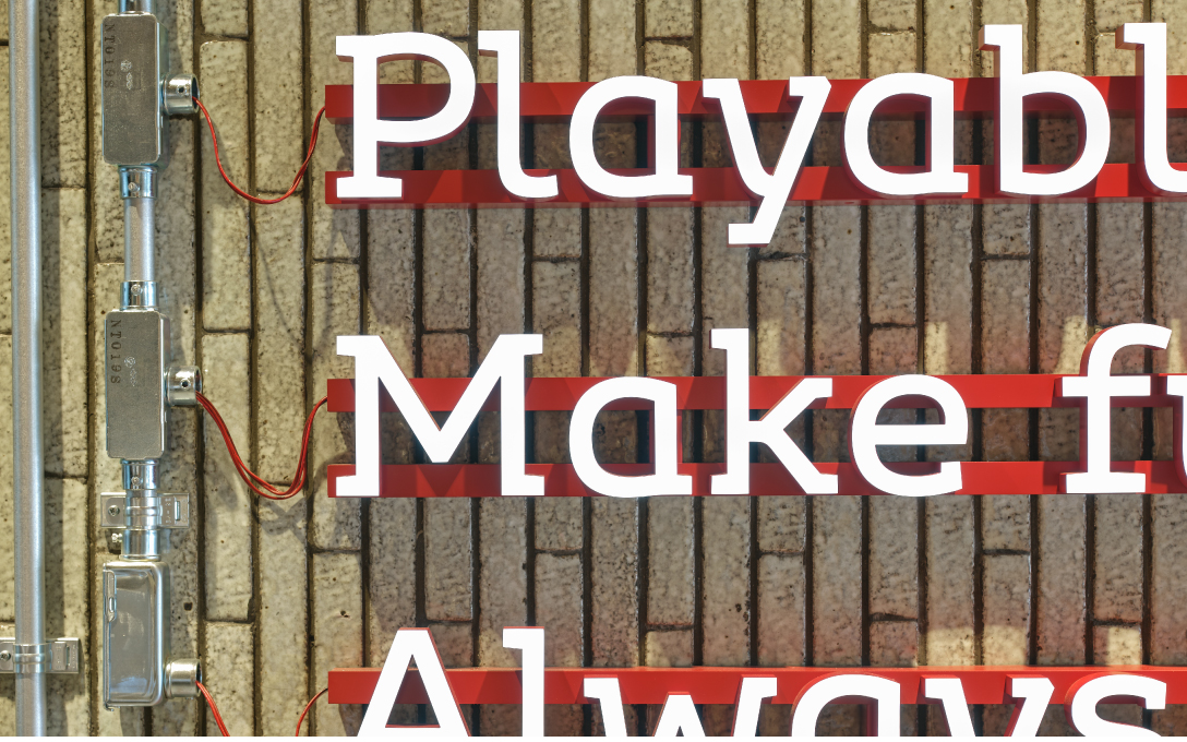
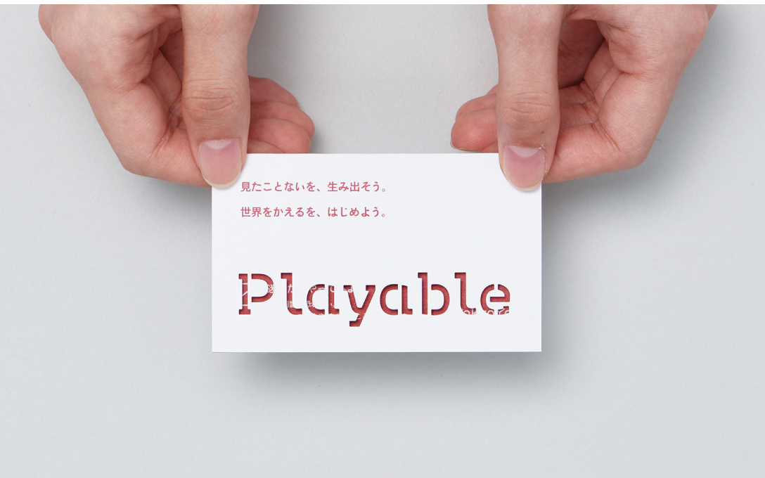
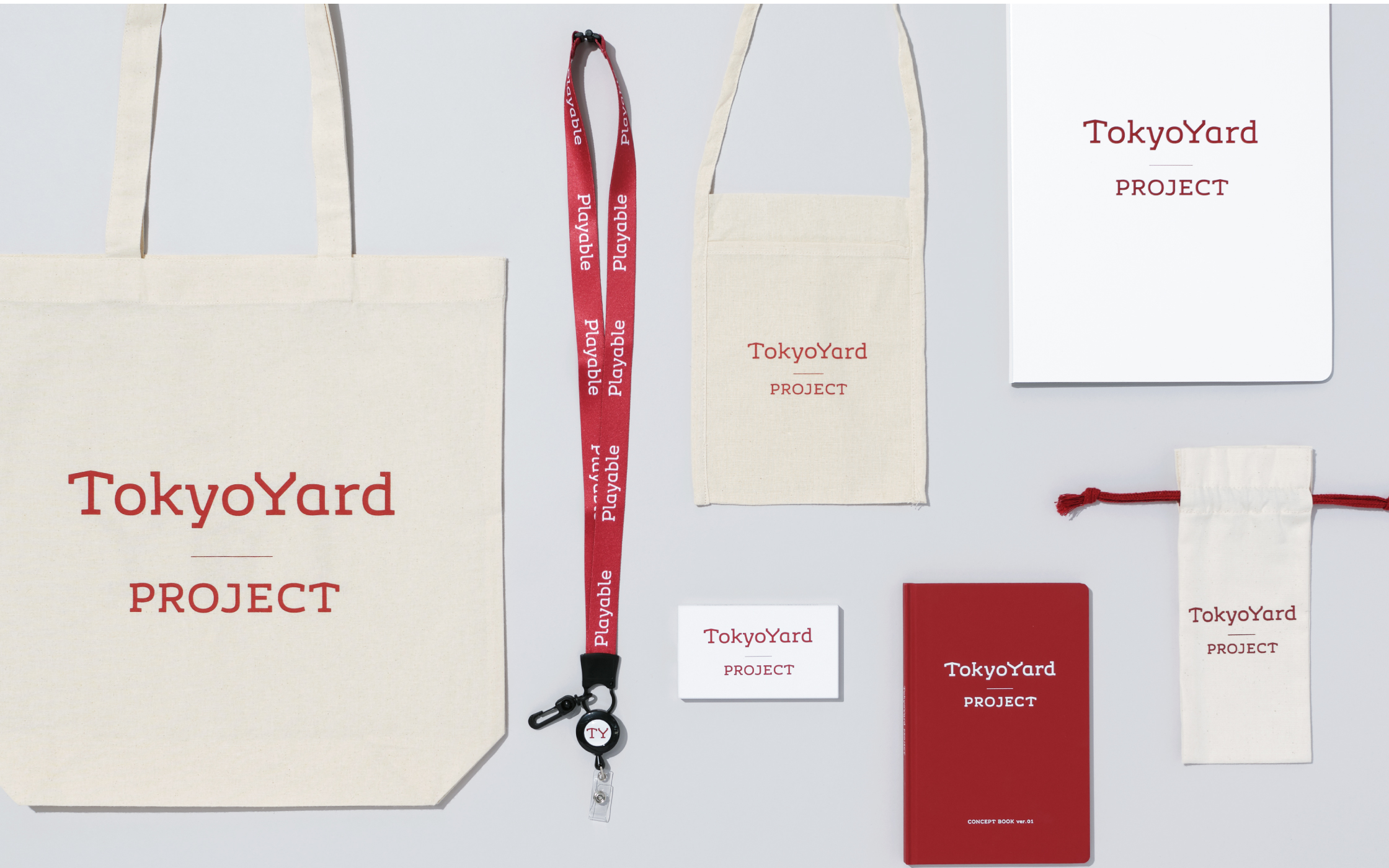
A branding project for development in the Takanawa Gateway Station area. Working based on the space’s history as a rail yard, we designed the letters T and Y to resemble shapes from warehouses and station buildings. The design was developed centering around an original typeface, the smallest unit for disseminating information about the area. From the facilities to be built in the area to the documents used on a daily basis in relation to the project, we worked to create a typeface that conveyed a sense of originality in every aspect of the project.
| Client | East Japan Railway Company |
|---|---|
| Creative Director | Saito Seiichi (Rhizomatiks)* |
| Art Director | Irobe Yoshiaki |
| Art Director (Typeface) | Yamaguchi Moeko |
| Designer | Yamaguchi Moeko, Yasuda Yasuhiro, Ikeda Hiromi |
| Type Designer | Yamaguchi Moeko, Yoshitomi Yui* |
| Copywriter | Takeda Yoshiyuki* |
| Photographer | Okaniwa Riko |
| Producer | Sone Yoshie |
| Agency | JR East Marketing & Communications, Inc. |
2020
*:Non-NDC staffSignage
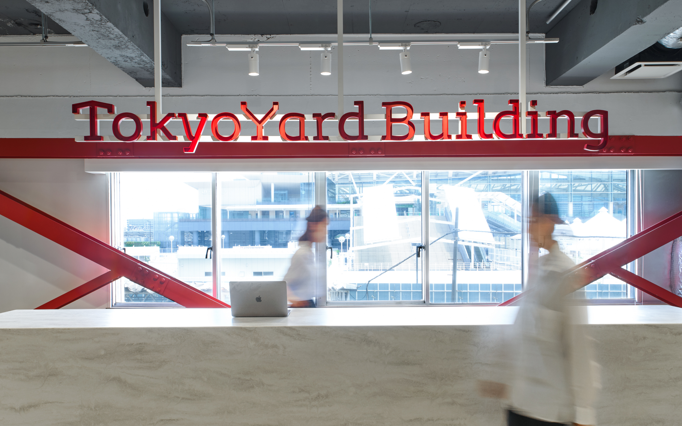
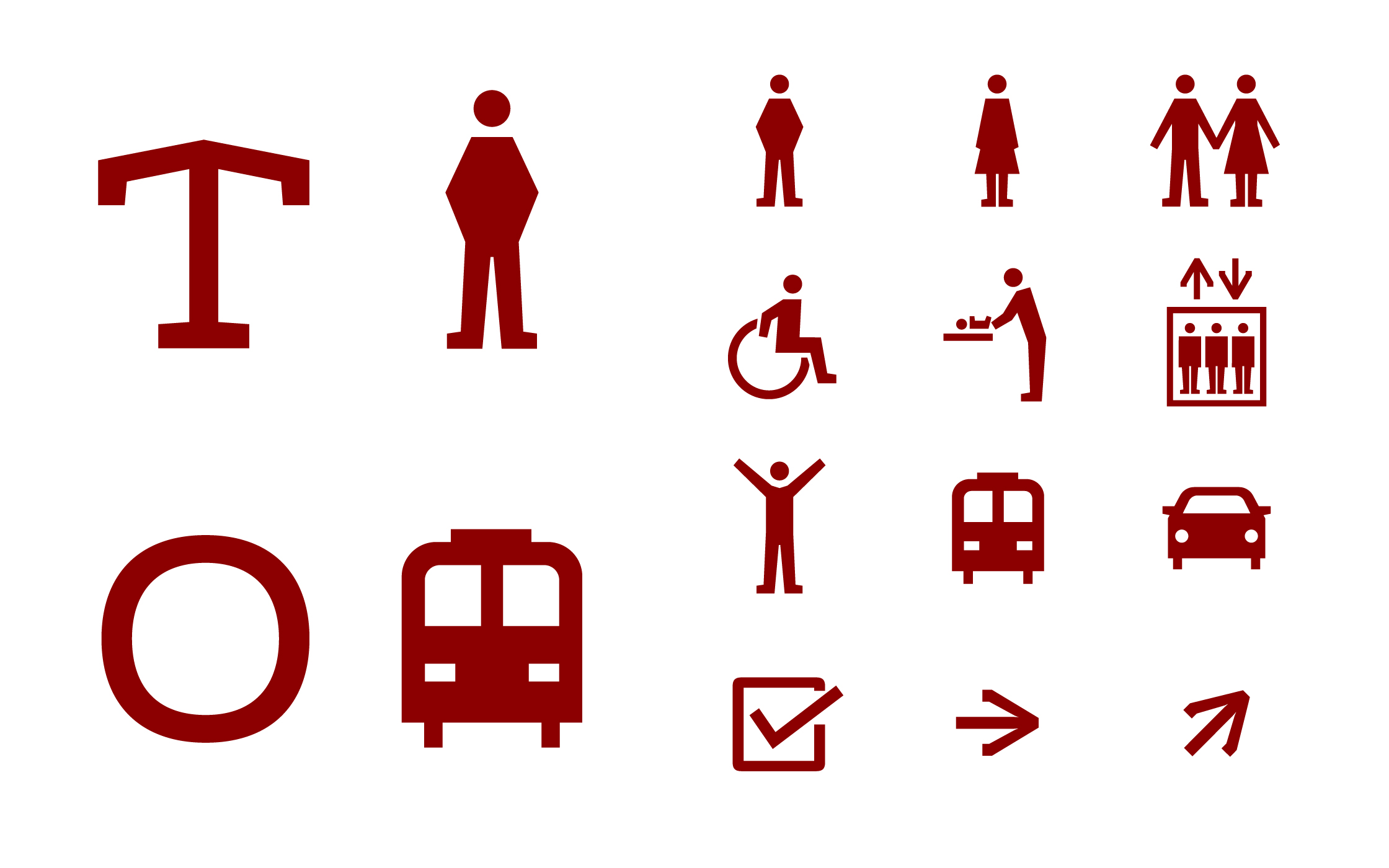
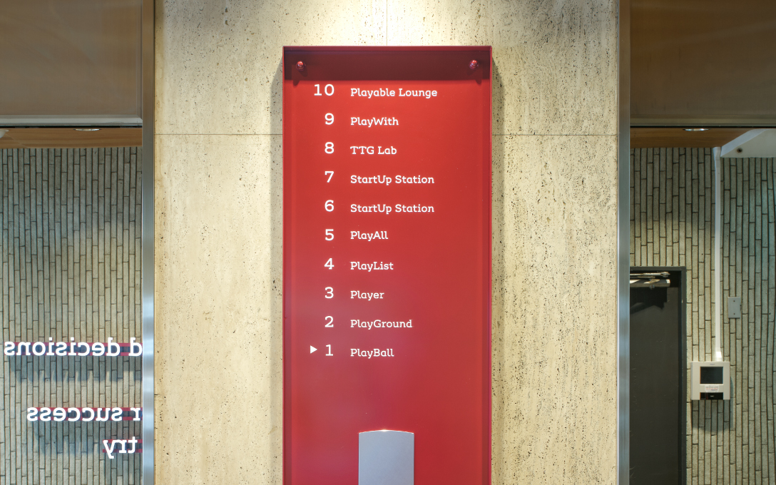
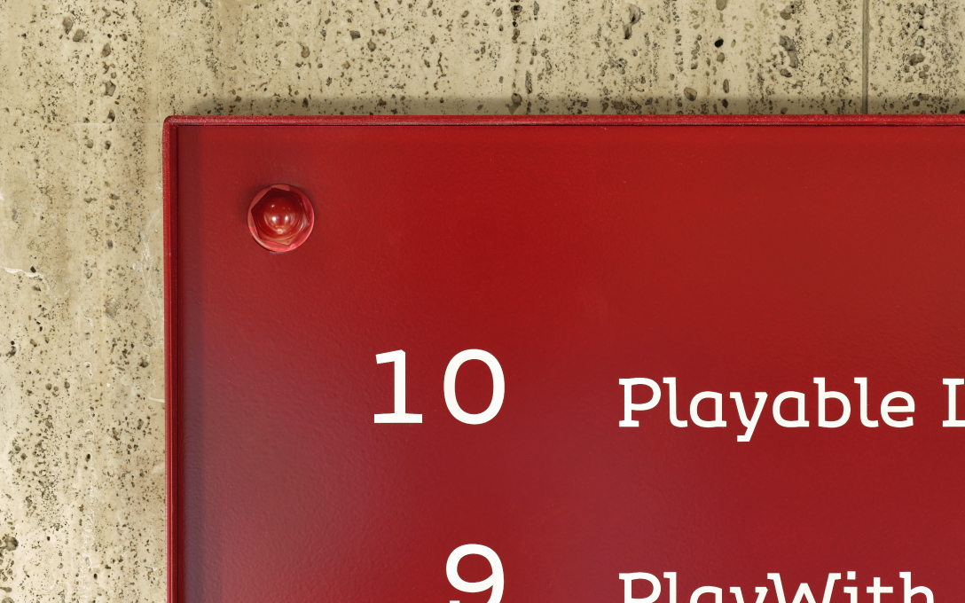
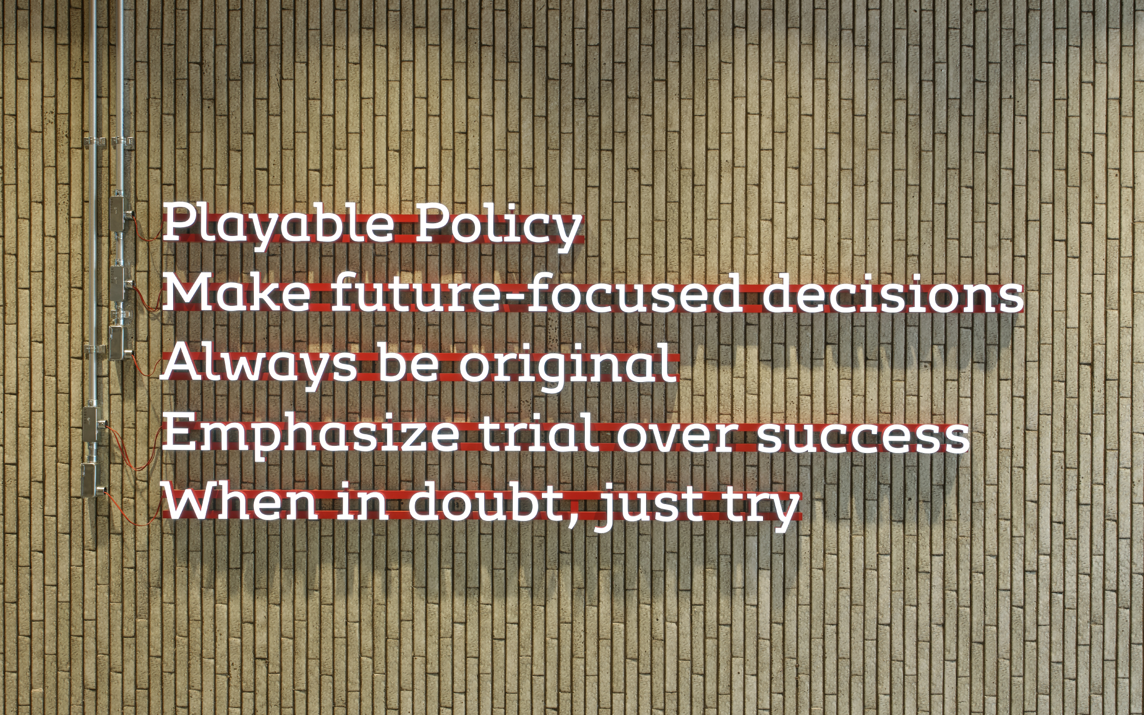
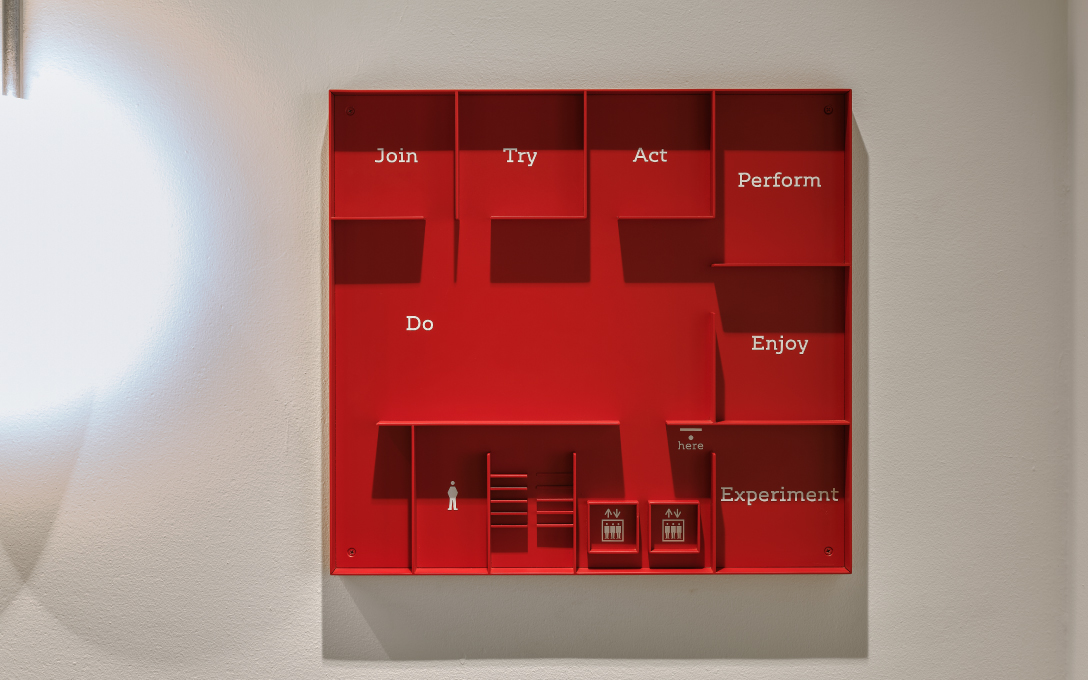

Signage planning used at the base for Takanawa Gateway Station area development project members. Using rigid brace-like elements and an original typeface with playful yet resilient curves, we designed signage for creative workspaces that will be the home for more creative city planning.
| Client | East Japan Railway Company |
|---|---|
| Art Director | Irobe Yoshiaki |
| Designer | Yamaguchi Moeko |
| Photographer | Okaniwa Riko |
| Producer | Sone Yoshie |
| Agency | Hakuten Corporation |
2020
*:Non-NDC staff