Super special select Hakutsuru Tenku, Fukuro-tsuri, and Yamada-Nishiki & Hakutsuru-Nishiki junmai daiginjo saké
Package
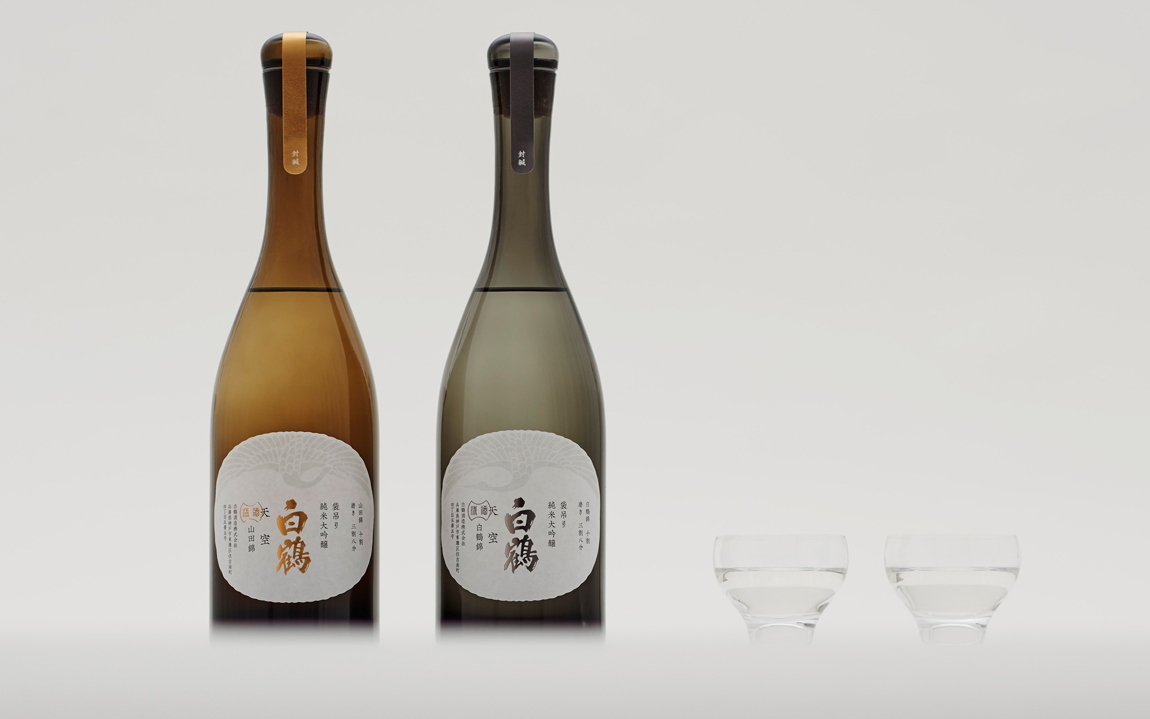
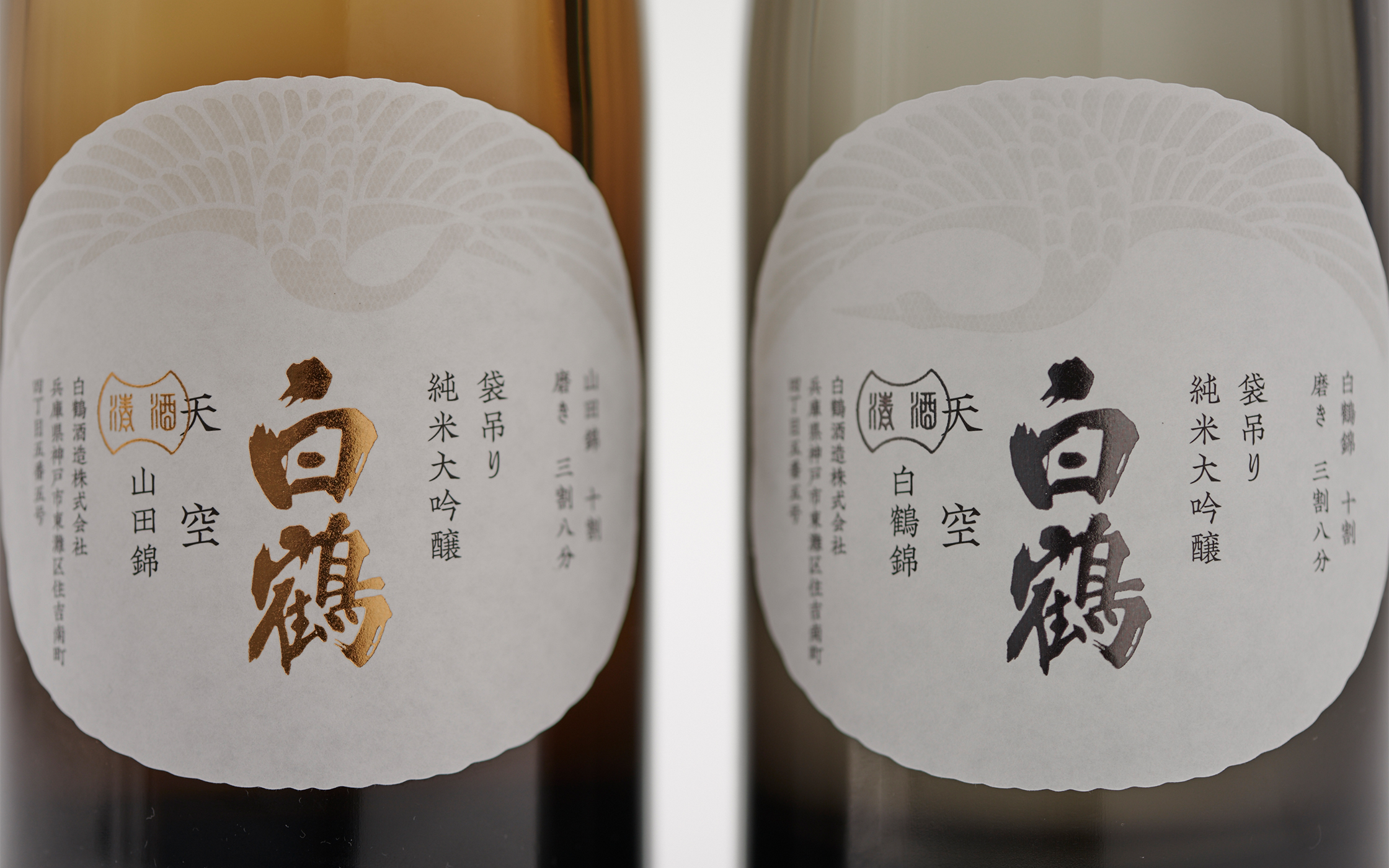
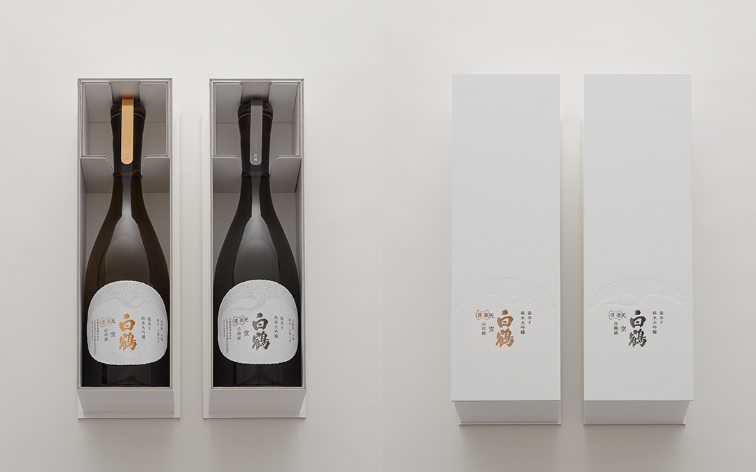
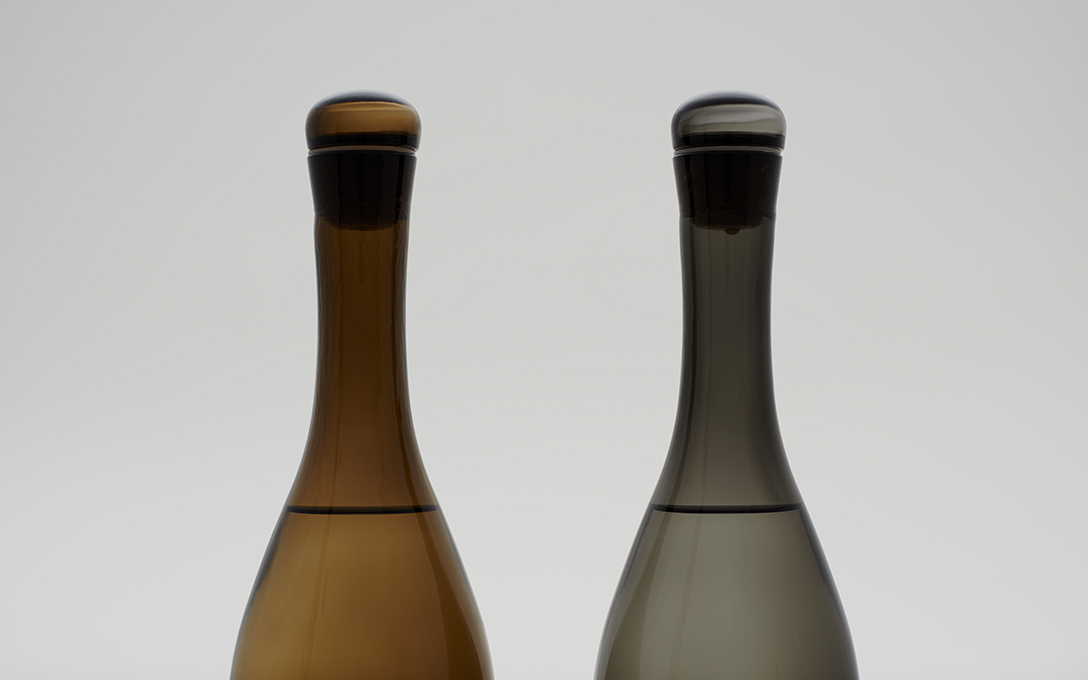
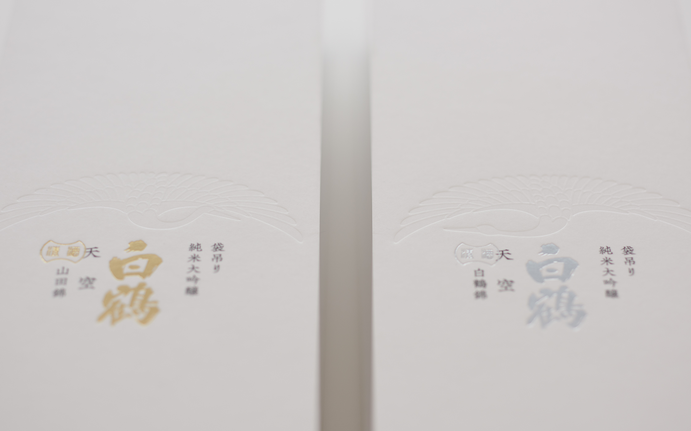
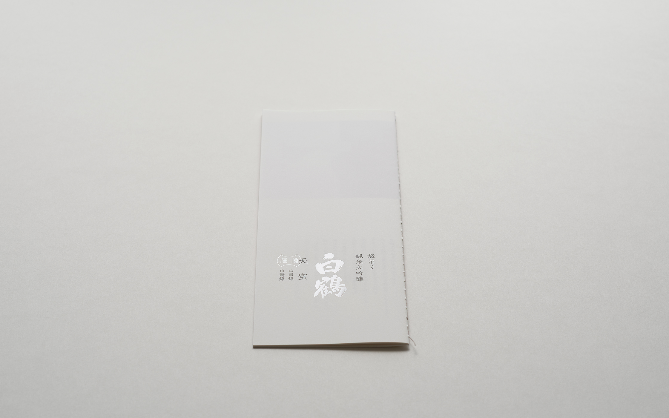
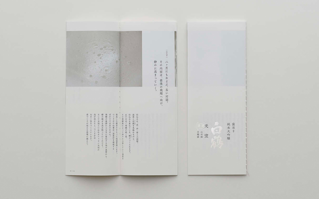
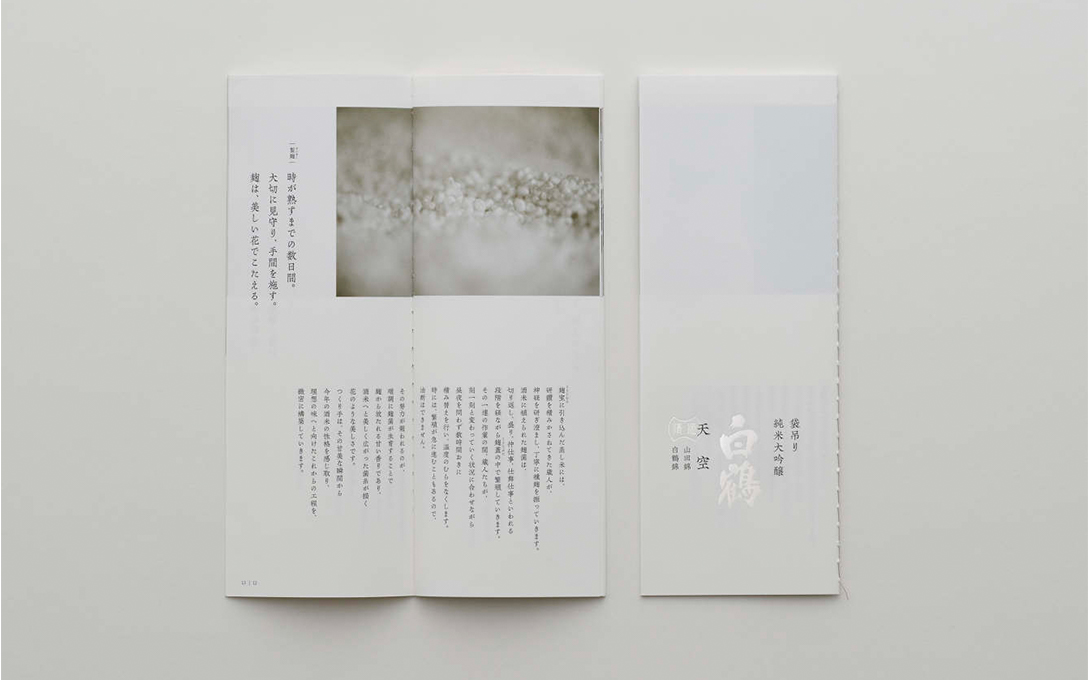
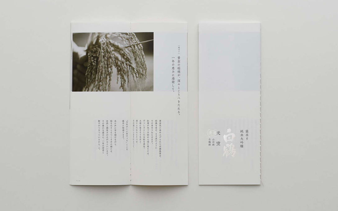
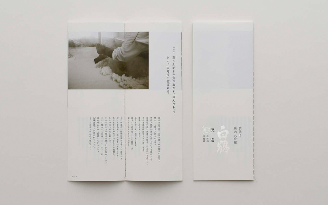
This project created the package design for these Hakutsuru flagship products. The bottle shape was created in the image of a standing crane, and the bottle colors represent the two varieties of brewer’s rice. With labels that make extensive use of watermarks and other fine expressions, a thread-bound pamphlet telling the saké brewing story, and a thick cardboard outer box, the physical expressions were carefully organized to produce a sophisticated, high-grade feel suitable for a high-price product.
| Client | Hakutsuru Sake Brewing Co., Ltd. |
|---|---|
| Art Director | Irobe Yoshiaki |
| Designer | Irobe Yoshiaki, Uematsu Akiko, Honma Hirofumi |
| Copywriter | Ueno Akira |
| Photographer | Sakano Takaya* |
| Producer | Hayasaka Yasuo |
2015
*:Non-NDC staffWeb/App
visit site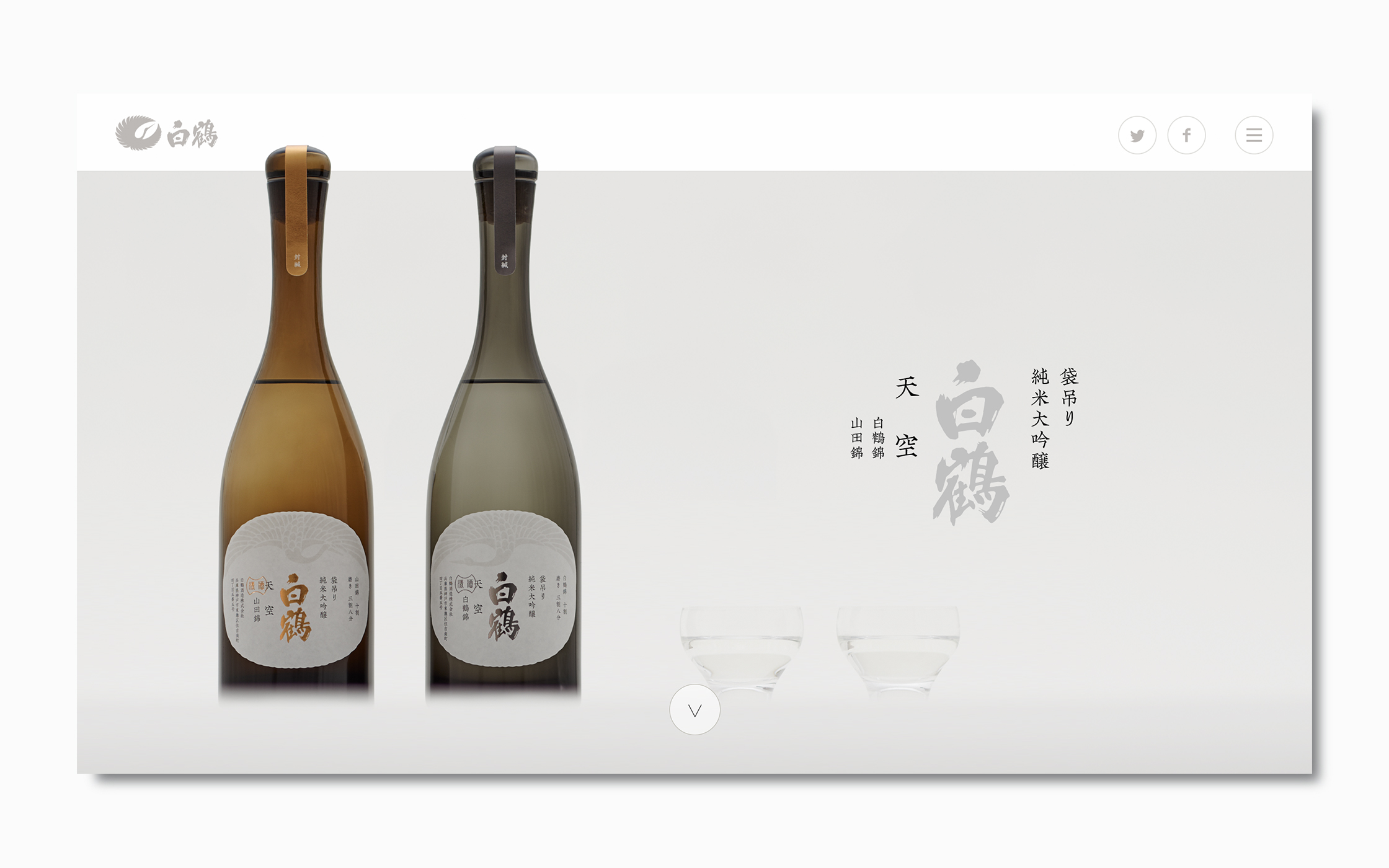
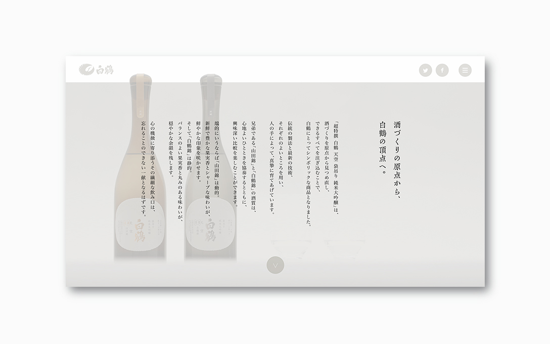
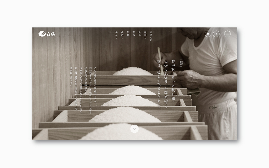
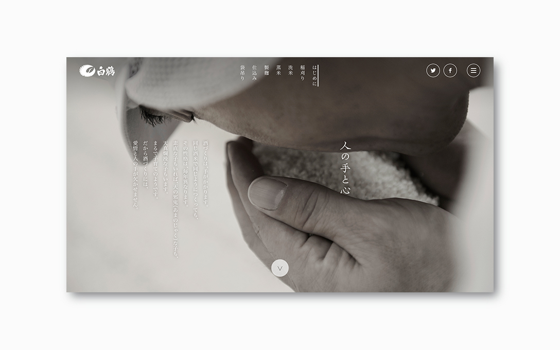
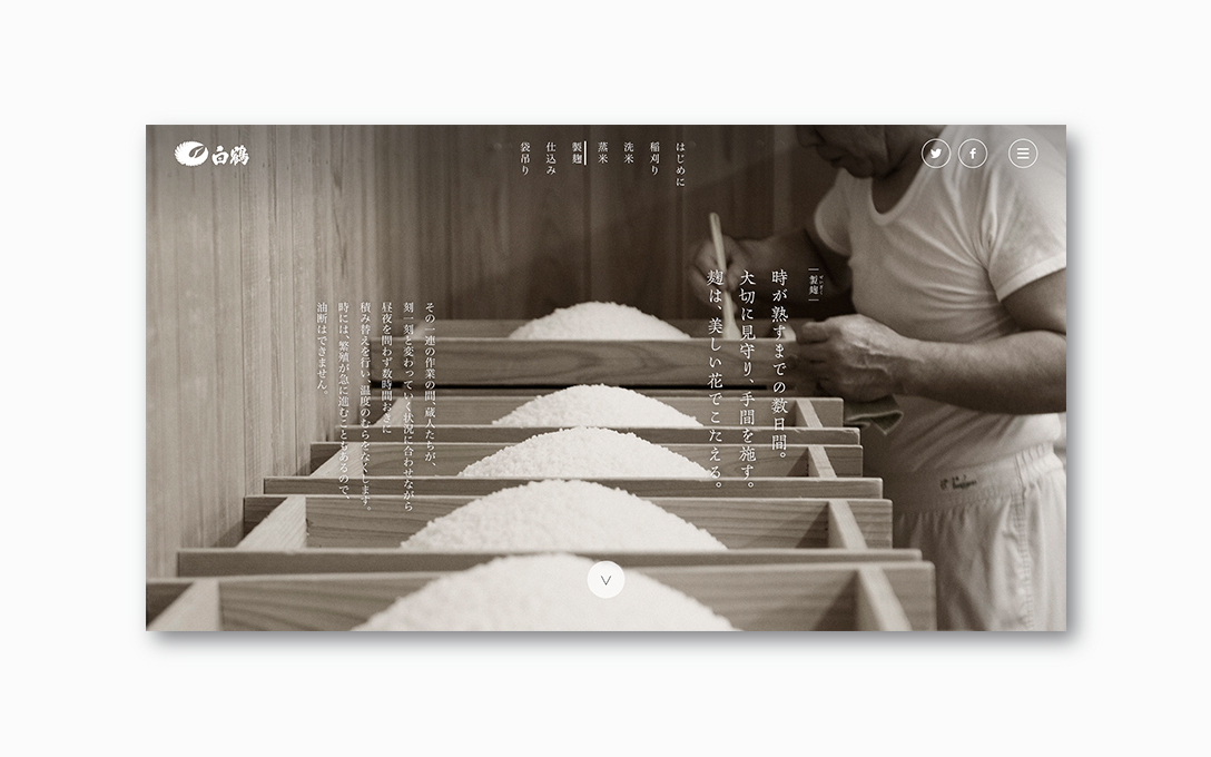
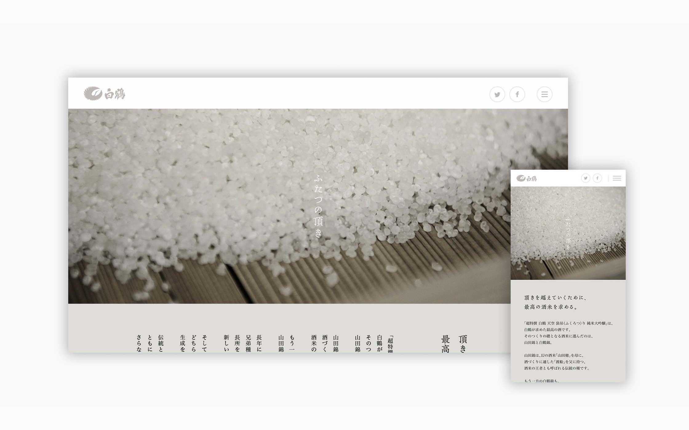
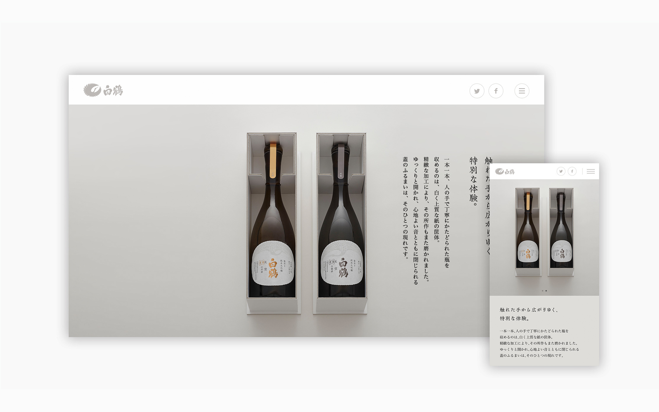
This project was for web design that introduces the flagship products of Hakutsuru.
A feeling of tense expectation is created by black-and-white photos illustrating the story of saké-brewing, and these are combined with the vertical typography and slow movement of the screen to produce a sophisticated, high-grade feel suitable for a luxury product.
Brand site
| Client | Hakutsuru Sake Brewing Co., Ltd. |
|---|---|
| Art Director | Irobe Yoshiaki |
| Web Director | Sawada Koji |
| Web Designer | Sawada Koji |
| Developer | Mito Yosuke* |
| Copywriter | Ueno Akira |
| Photographer | Sakano Takaya* |
| Producer | Hayasaka Yasuo |
2015
*:Non-NDC staff