TTN Corporation “igusa mono”
Graphics
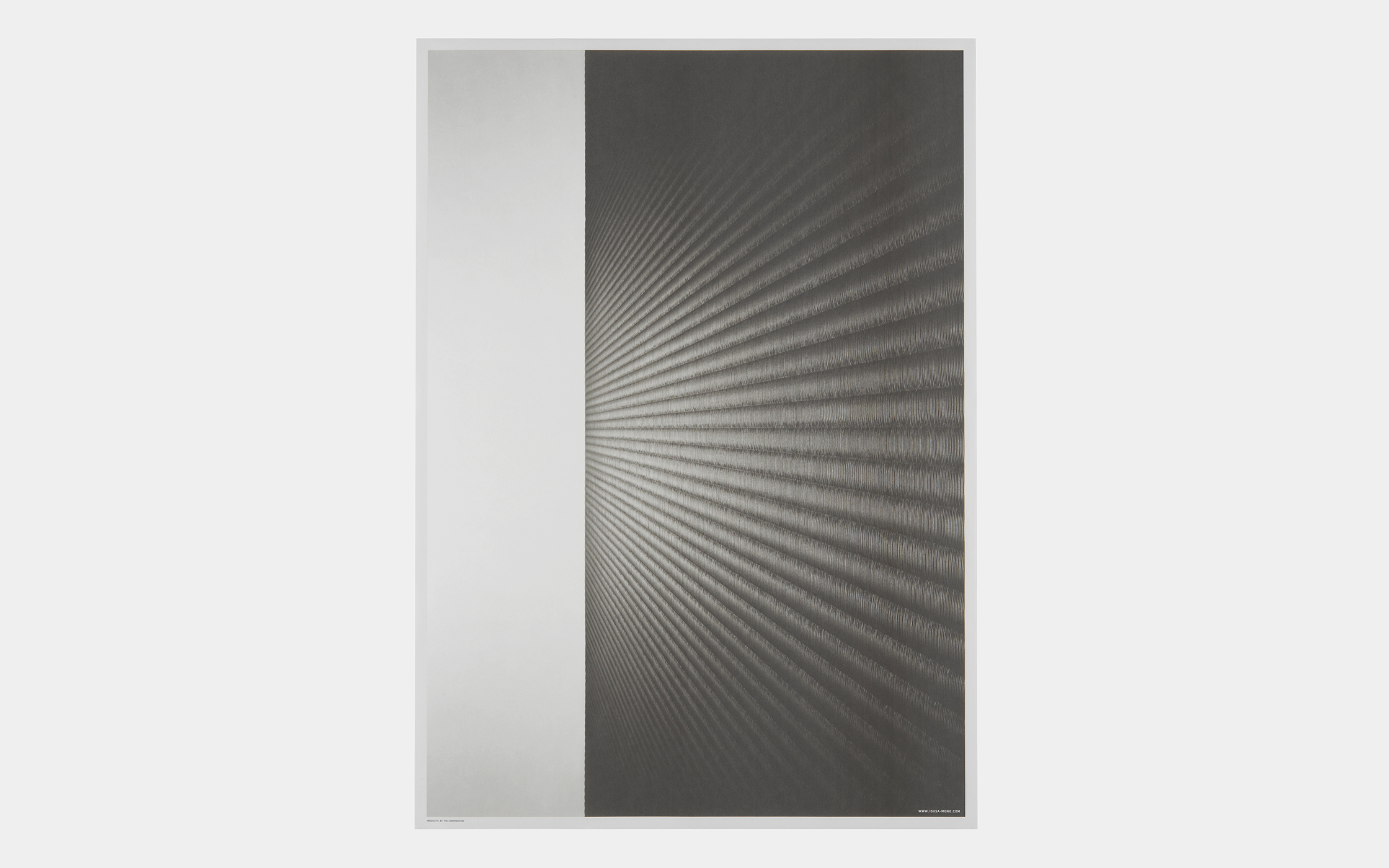
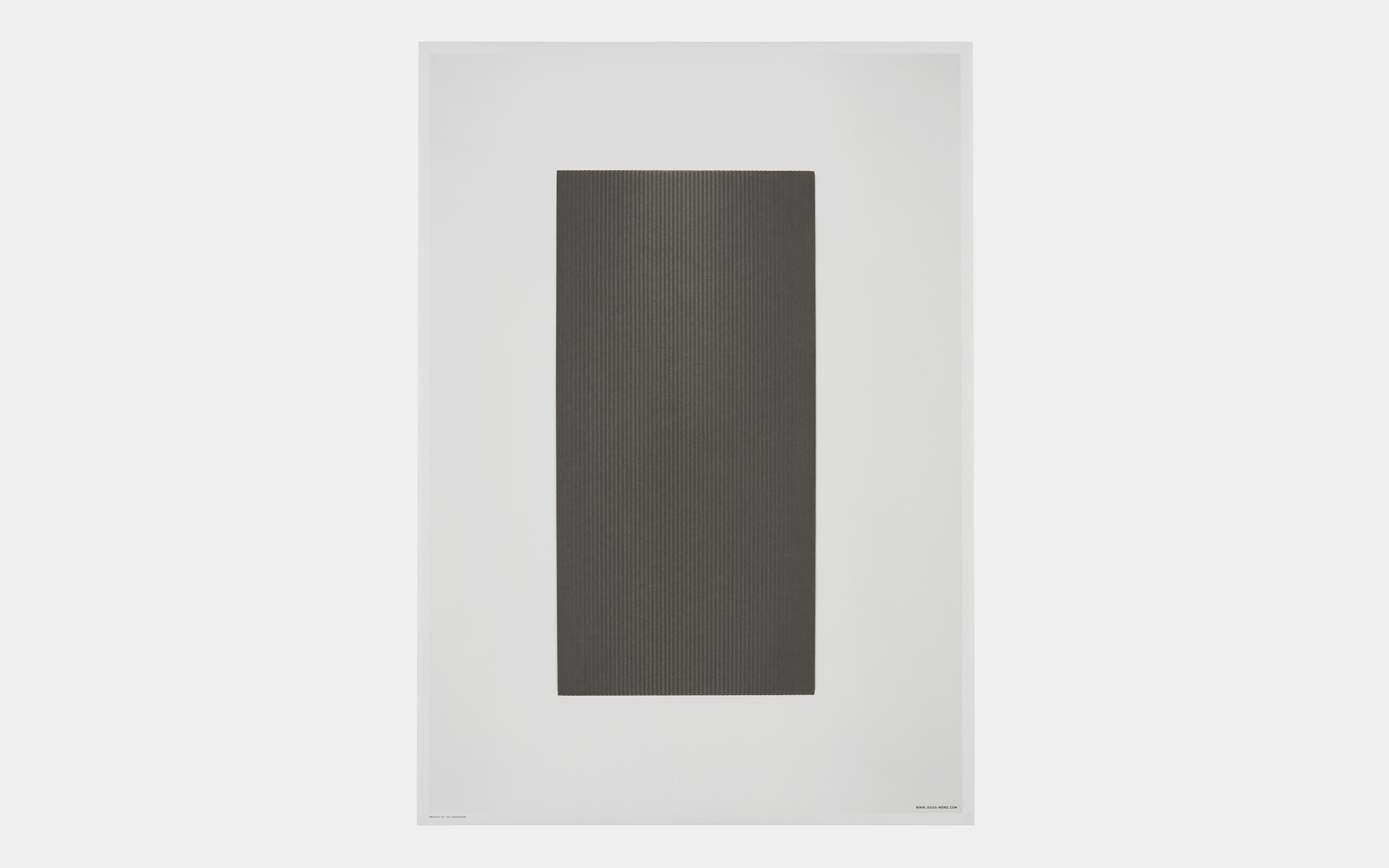
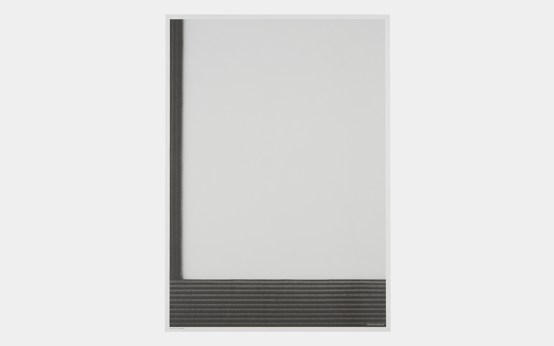
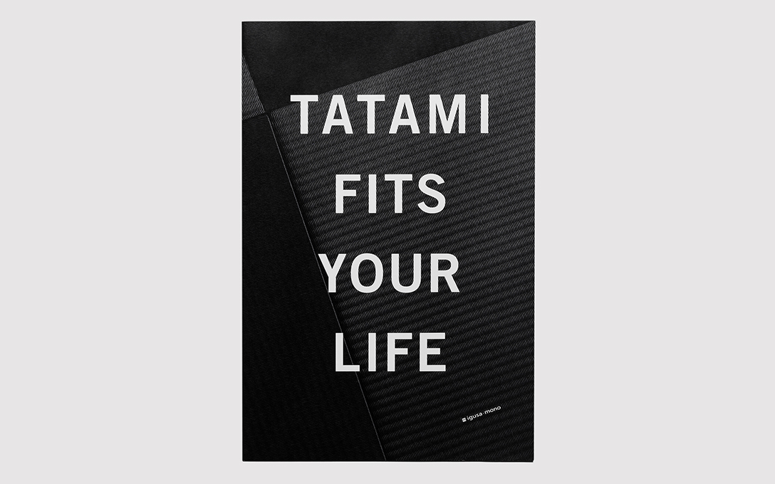
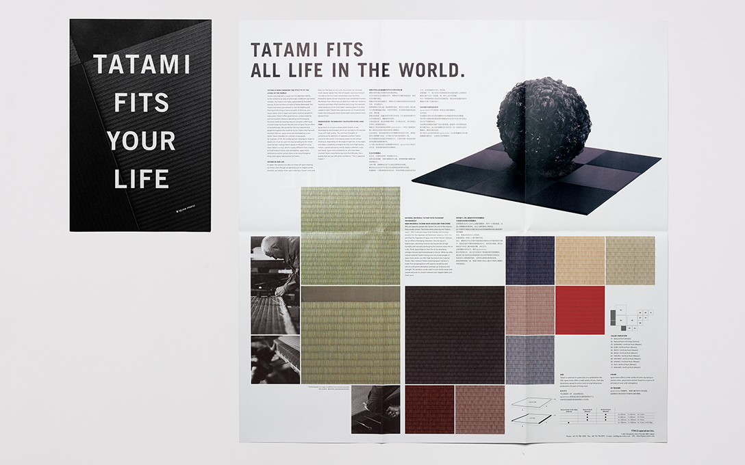
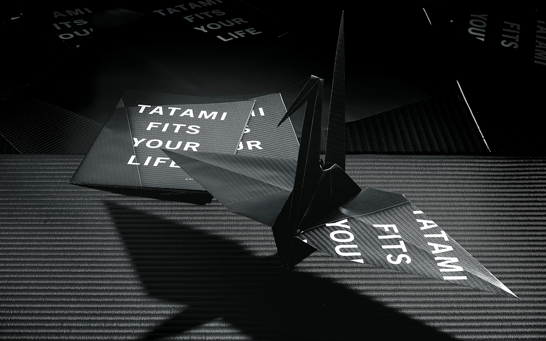
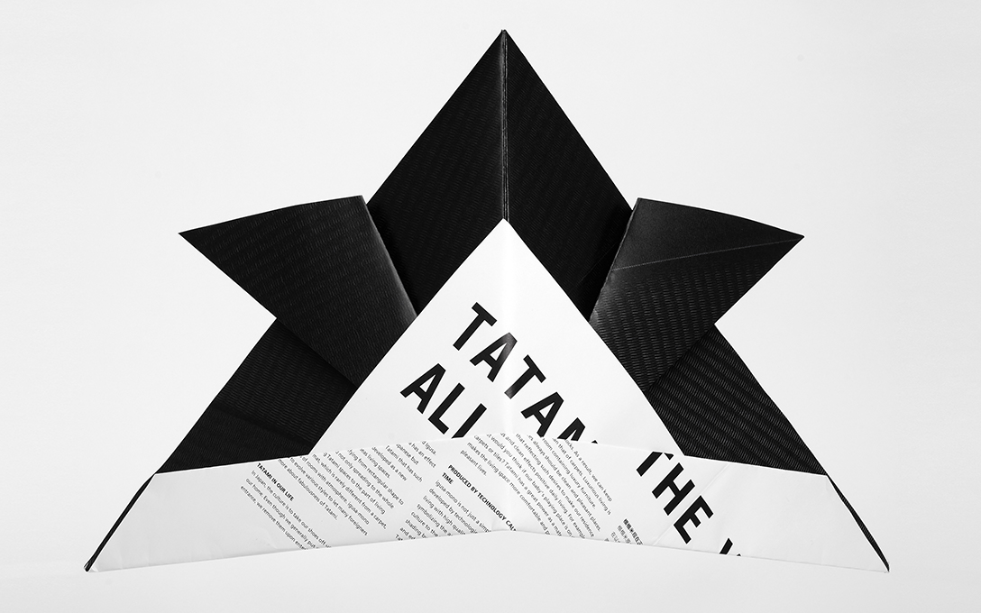
This leaflet and poster were created for the “igusa mono” exhibition that proposes ideas for the best ways to use tatami in modern living. The square leaflet was distributed at the booth for use as origami paper, symbolizing the Japanese quality of precision manufacturing. The poster expresses Japanese beauty through a contrast of black and white that produces a feeling of tension in a way that is familiar to students of Japanese calligraphy.
| Client | TTN Corporation |
|---|---|
| Art Director | Yoshida Takanari |
| Designer | Yoshida Takanari |
| Copywriter | Hasumi Ryo |
| Photographer | Okuwaki Takanori* |
| Producer | Furuzawa Goro |
2013
*:Non-NDC staff