HANEDA
New Logo, New Mindset

NDC created the new logo for the Japan Airport Building Group, which operates Haneda Airport, Japan’s gateway to the skies
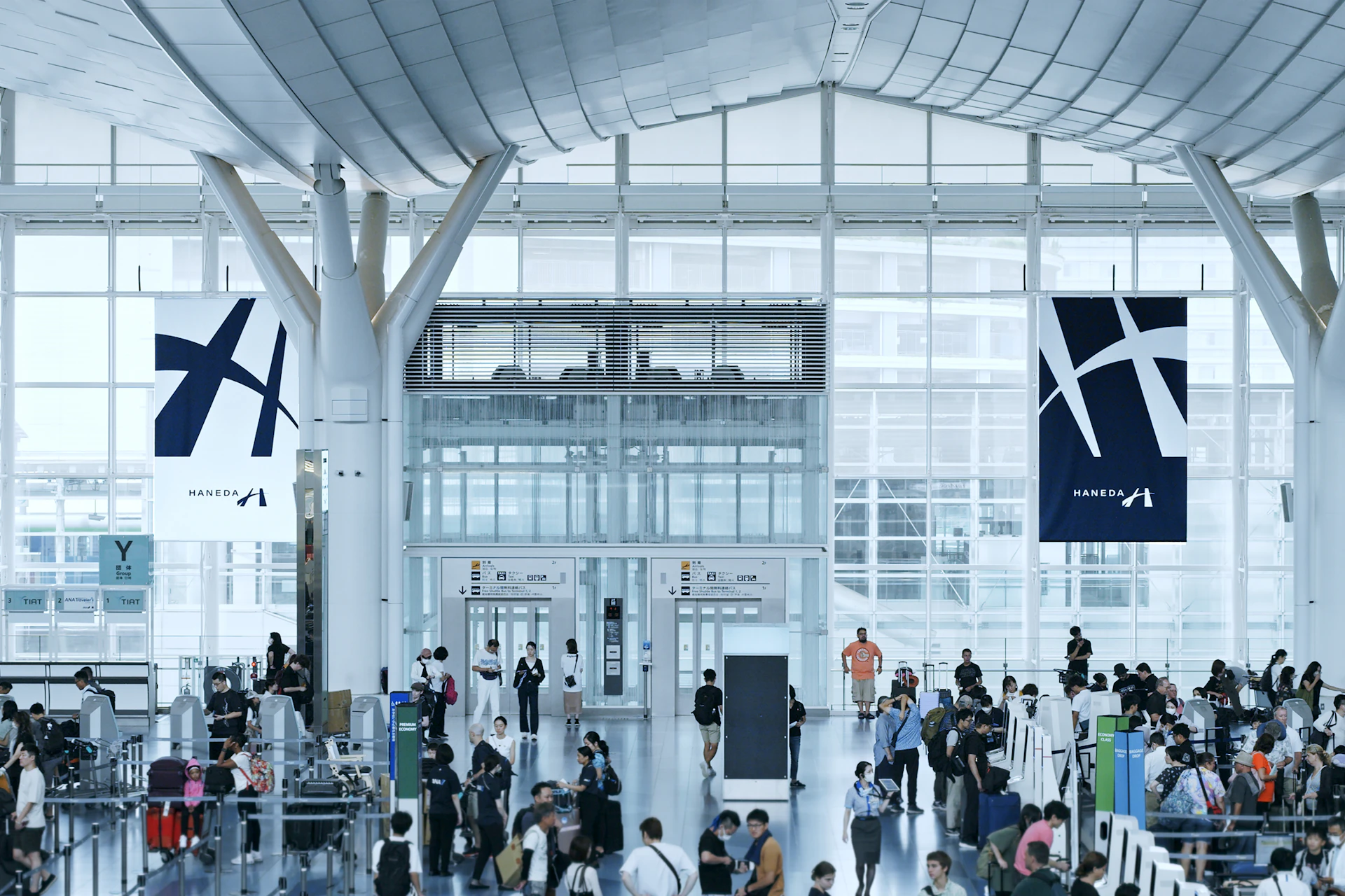
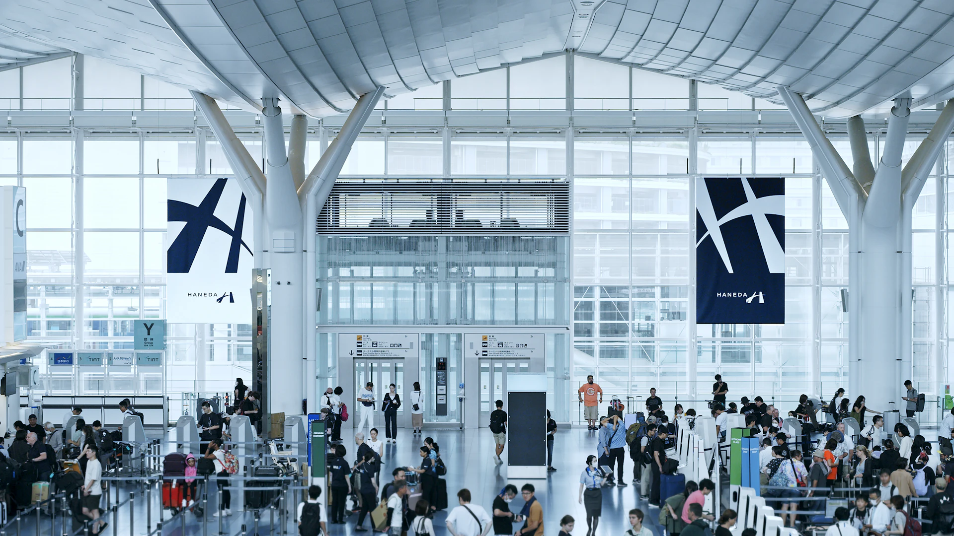
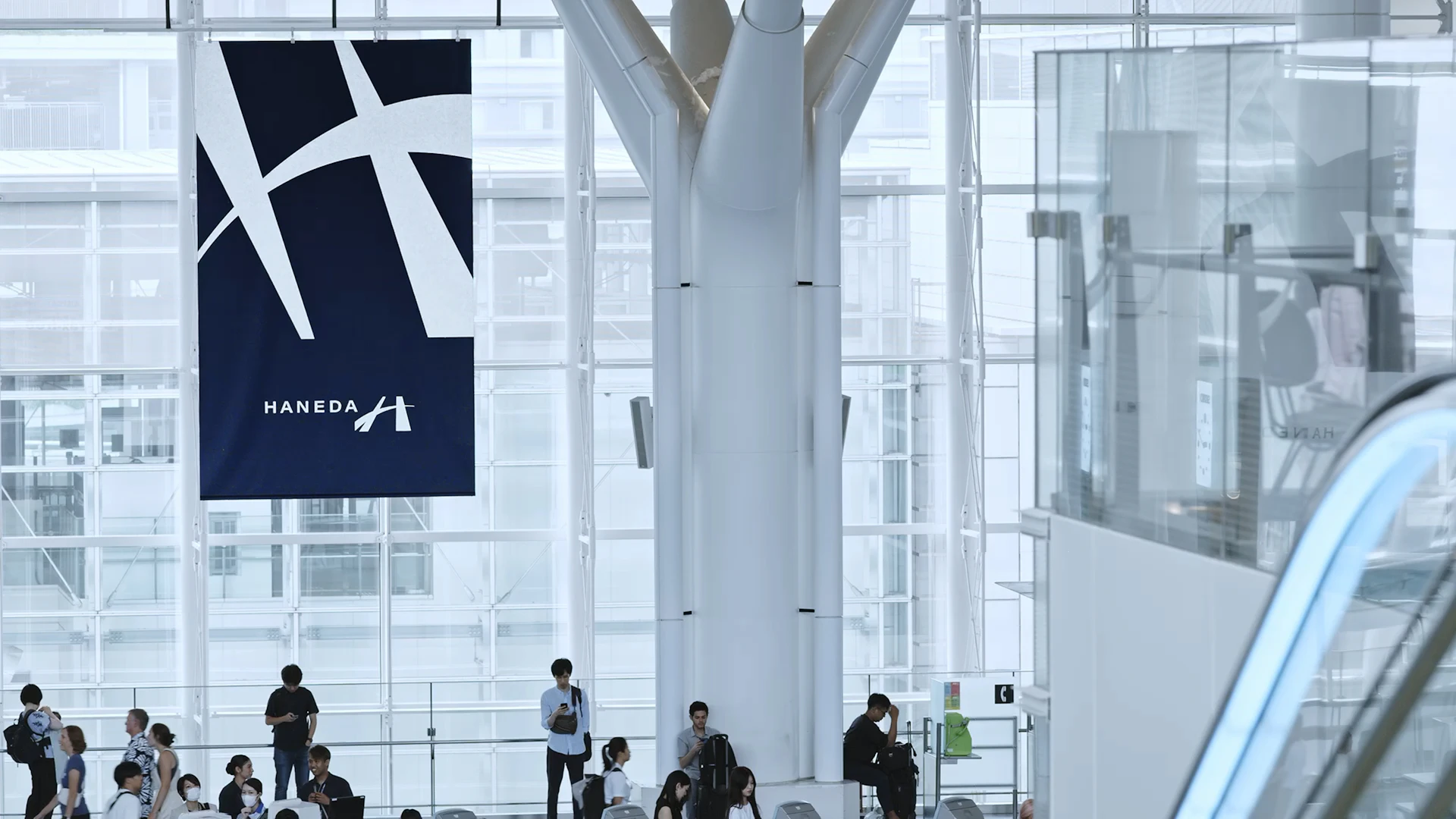
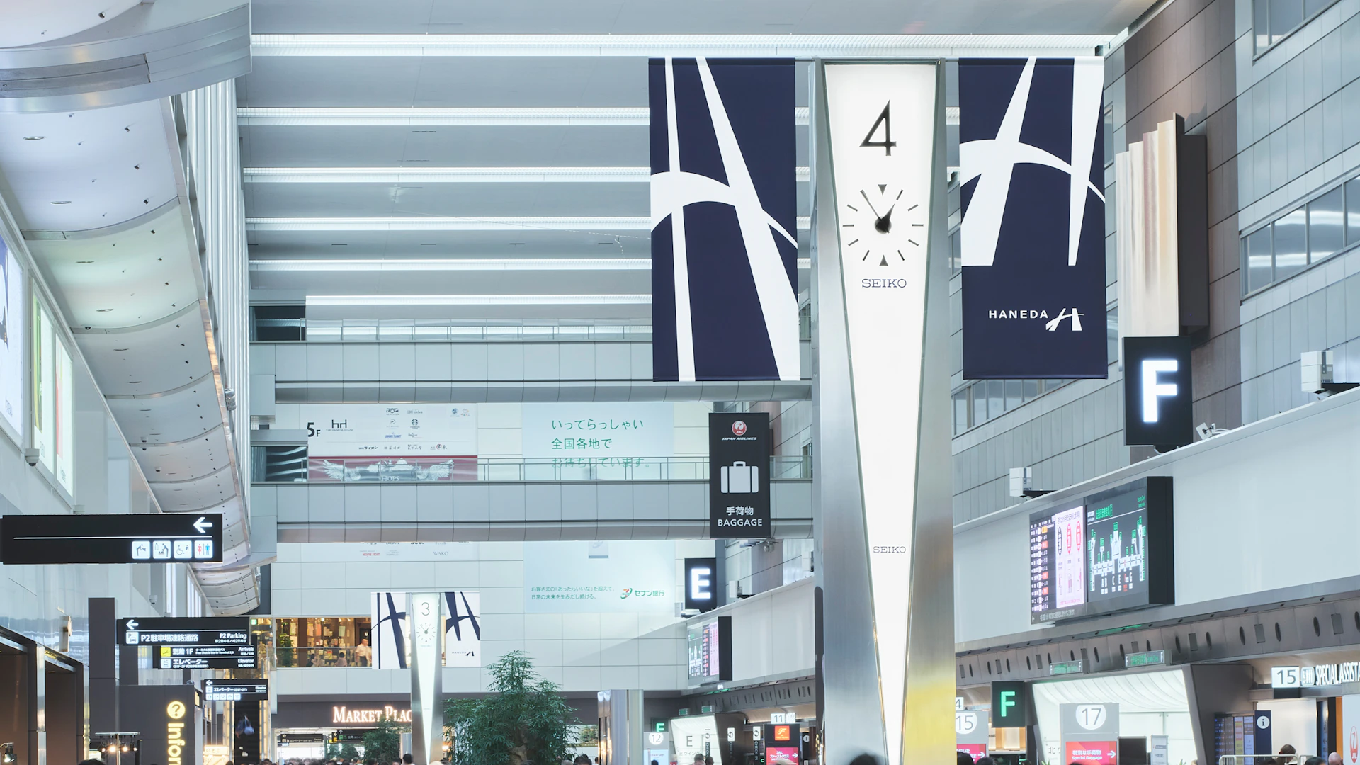
The new logo was required to serve as a powerful symbol announcing HANEDA’s ambition for further growth to the world, marking the company’s 70th anniversary in 2023. Additionally, for the first time in history, it unified the logos of all 20 group companies, which previously had disparate logos and mindsets. It aims to function as a banner under which the entire group can come together to communicate the unique value of Japanese airports.
Haneda Airport has earned global recognition for its cleanliness and attentive service — expressions of thoughtfulness toward people. What future might emerge if this mindset and technology were extended to a global scale? We created a distinctive “H” by intersecting a straight line representing the existing value of “attention to people” with a curved line depicting the future value of “attention to the planet.” The color chosen is “tomekon,” the deepest shade of indigo blue, embodying the intention to deepen layered values and enrich the future.
Visual Identity
Graphics


Web / App
Credit
- Creative Direction
- Art Direction
- Copywriting
- Graphic Design
- Motion Design
- Web Design
- Web Direction
- Photography
- Produce


