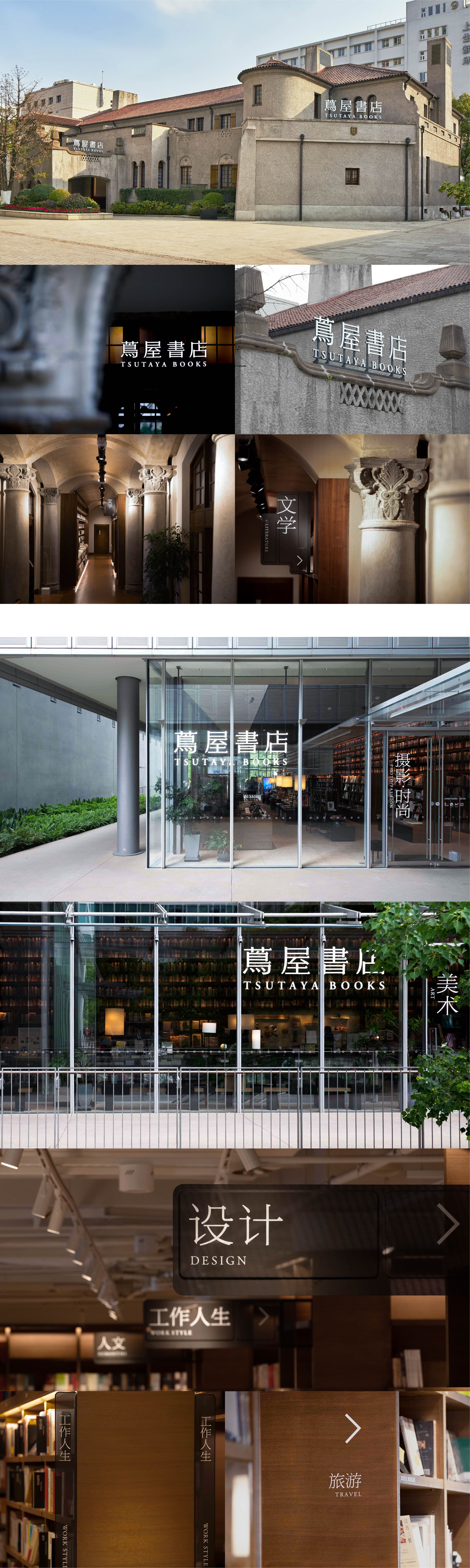
Jan 24, 2022
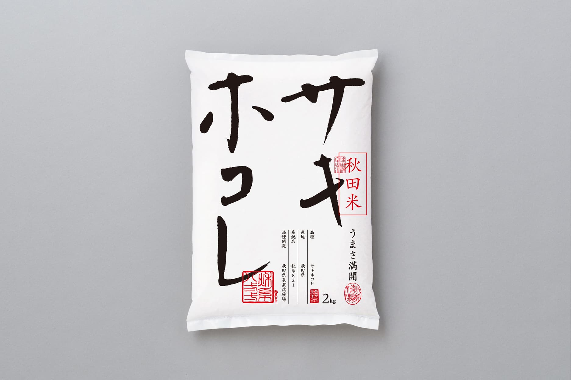
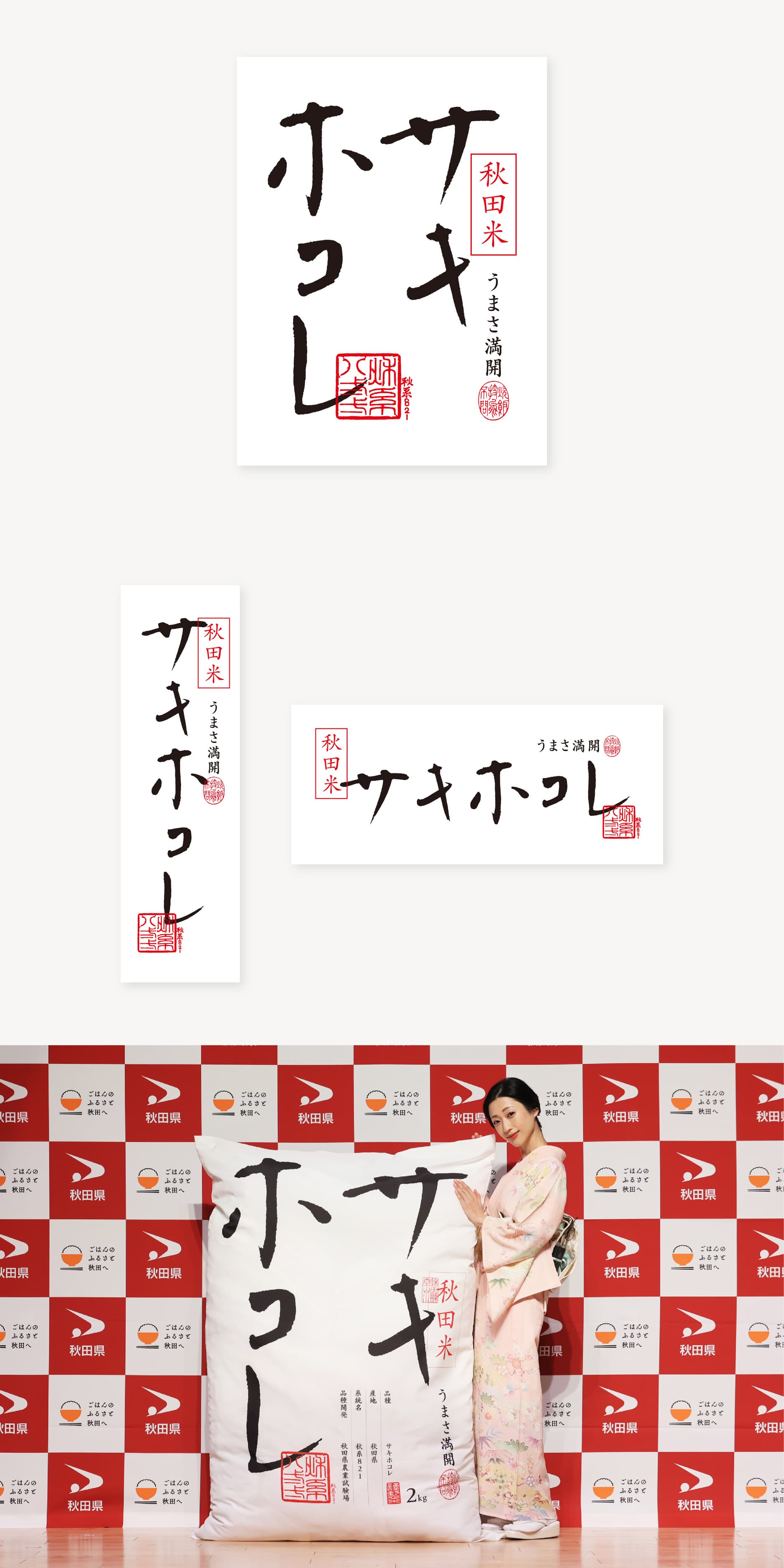
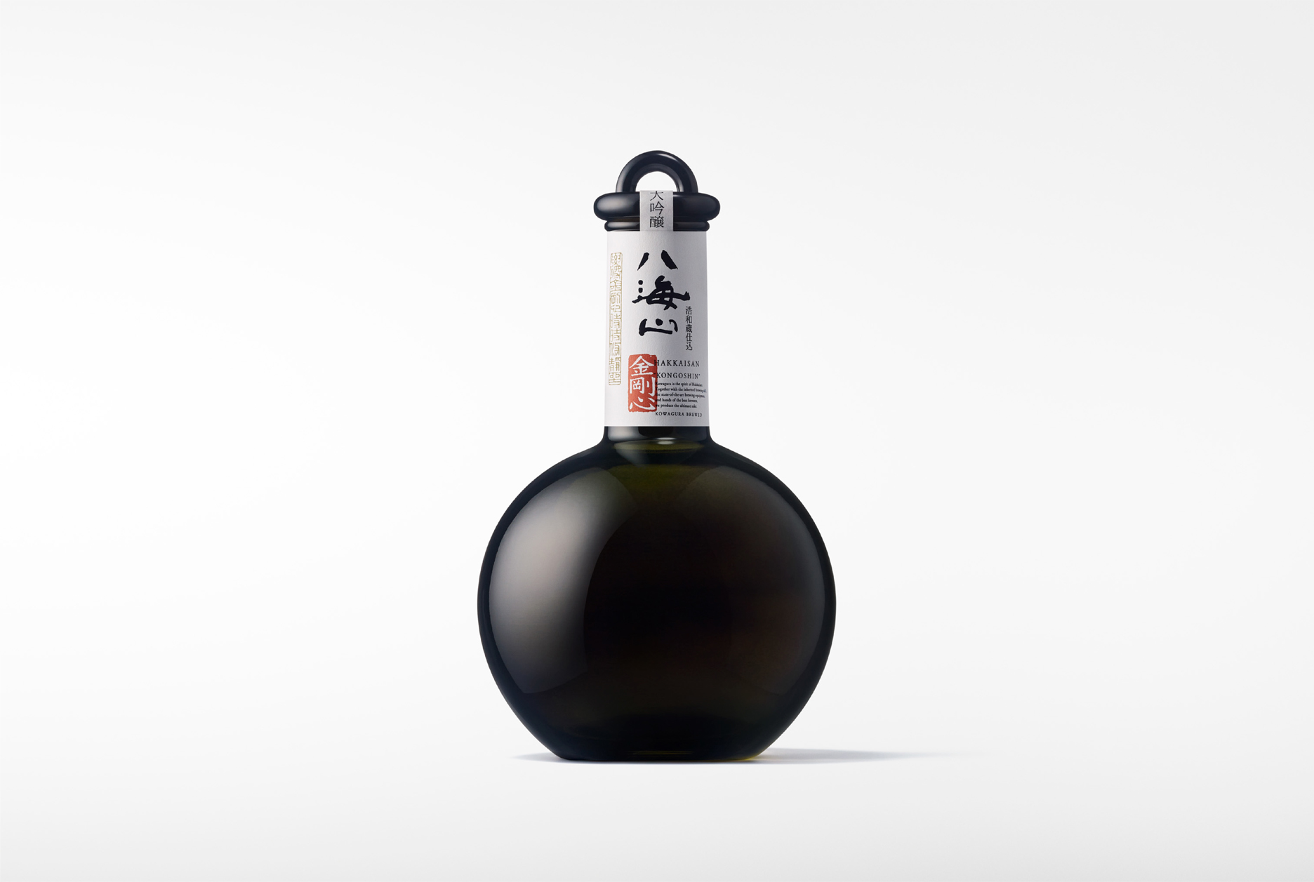
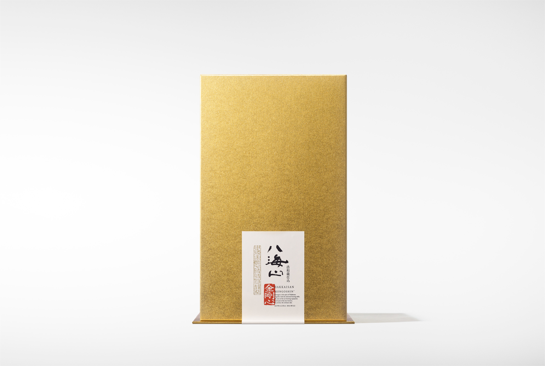
Hakkaisan Kongoshin Junmai Daiginjo
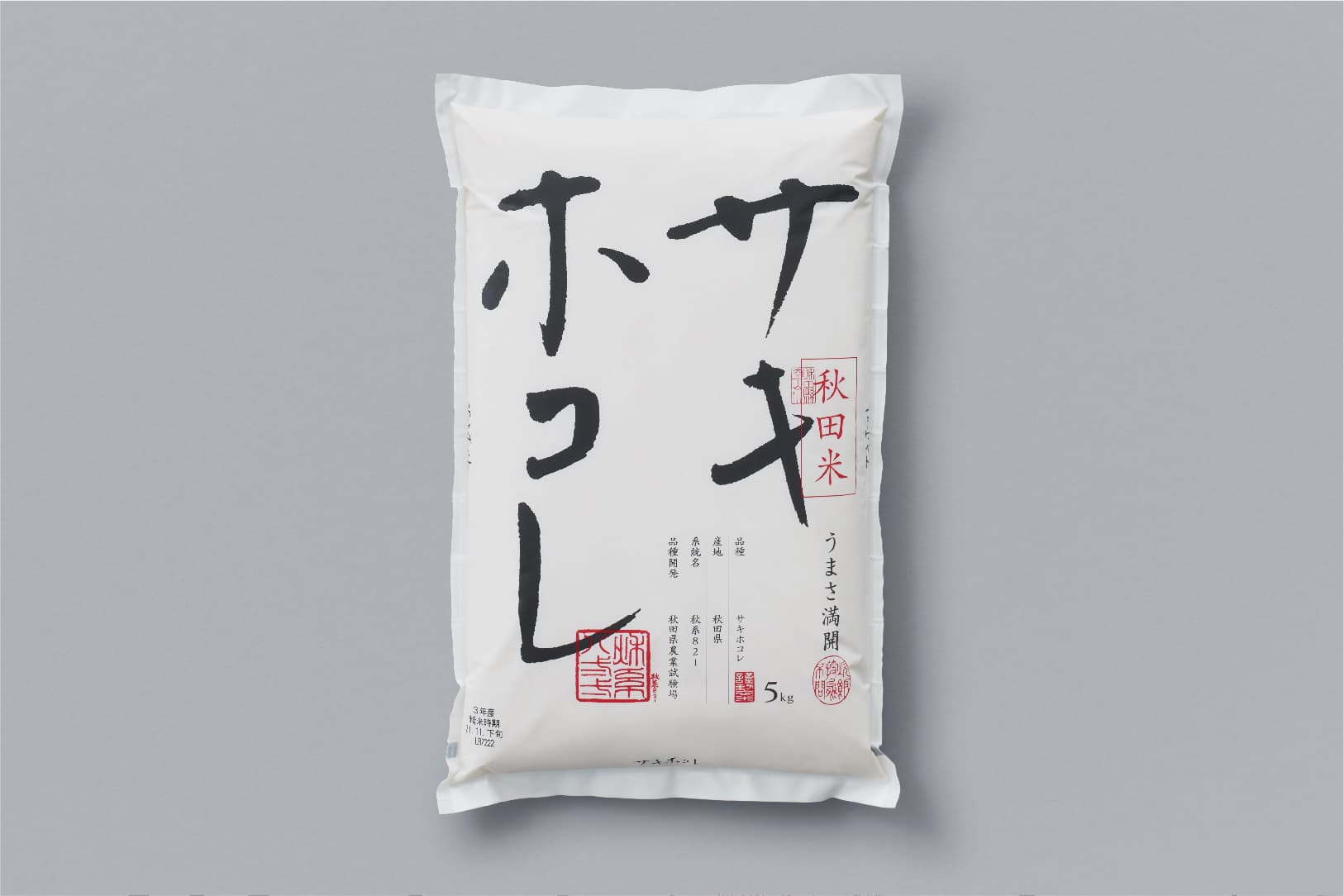
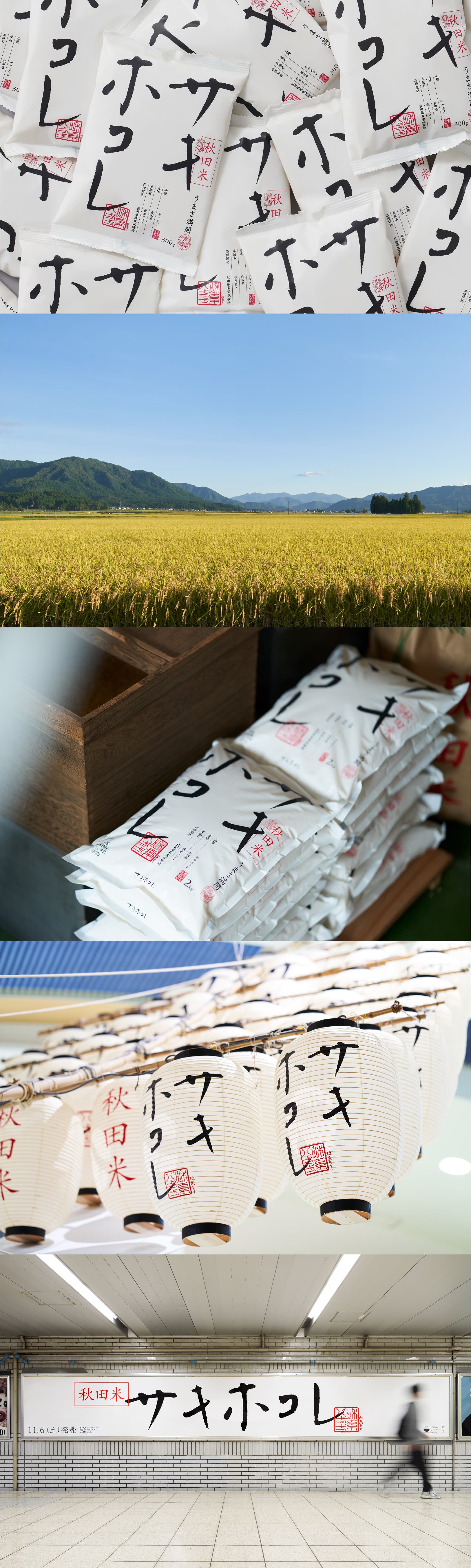
Hakkaisan Kongoshin is the ultimate junmai daiginjo sake produced by Hakkaisan Brewery. It is a seasonal sake available twice a year, once in the summer and once in the winter. Hara Design Institute handled the re-design of its packaging, incorporating "Hakkaisan" calligraphy by Kyuyo Ishikawa that uses unwavering and imposing brushwork to echo the meaning of Kongoshin--unwavering heart. The calligraphy is accompanied by an engraved "Kongoshin" seal, and a Chinese poem inspired by the stance that it represents. The new packaging retains the original concept, updated to accentuate its splendor and appeal to contemporary tastes, communicating Hakkaisan Kongoshin Junmai Daiginjo's character as a luxurious and festive sake that is ideal as a gift or as a drink to celebrate special occasions. The new design was launched at restaurants and wine shops in Japan in December 2021.
AD: Kenya Hara
D: Kenya Hara, Kanako Ohashi, Hiroyuki Sato, Saiko Kanda,
Pr: Shogo Kawahara
D: Kenya Hara, Kanako Ohashi, Hiroyuki Sato, Saiko Kanda,
Pr: Shogo Kawahara