Asahi Super Dry
Reflecting Contemporary Values

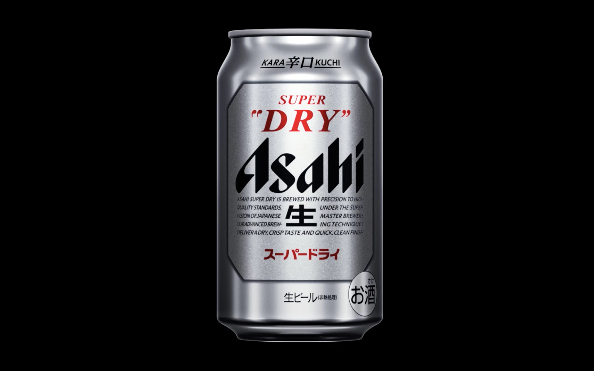
In 1987, Japanese brewery Asahi Beer launched Asahi Super Dry with a groundbreaking concept: a crisp, dry beer with a sharp finish. Paired with its innovative metallic silver design, Super Dry has earned enduring appreciation from countless consumers over the years.
In 2022, thirty-six years after its initial release, NDC undertook Super Dry’s first comprehensive package redesign. Guided by three keywords — SIMPLE, SILVER, and IDENTITY — we created a design that radiates renewed brilliance. The new look features refined essential elements, harmonious variations of silver inspired by Japanese aesthetics, and a clearer expression of the brand's distinct character.
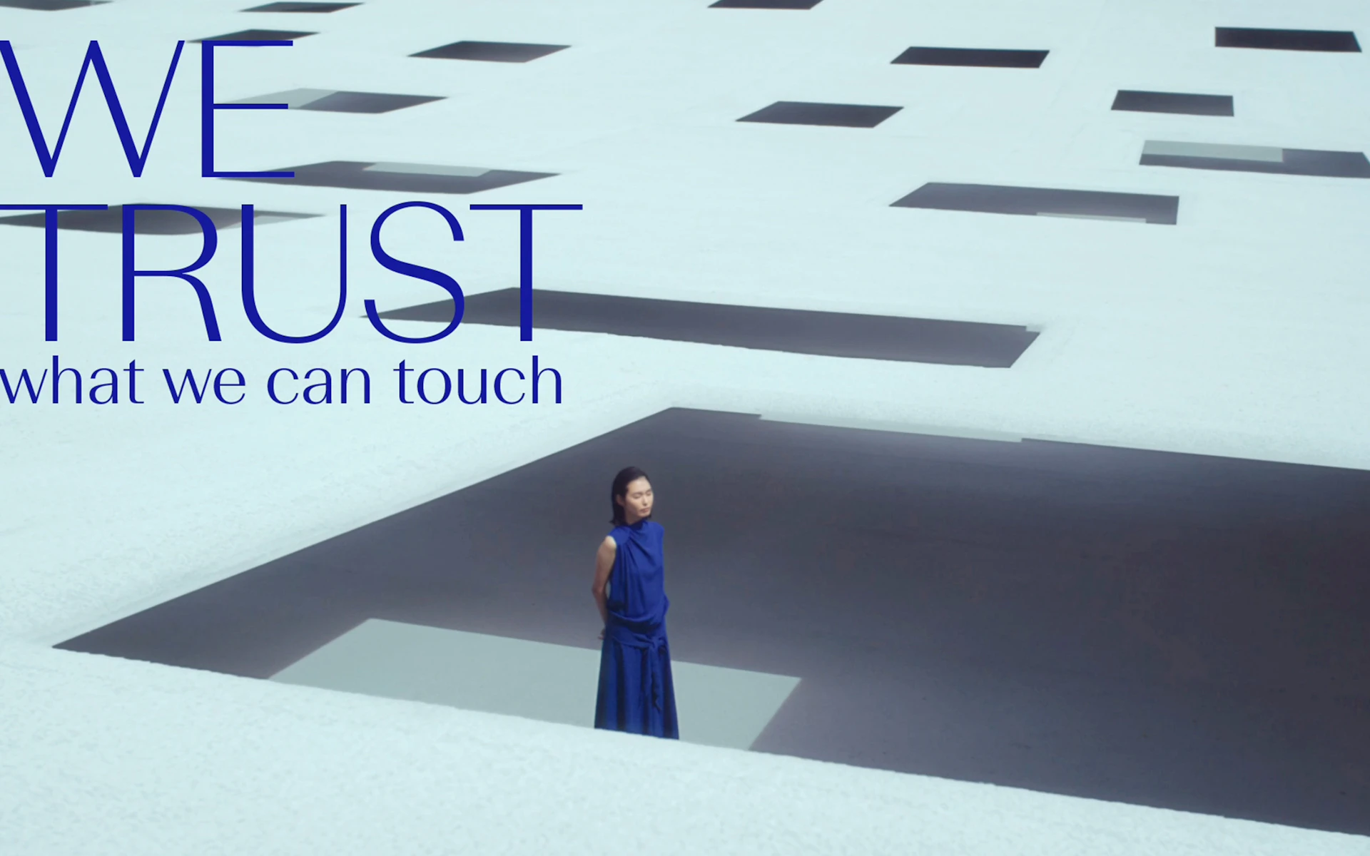
We also produced a dynamic visual narrative that elegantly explores these three keywords. As Super Dry has consistently evolved with the times, we examined how the brand should position itself in this era of significant change. The film sharply captures their process of self-reflection, addressing the diversification of values and the reality of globalism.
Package

Movie
Credit
- Creative Direction
- Design
- Direction
- Art Direction
- CG Design
- Copywriting
- Composition (Music)
-
- Yasuhiro Nakashima *
- Produce
* Non-NDC staff

