Yamato Group
From Everyone’s Logo to an Emblem for the Future

The Yamato Group is a corporate entity consisting of 45 companies centered around Yamato Transport, a leading delivery service provider in Japan.
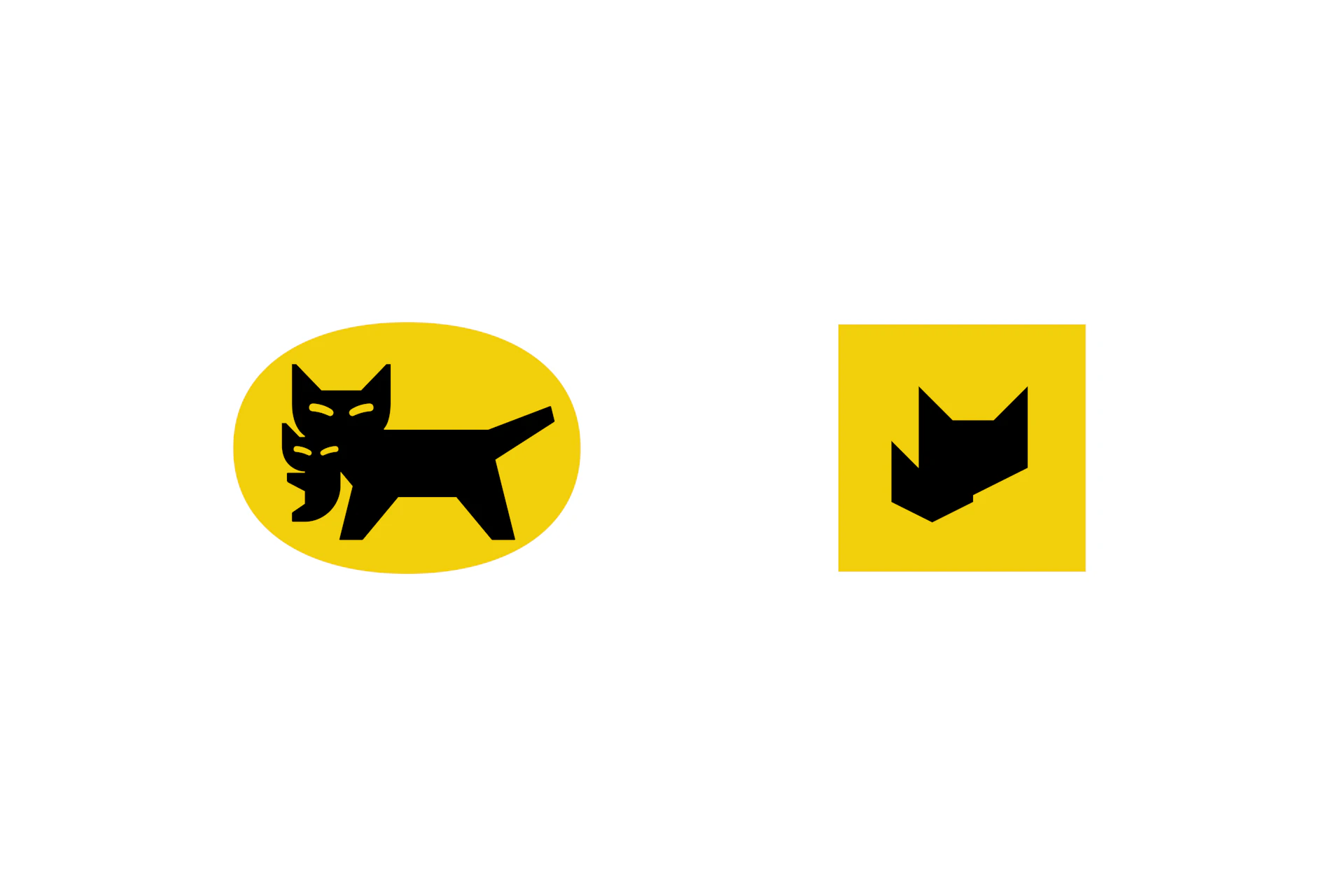
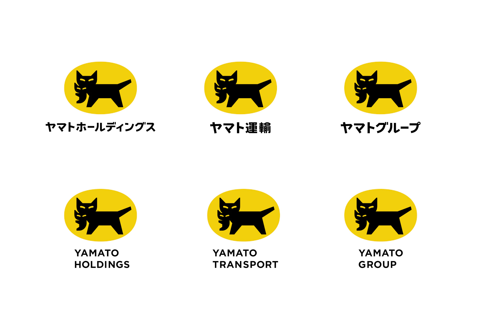
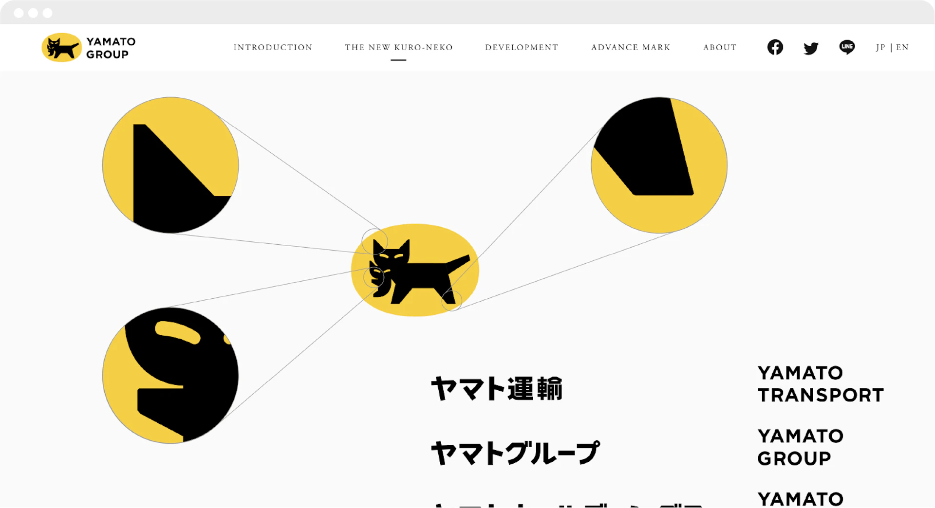
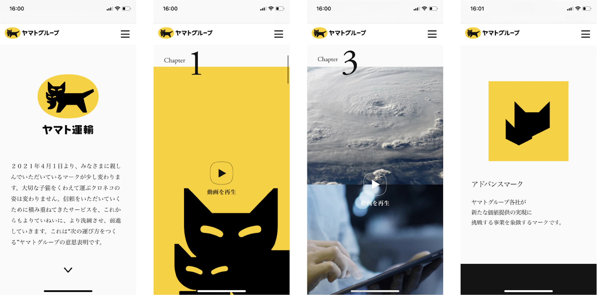
Having supported Japan’s logistics for over 100 years since its founding, the company has accelerated and expanded its services with the changing times. This led to the decision to refresh the corporate symbol mark. The “Kuro Neko mark,” depicting a mother cat carrying her kitten, is considered a shared asset among Japanese people and, given its ubiquity, practically an element of environmental design. While preserving its essence, we refined the form to suit a company that continues to advance toward the future.
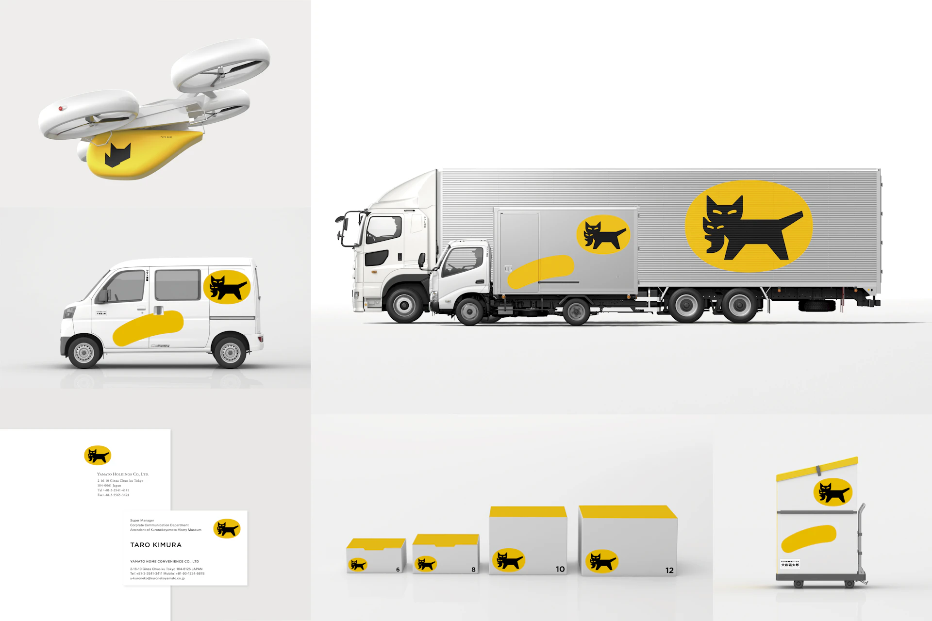
We also developed and created logotypes for the group companies’ names, a corporate color that blends naturally from urban areas to rural mountains, and an “Advance mark” symbolizing new business domains opened through cutting-edge technology. The two marks together express the Yamato Group’s commitment to “creating the next way of delivery.”
Visual Identity







Movie
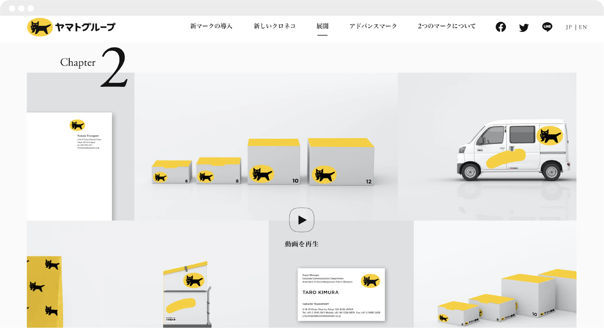
Web / App
Credit
- Art Direction
- Design
- Movie
- Movie Editing
- CG Design
-
- Yuuki Saito
- Mariko Tsutsumi
- Takashi Suzuki
- Yoshifumi Okuyama
- Kiichi Tai
- Akihiro Terada
- Kenichi Hashimoto *
- Music
-
- Kentaro *
- Sound Engineering
-
- Osao Hori *
- Web
-
- Xin Zhong
- Hiroshi Hosokawa
- Nana Miyazaki
- Kohey Shimizu *
