Daikanyama Tsutaya Books
Individuality That Spreads Like Particles

Tsutaya Books was born in 1983 as a store proposing lifestyles through books, music, and film. As the TSUTAYA brand expanded nationwide through rental video services, we returned to the founding principles to create new markets, opening Tsutaya Books in Tokyo’s Daikanyama in 2011.
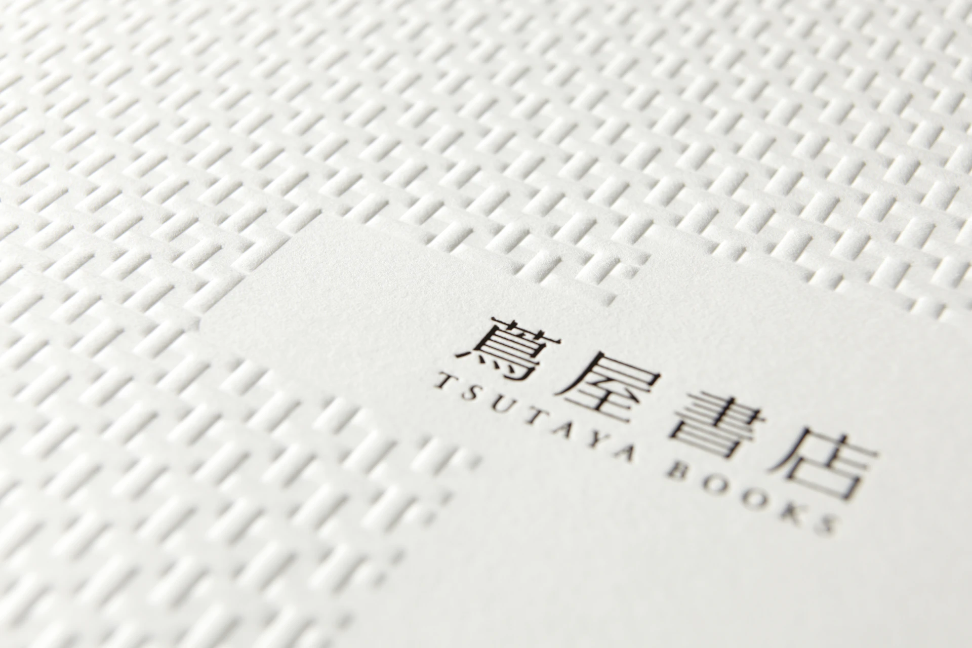
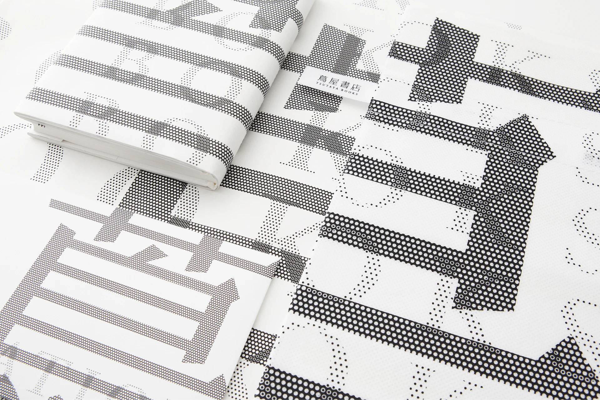
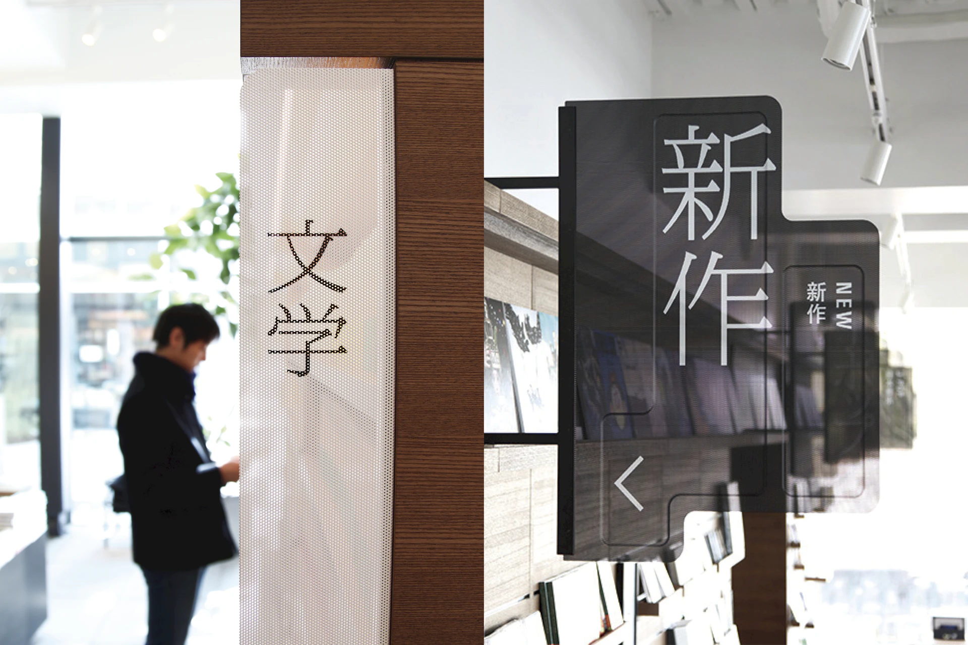
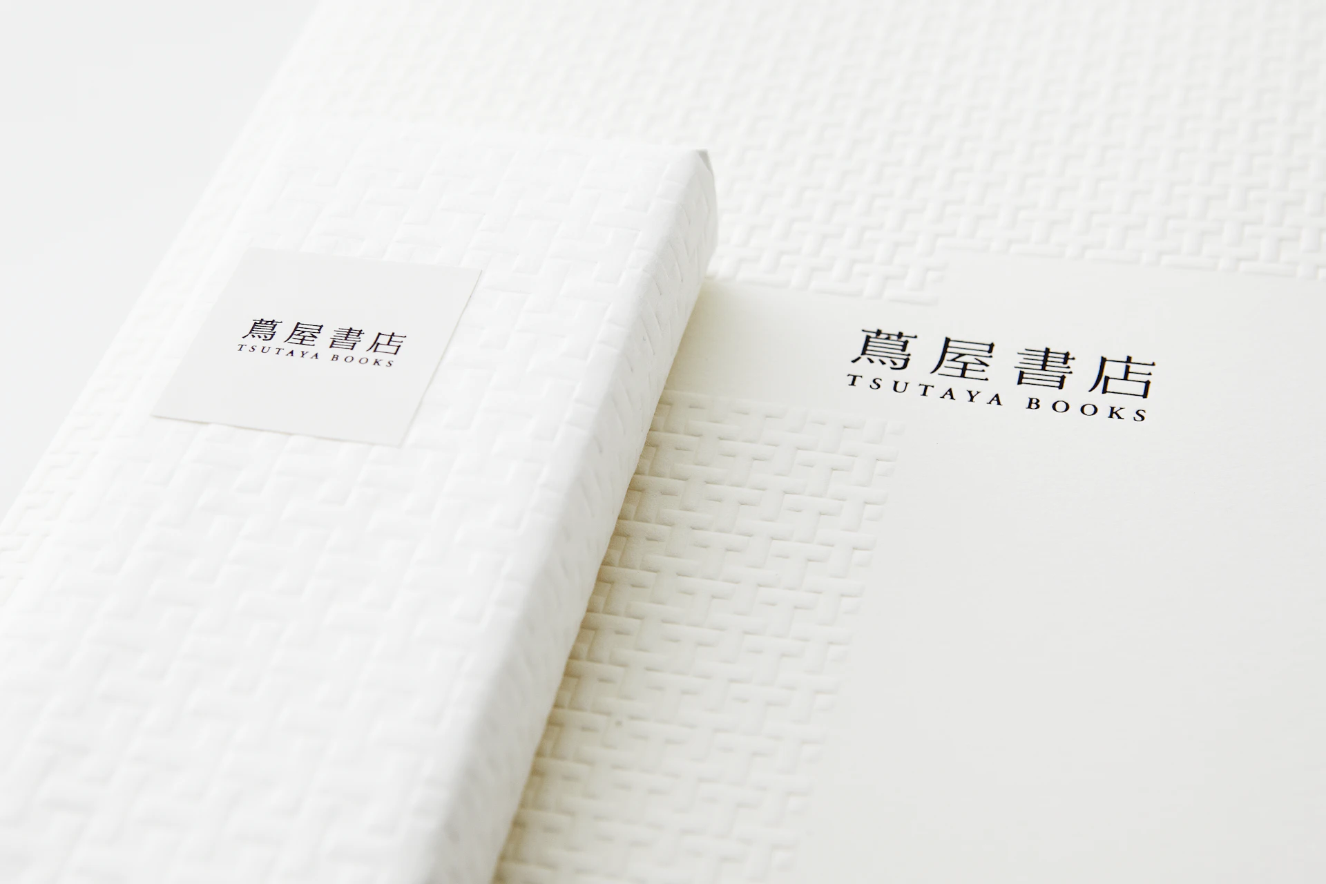
As the project’s symbol, we updated the logotype from TSUTAYA to Tsutaya Books. We adopted a readable, concise kanji logo, with the visual identity transforming the logo into particles—a collection of dots—for various applications.
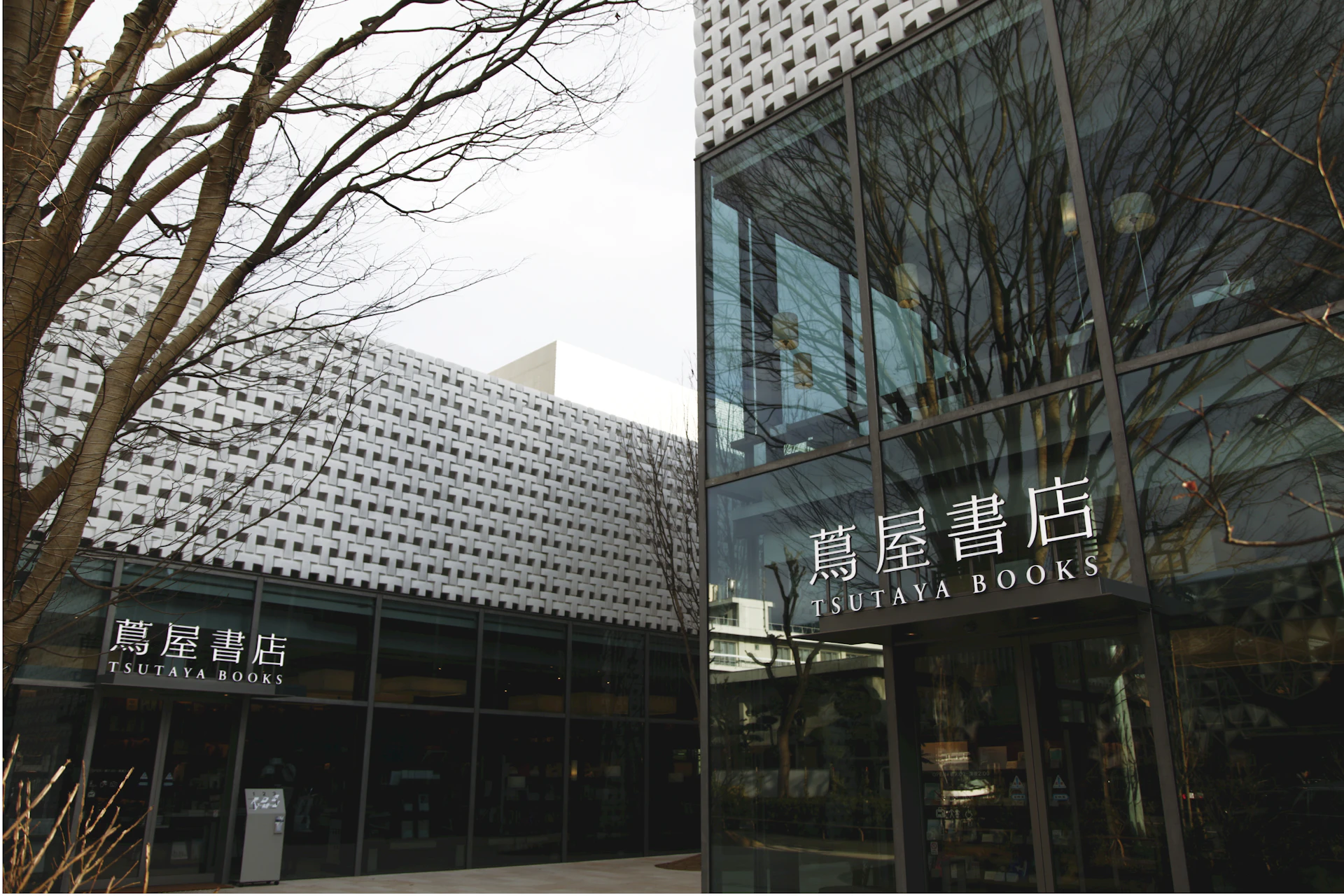
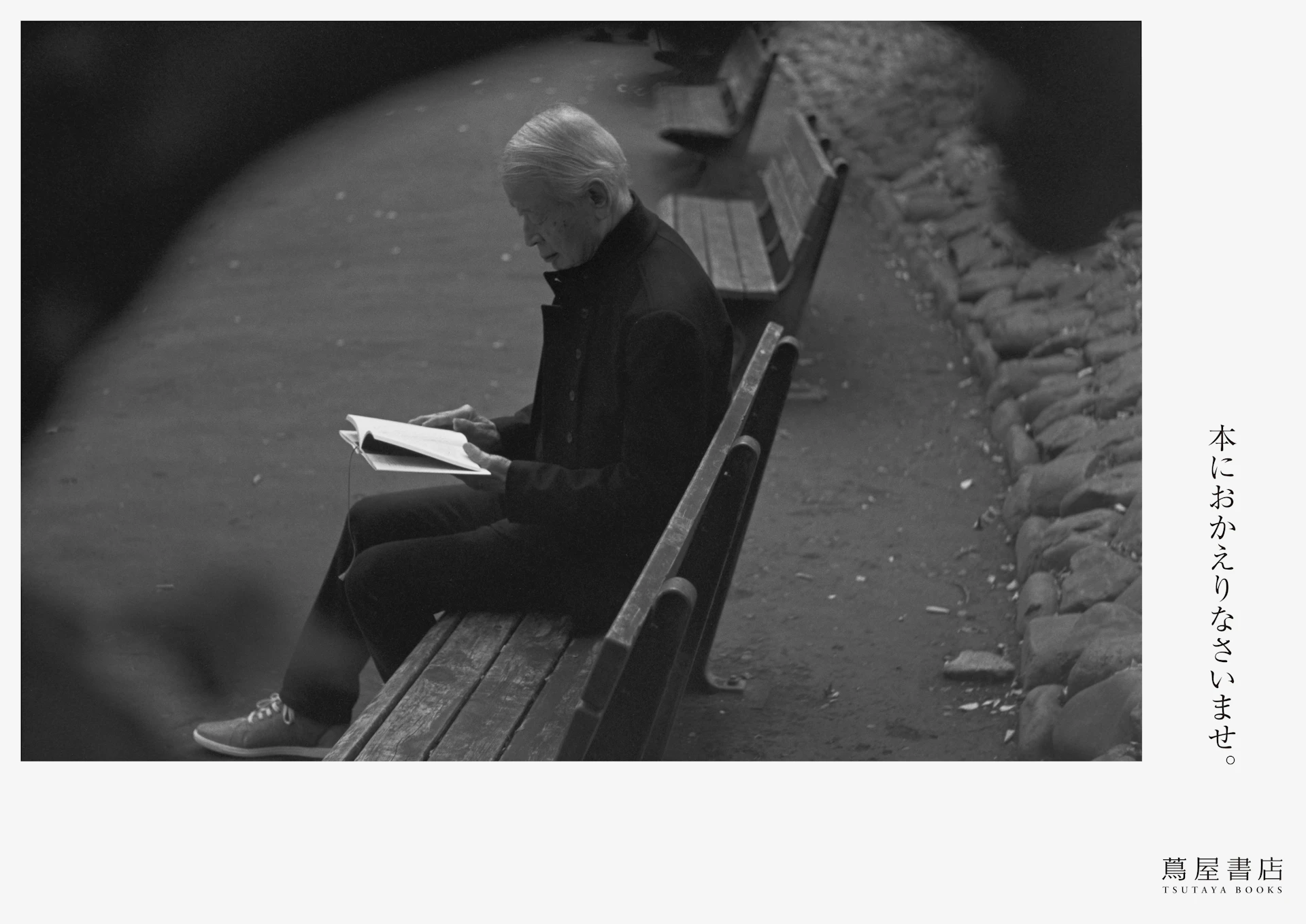
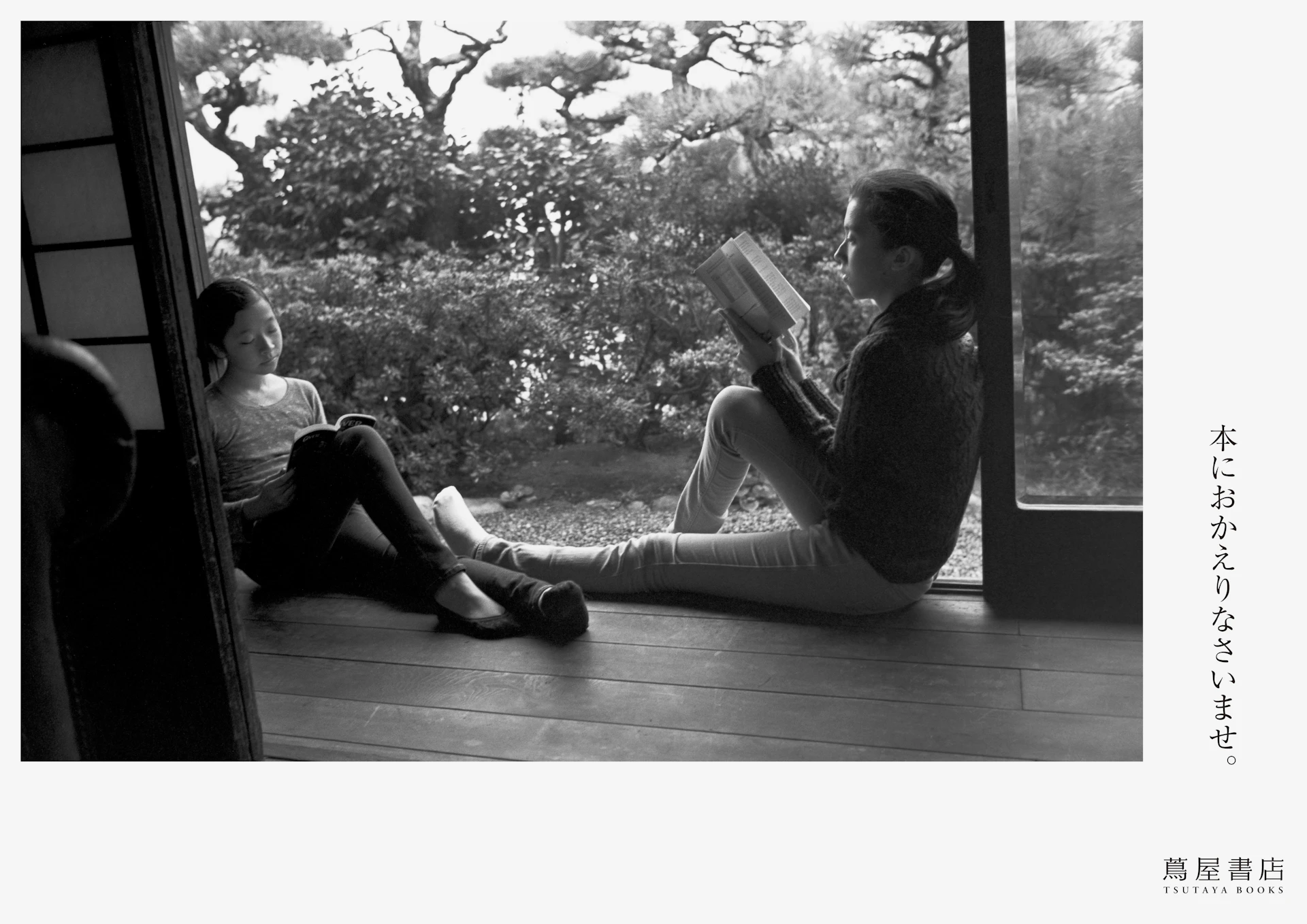
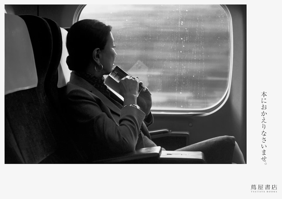
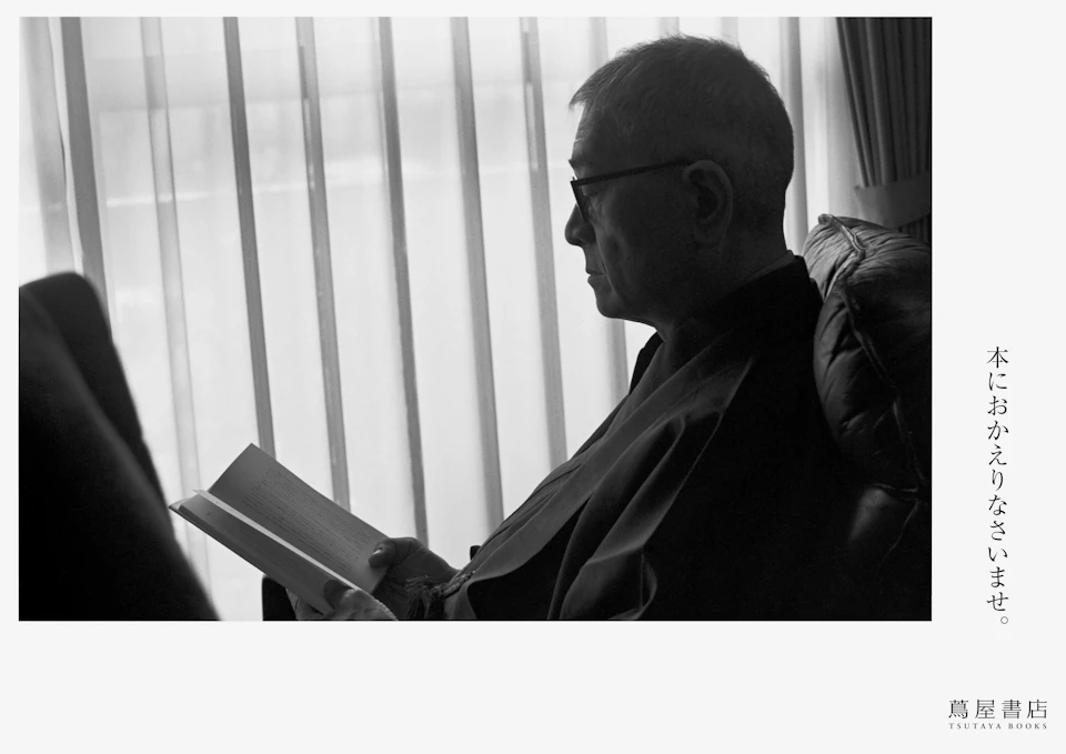
For the signage system, we used perforated metal plates to create semi-transparent, thin structures. Large characters were positioned in high-visibility locations, achieving a system readable from both sides. We also created advertising that expressed the dignity of principled adults through the image of “people who read,” accompanied by the message “Welcome back to books.”
Visual Identity




Products


Credit
- Art Direction
- Design
-
- Kenya Hara
- Kaoru Matsuno
- Haruka Misawa
- Naoko Sasaki
- Hiroaki Kawanami
- Copywriting
-
- Harada Munenori *
- Ryo Hasumi
- Photography
-
- Yoshihiko Ueda *
- Produce
- Web Design
-
- Hiroyuki Saito

