Tokyo Electric Power Company CI Design
Softer and Warmer Electrical Power
Tokyo Electric Power Company is Japan’s largest electric utility, providing energy to the Kanto region centered around Tokyo.
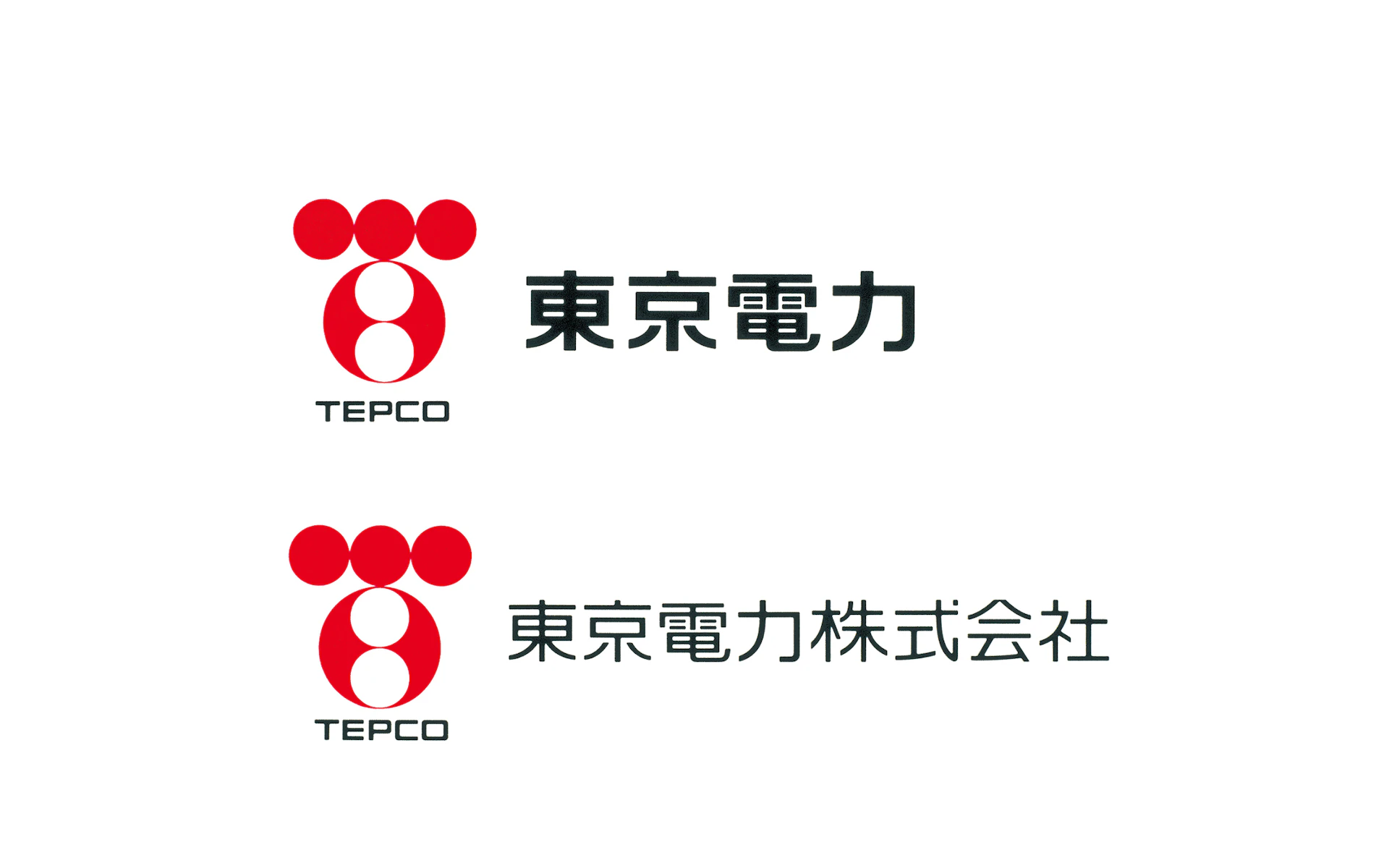
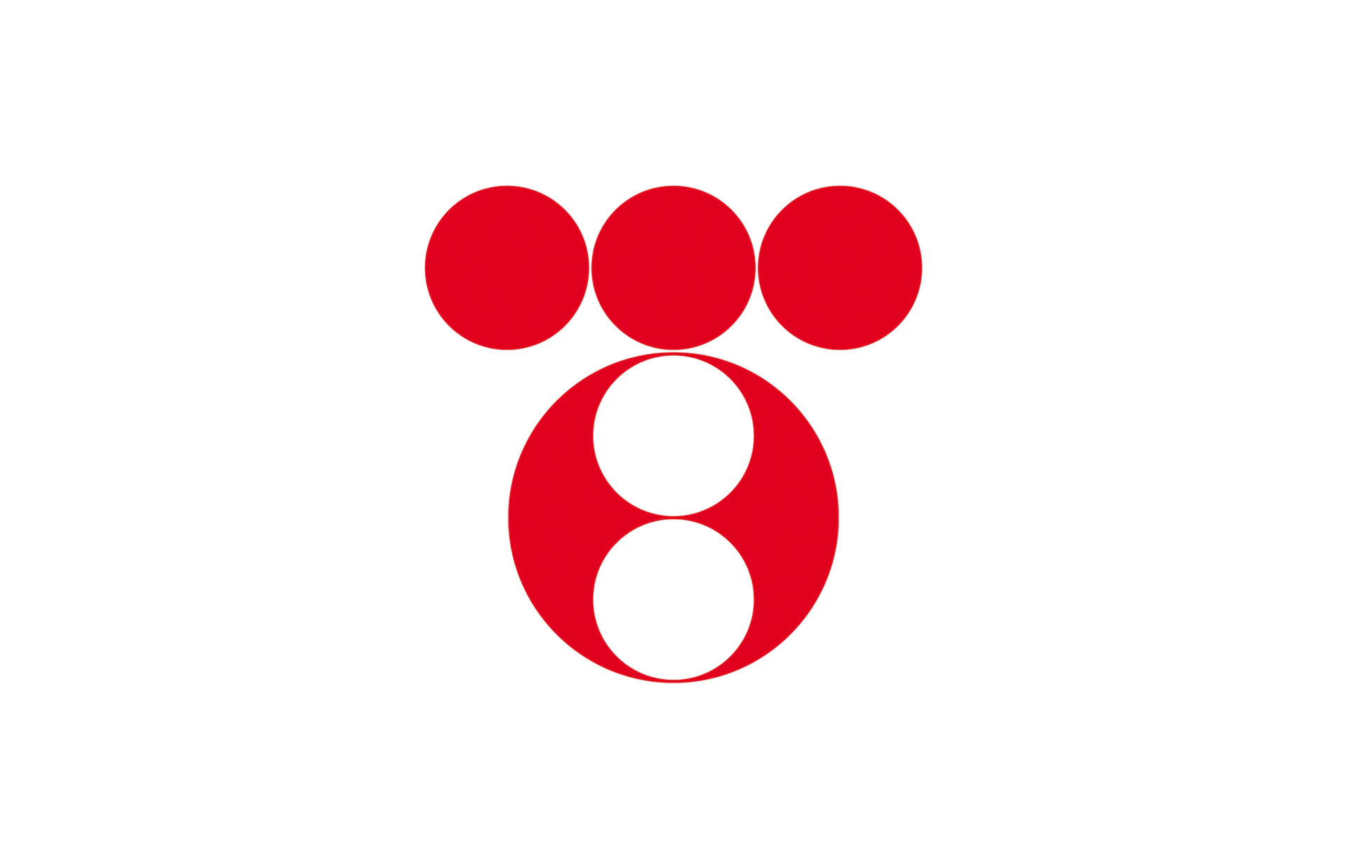
We believed that electricity — which enriches every aspect of human life — should be represented by a circle form. This led us to create a rounded, soft symbol mark, opposite of the lightning bolt commonly used by power companies.
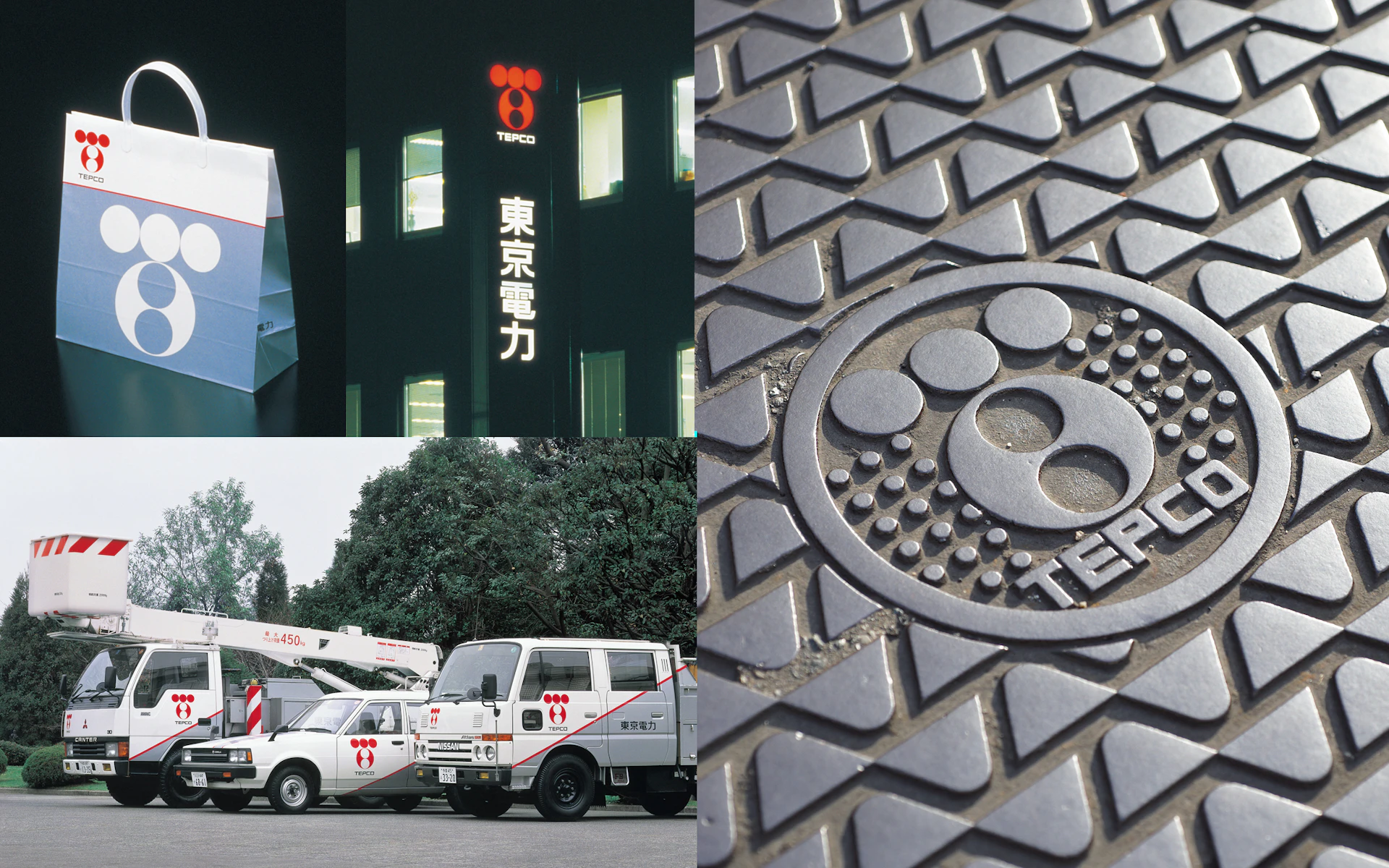
The design deftly arranges six circles and a Japanese red color into a T-shaped formation. Though abstract, it maintains a friendly approachability — almost resembling an animated character — evoking the warmth of electricity in homes.
Visual Identity
Based on the idea that people appreciate electricity when a happy family is gathered together in a bright home, NDC created a simple, soft, round logo. Made up of six circles, the abstract symbol has a familiar, almost anime look to it, evoking the warmth of electricity and the warmth of the home.
