Takara Shuzo “Jun” Total Branding
Reinventing the Essence of Shochu

Takara Shochu “Jun” is a flagship product and long-selling brand released in 1977 by shochu maker Takara Shuzo.
Though shochu had long been enjoyed as “the people’s spirit” in Japan, its consumption declined as beer and whisky gained popularity with the westernization of Japanese diets. Following the 1974 vodka trend in America, a “white revolution” of white, clear spirits swept across the world. Developed as Japan’s answer to this revolution, Jun needed to transform shochu’s commonplace image.
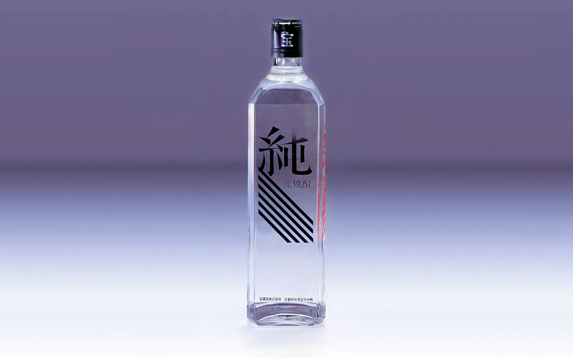
NDC handled everything from product planning to naming, package design, and advertising. By replacing the traditional 1.8-liter bottle with a sharp, angular bottle and directly printing the logo onto the glass, Jun’s innovative design sparked a shochu boom immediately upon release. This branding perfectly answered the era’s desire for lightness.
Package
Jun caused a furor in distilled spirits the moment it was launched. NDC handled all the product planning, packaging, naming and advertising. The sharp looking bottle shape and the logo printed directly on the bottle symbolize the novelty of this spirit. The branding captures the essence of a more casual era and suggests drinking it on the rocks or with water.

Credit
- Creative Direction
-
- Yusuke Kaji
- Art Direction
-
- Kenzo Nakagawa
- Design
-
- Hiroyasu Nobuyama
- Copywriting
-
- Syuji Yamada
- Photography
-
- Kohji Suzuki

