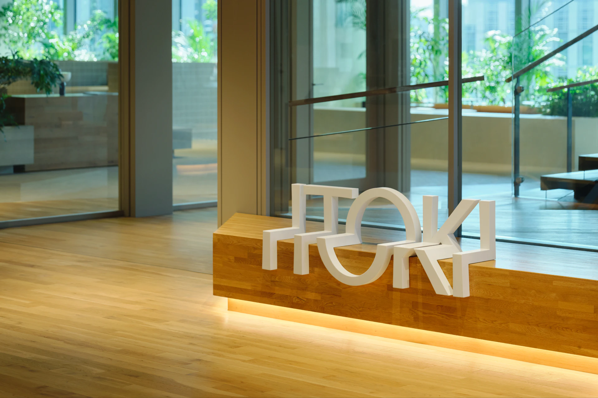
SHIBUYA TSUTAYA
Where Inspiration Drips and Trends Arise
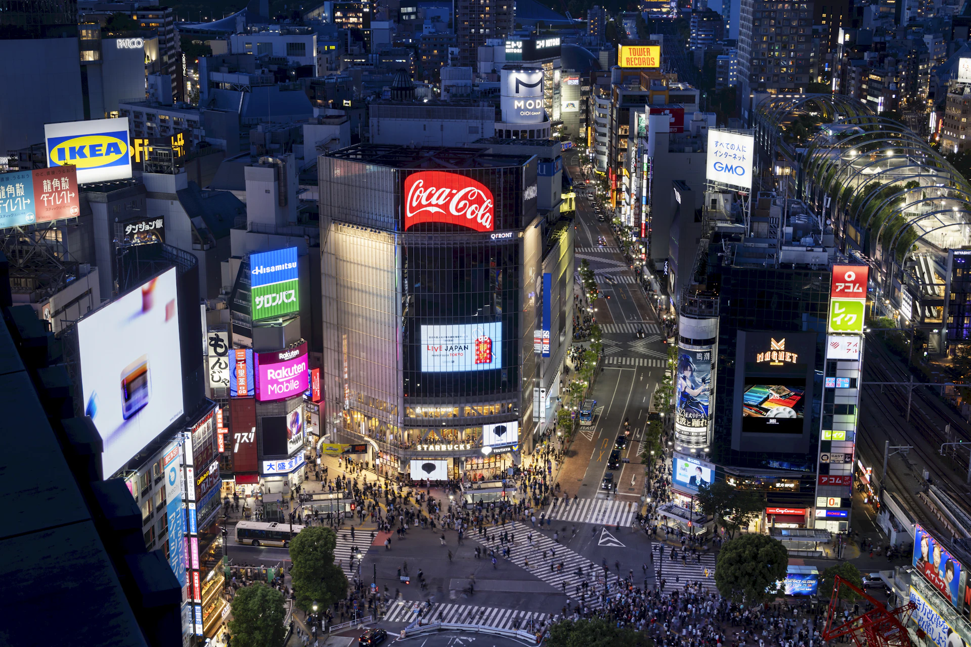
Shibuya—a tourist destination drawing visitors from around the world and a hub of youth culture. Standing at its center, SHIBUYA TSUTAYA has remained a landmark since its opening in 1999.
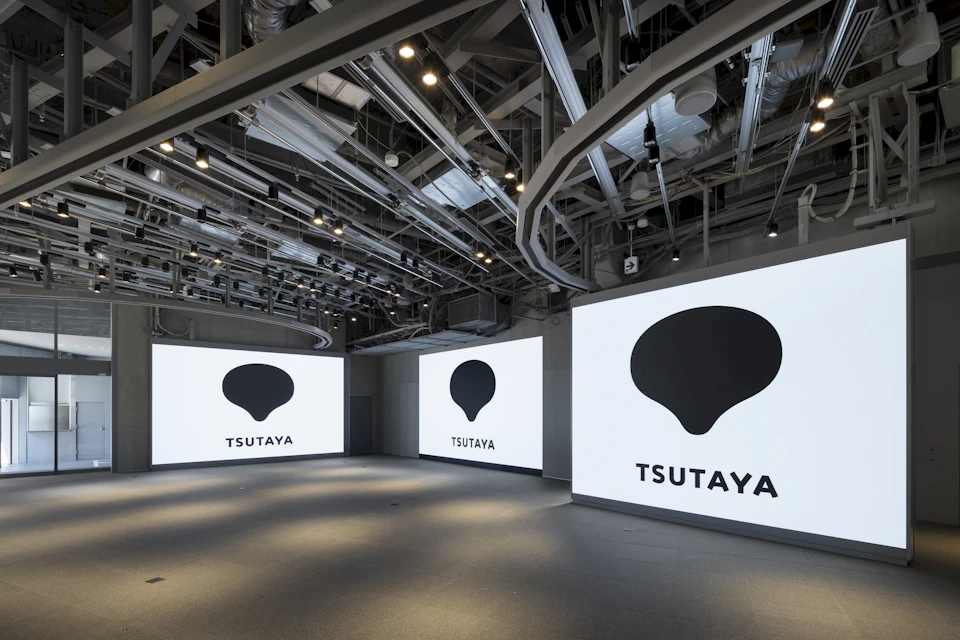
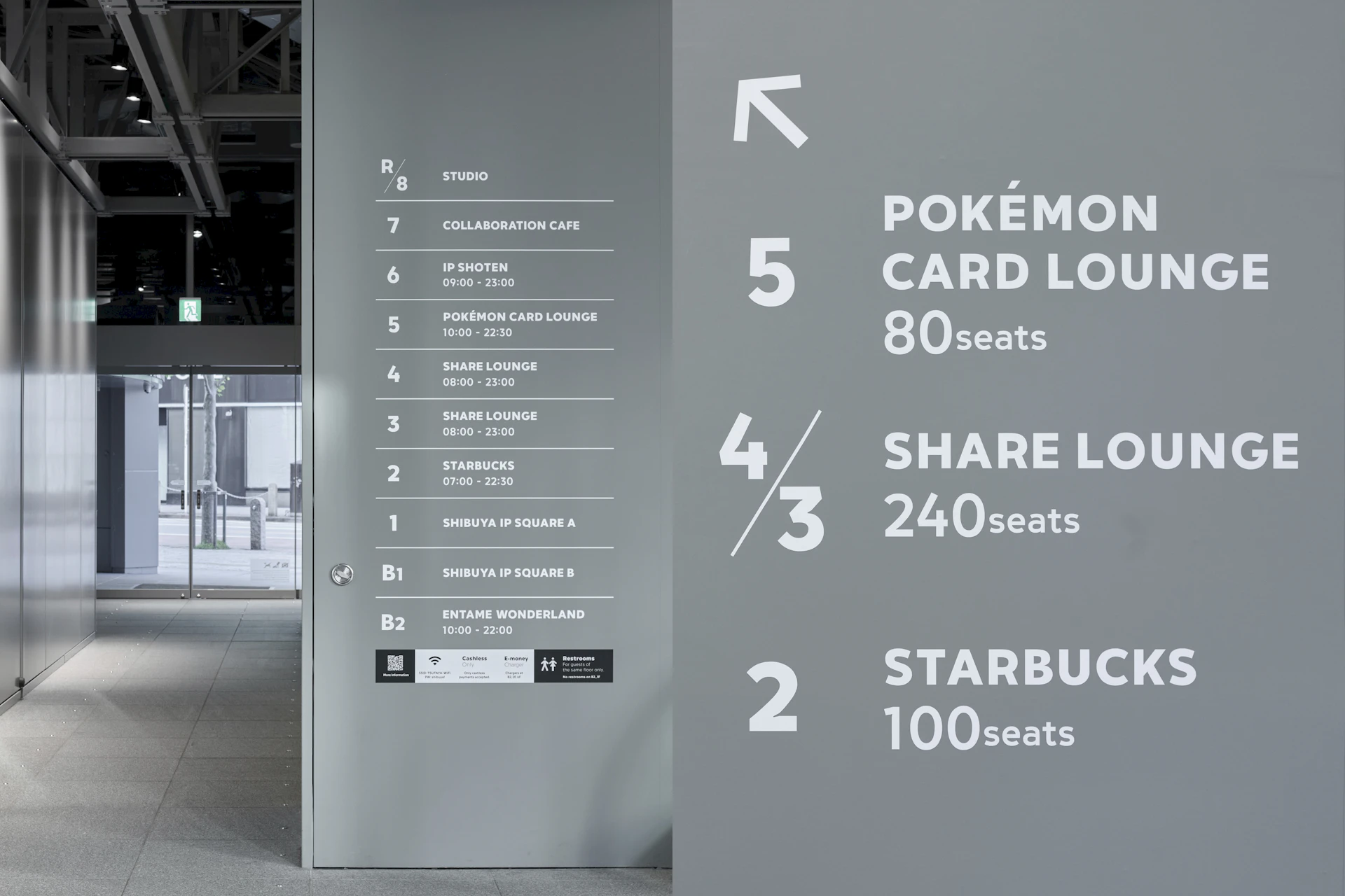
While TSUTAYA has traditionally focused on bookstore and CD/DVD rental businesses, the digitalization of content and evolving distribution systems have prompted updates to both business operations and store spaces. SHIBUYA TSUTAYA, a flagship location, underwent renovation, for which we were tasked with refreshing the logo to accommodate its function as a vessel for diverse content.
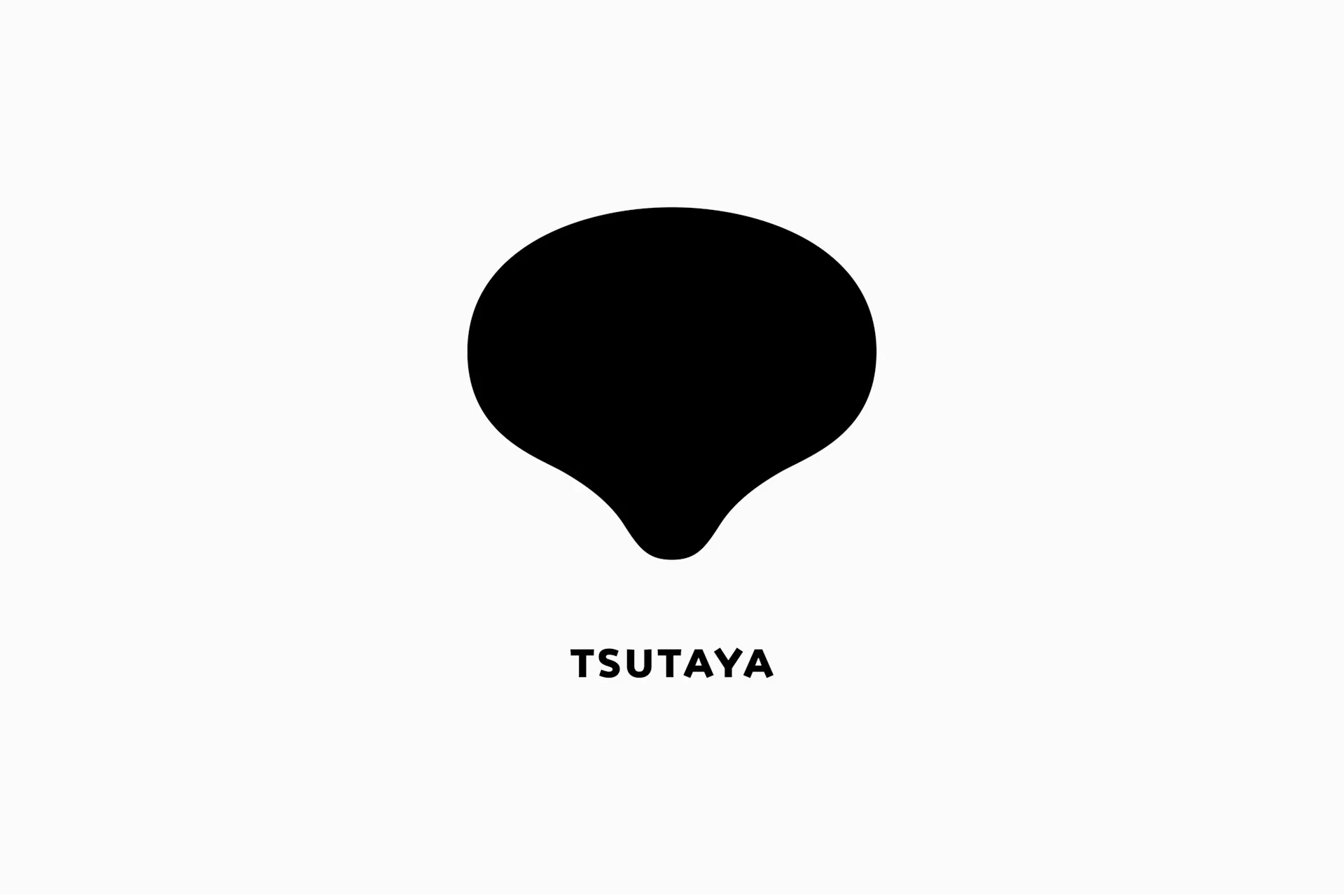
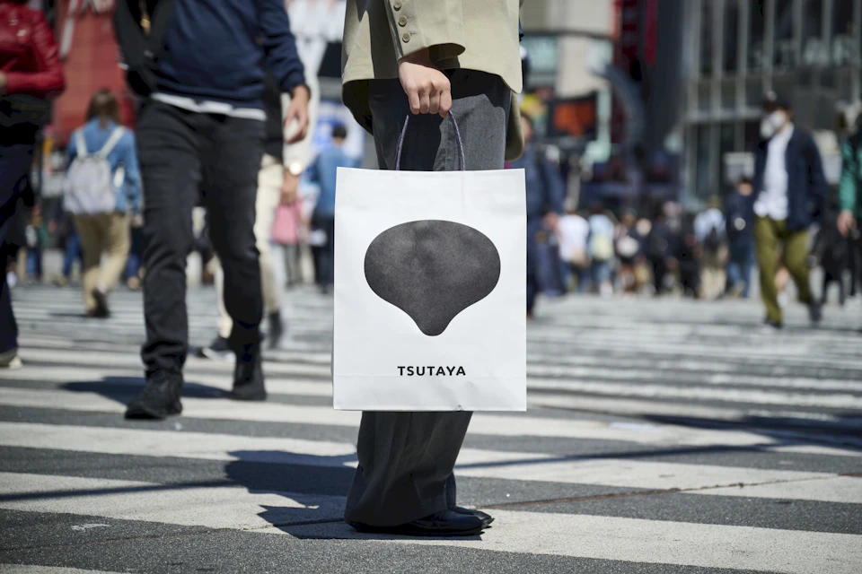
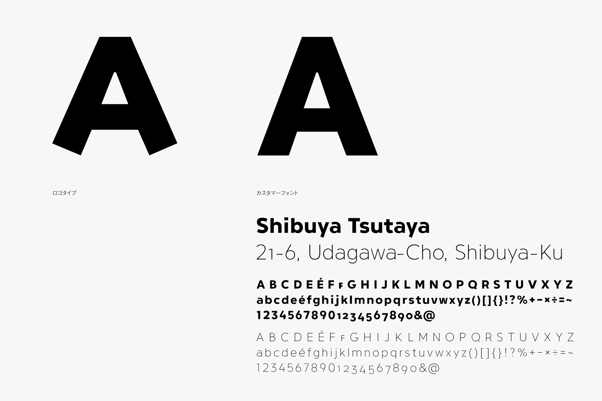
The symbol mark uses TSUTAYA’s “T” as its motif, shaped like a soft fluid that appears to be both dripping down and rising up like vapor. The logotype expresses a bright character by angling the ends of letters like “A” and “Y.” Aiming to create a visual identity suited for a space that condenses the appeal of various entertainment forms and spreads them to many people, we designed a soft, vibrant, and approachable visual identity.
Visual Identity
Typeface

Credit
- Art Direction
- Photography (Archived)
-
- Rui Hosokawa
- Kazuki Majima
- Hikaru Miyata *
- Motion Design
- Produce

