PRISTINE
Subtle, Simple Design Evoking the Charms of Organic Cotton
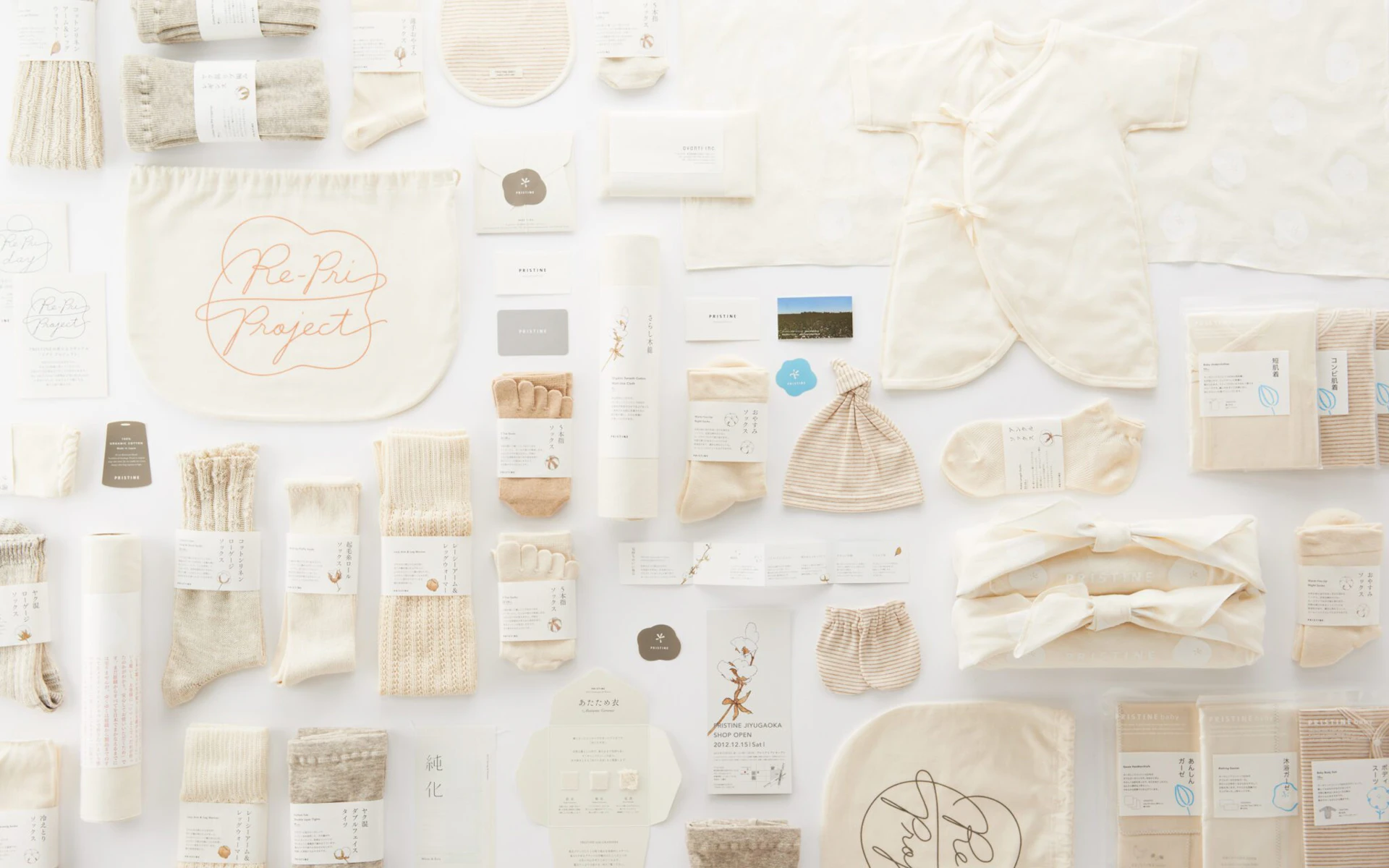
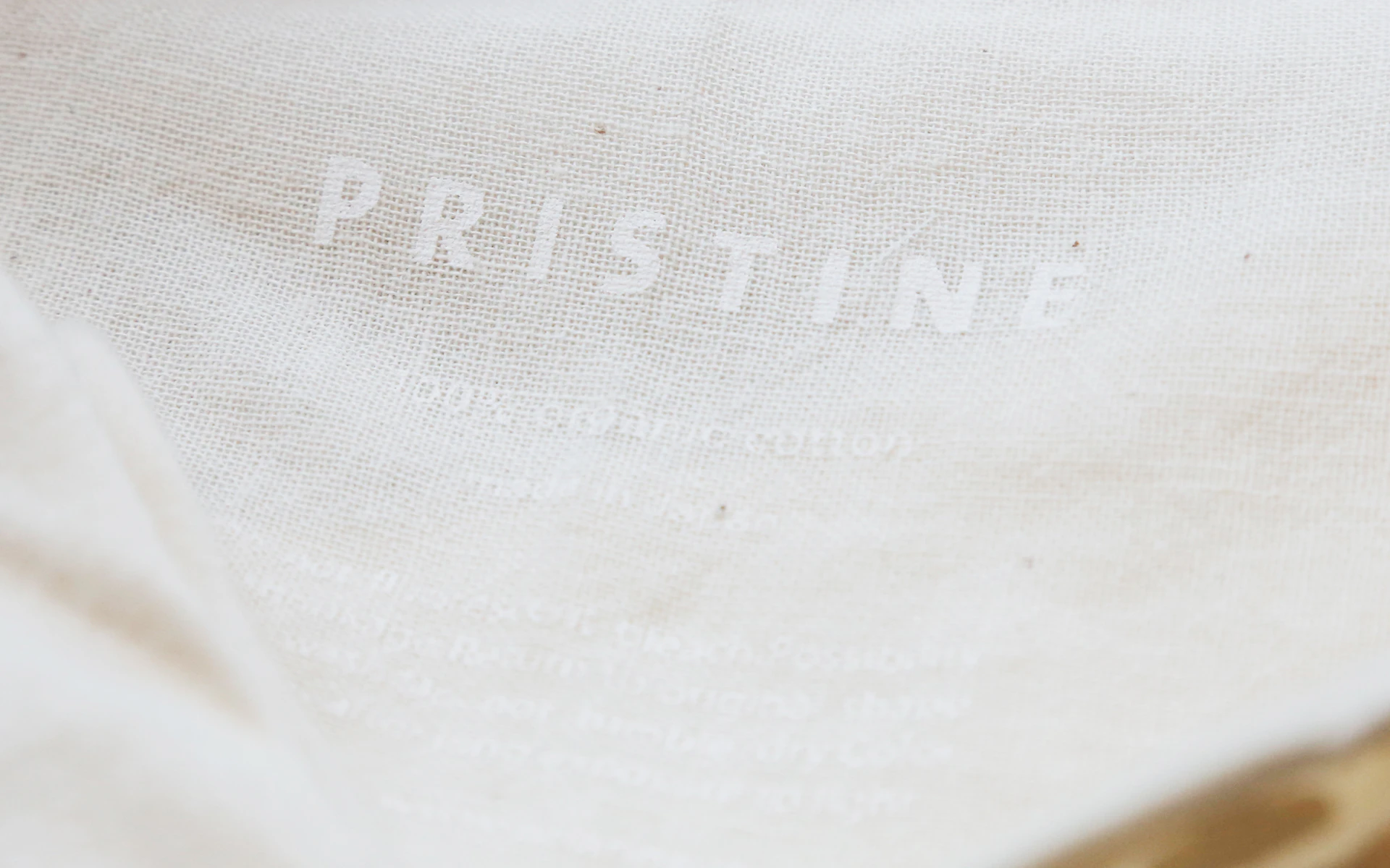
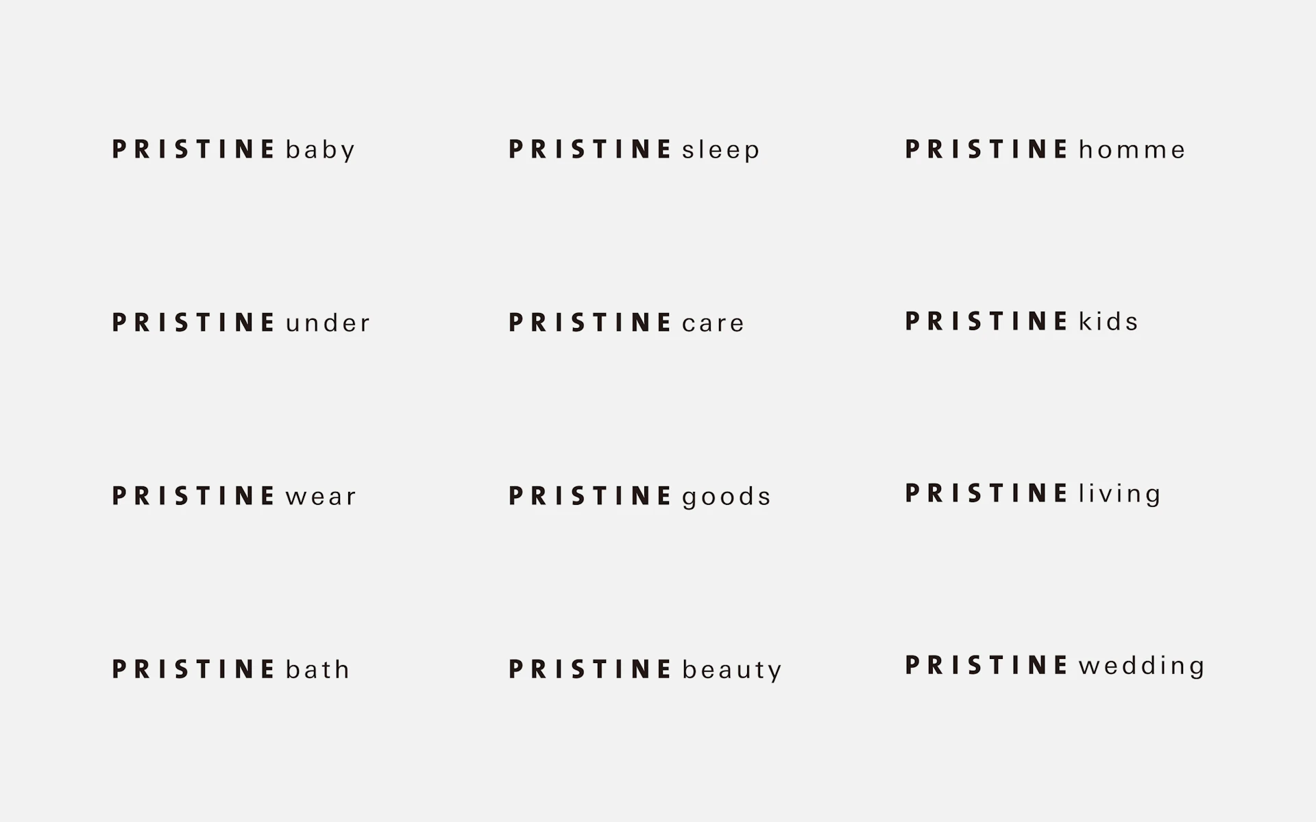
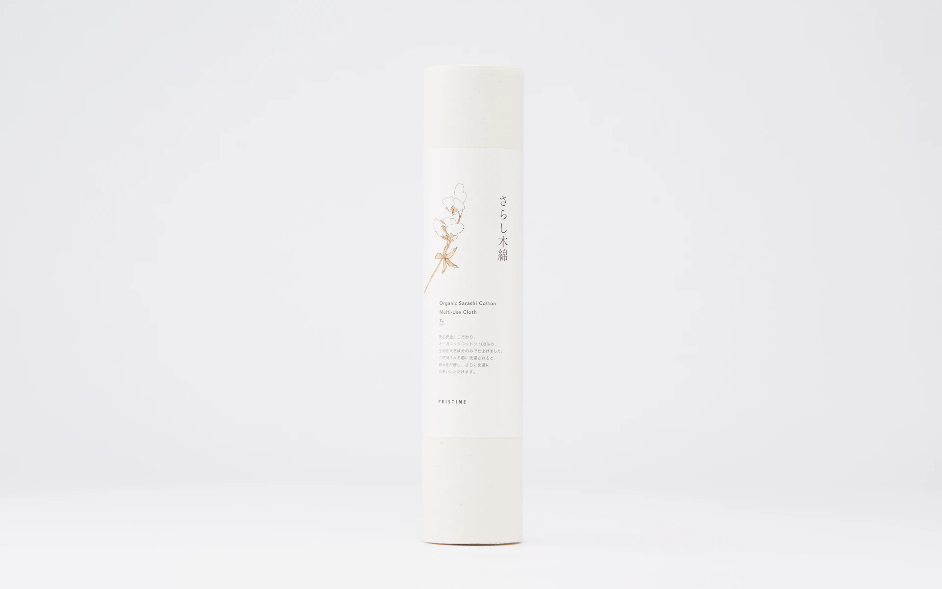
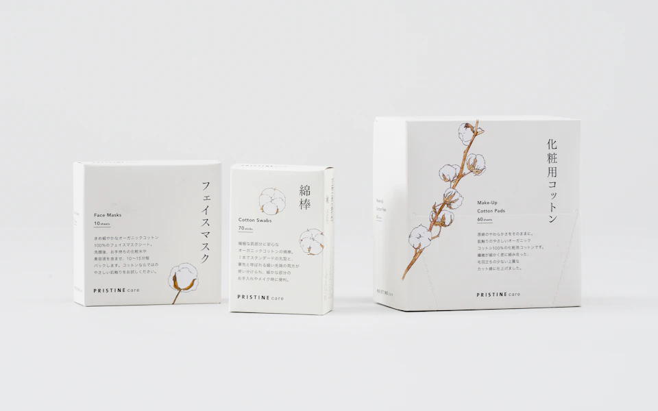
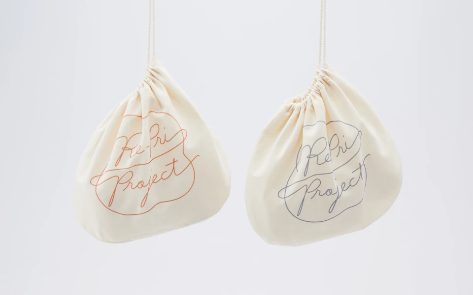
Pristine is an organic cotton brand that imports raw cotton and manufactures all of its products – from the threads to the textiles – in Japan. The logo, packaging, tags, hangers, storefront display, and all of the brand’s communication tools are directed so that customers can imagine the visual and tactile sensations of a cotton plantation. Knowing that the fine textures and subtle hues of organic cotton best communicate cotton’s appeal, Pristine’s branding avoids excessive decor and focuses on bringing out the charms of the material itself.
Visual Identity
Package
Pristine
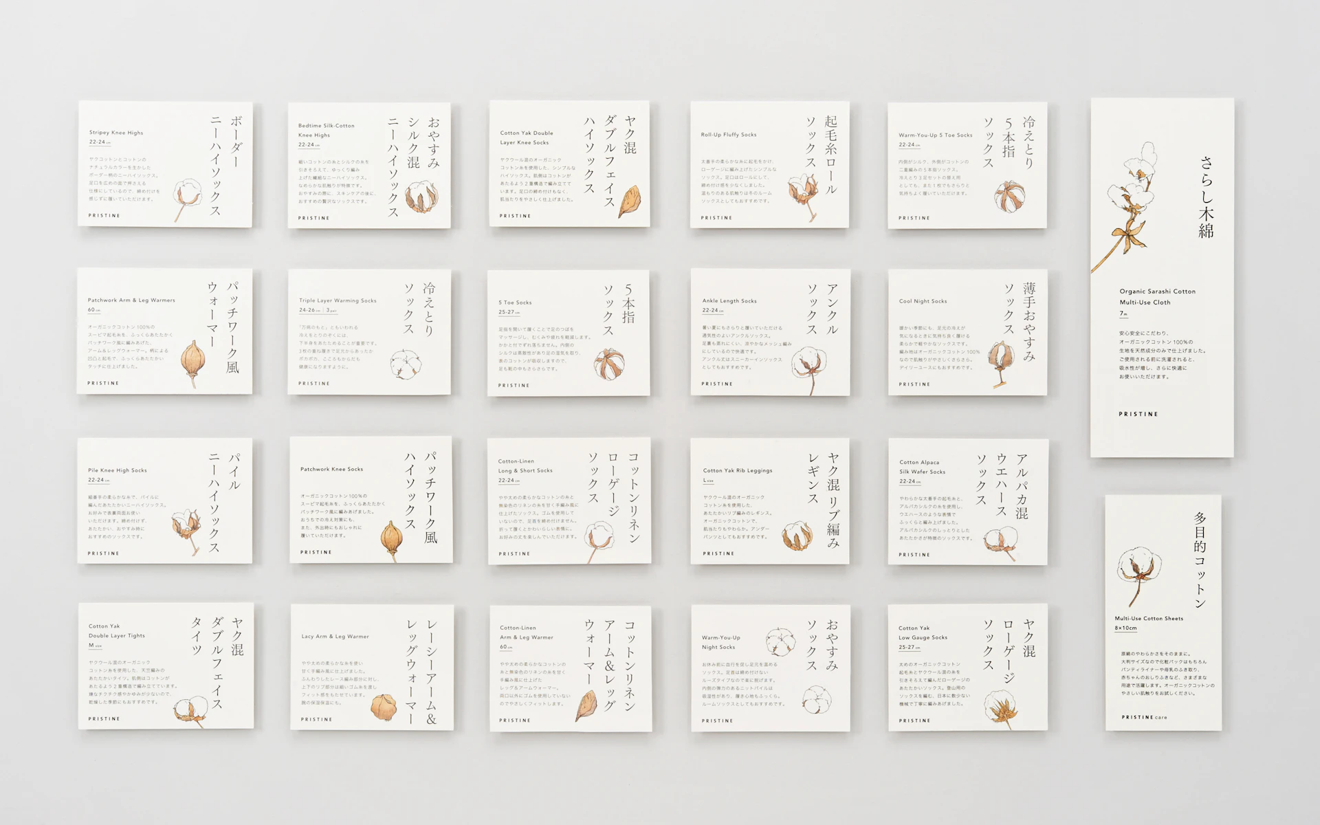
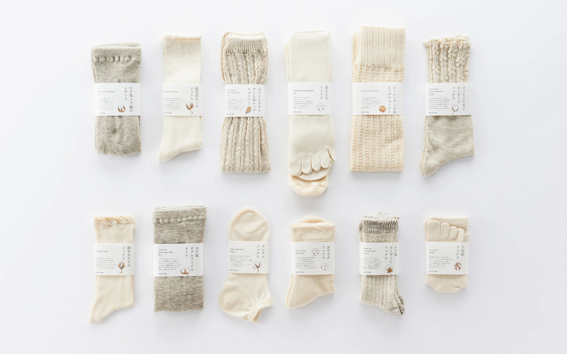
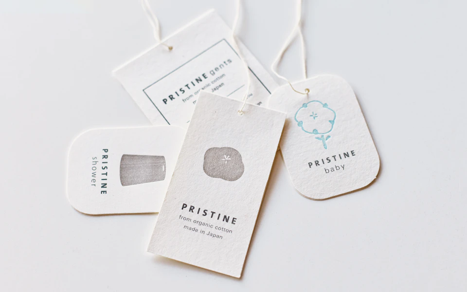
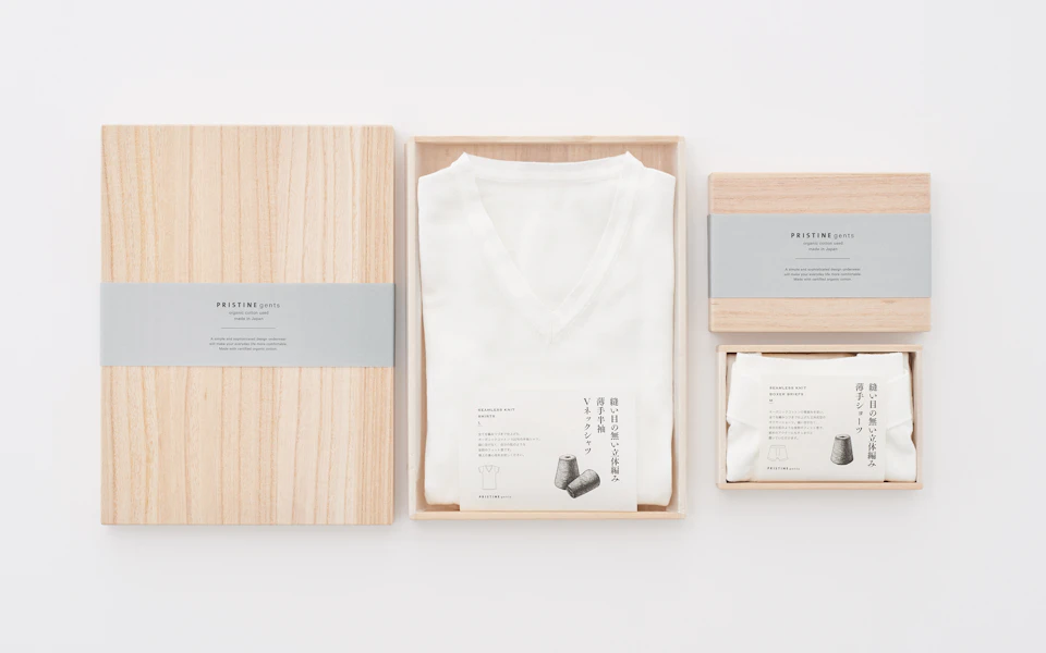
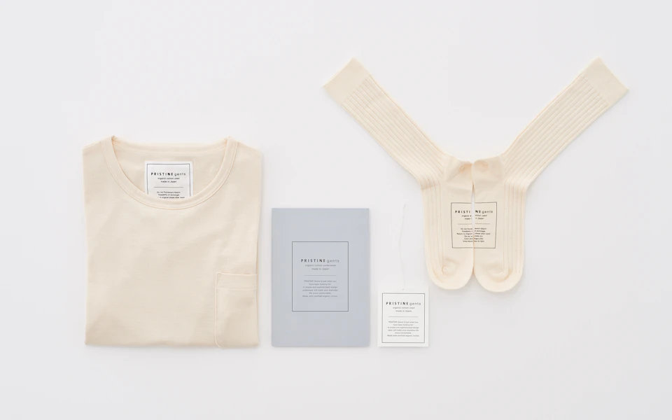
Pristine offers a wide array of products, ranging from apparel to household items. To fulfill the objective of having customers feel the materiality of the cotton as much as possible, products are wrapped simply with a paper band. The assembled products bring to mind a vast cotton farm. The label system featuring illustrations of a cotton plant is designed to welcome customers into the world of organic cotton. The hang tags are made using original recycled cotton paper derived from reclaimed products.
avanti
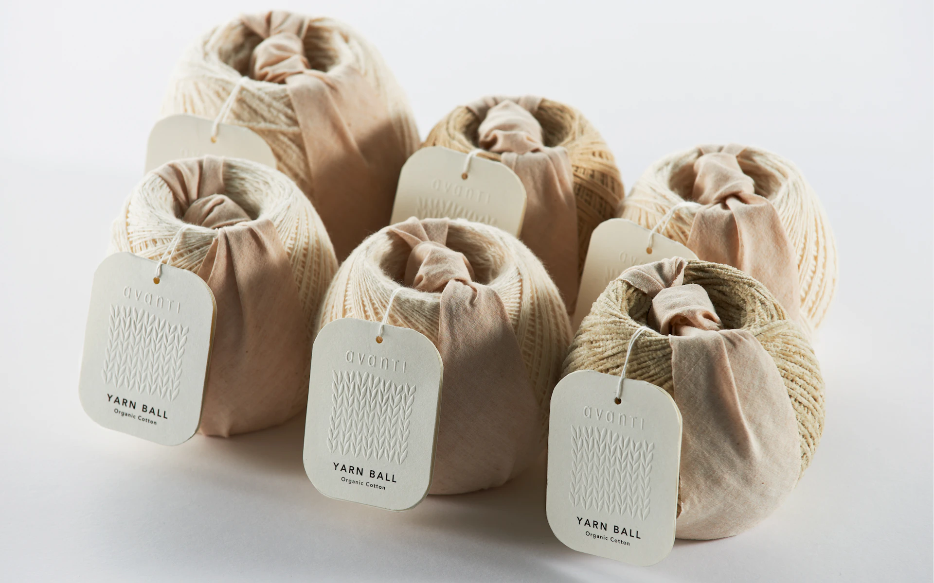
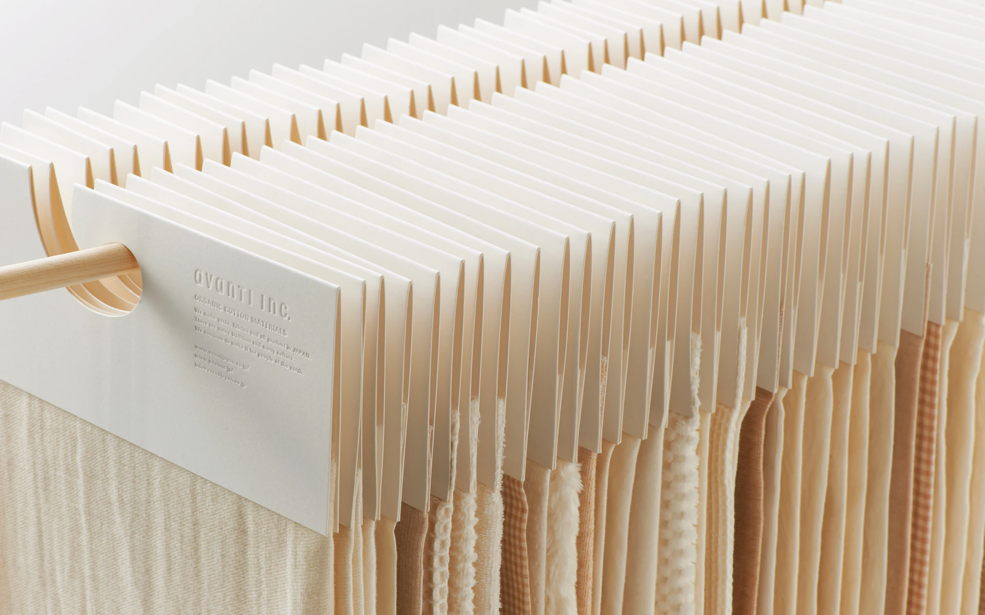
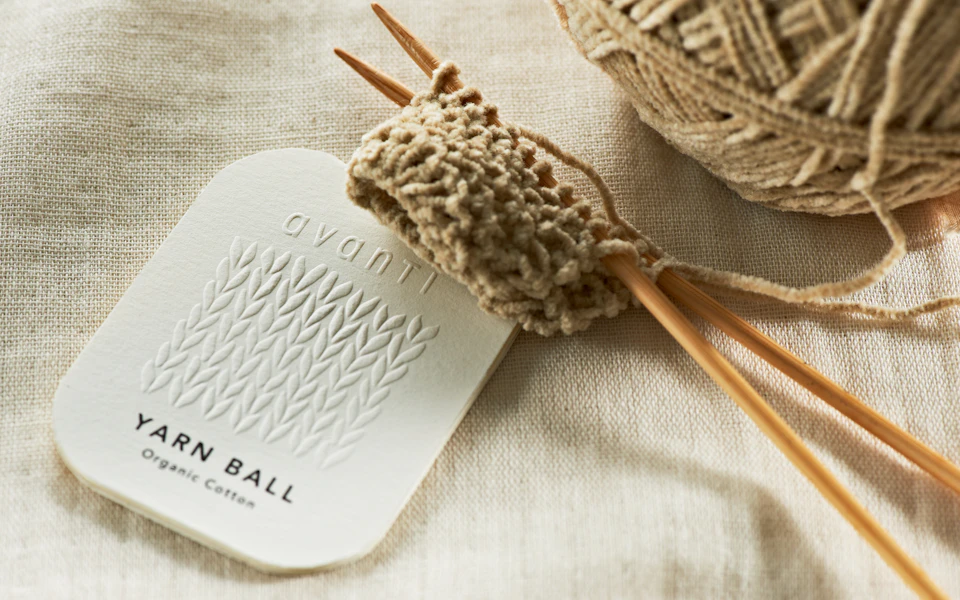
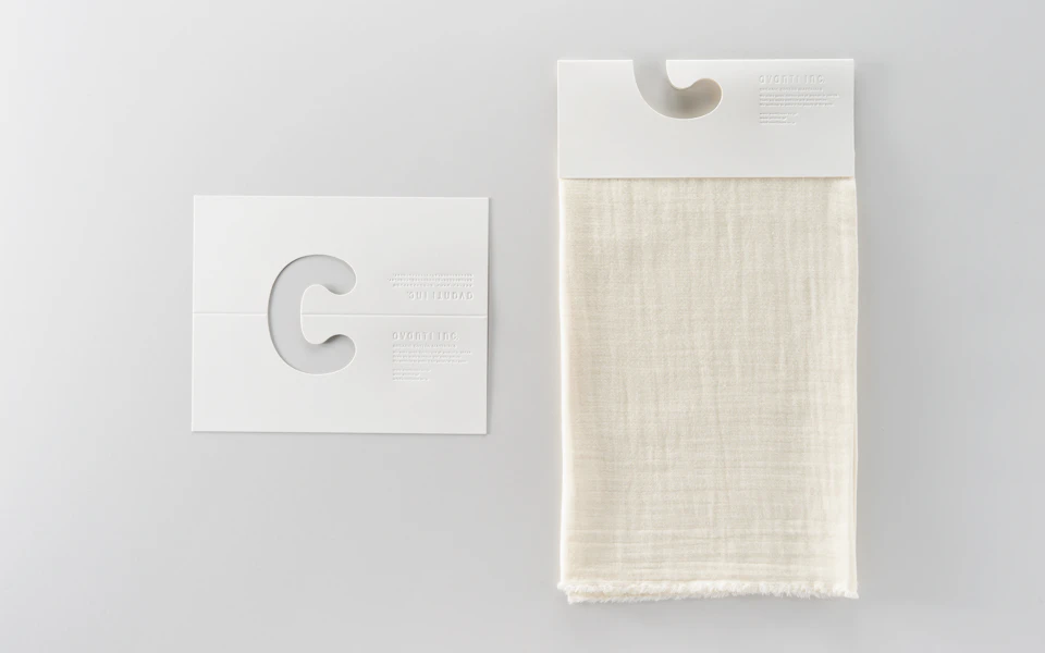
Avanti, Pristine’s parent company, is a manufacturer of organic cotton materials. The product hanger enhances the light and natural materiality of the textiles. The balls of yarn are wrapped in a distinctive manner using textile scraps in accordance with the brand’s ecological consciousness and efforts to reduce waste.
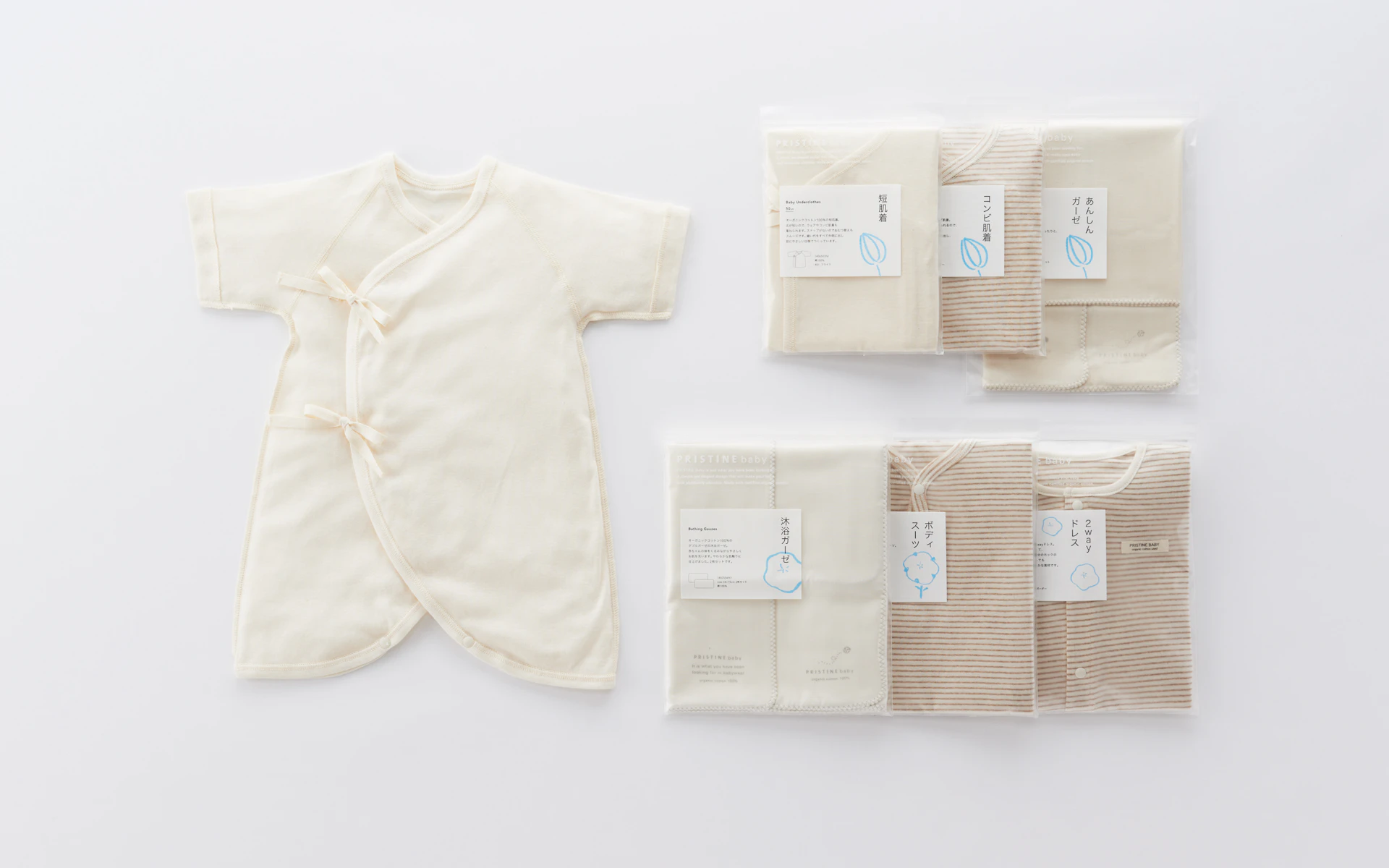
Pristine Baby
The packaging for the line of baby products features crayon drawings of cotton bolls to convey an innate sense of gentleness and sweetness. We ensure that every package reflects Pristine’s corporate values of caring for people and the environment.

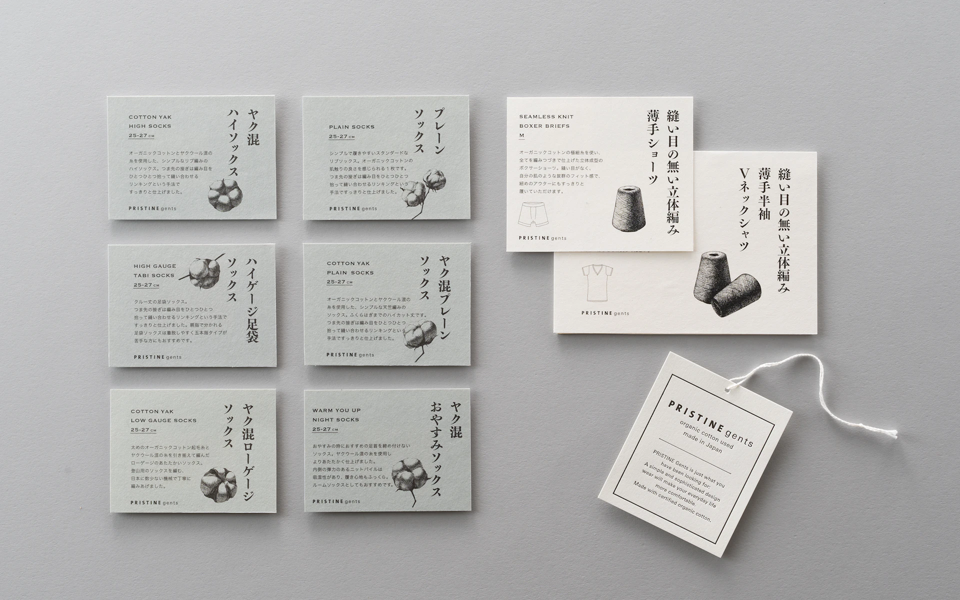
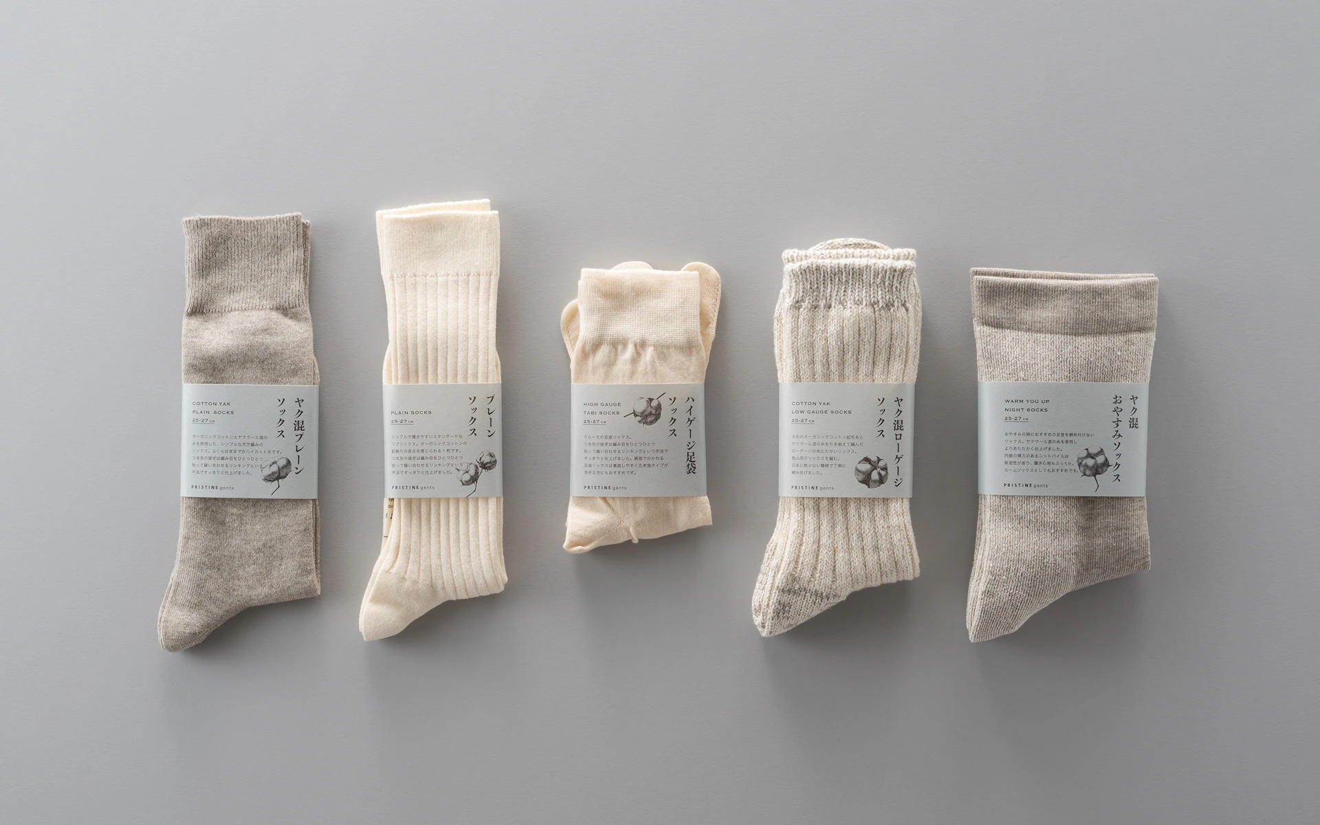
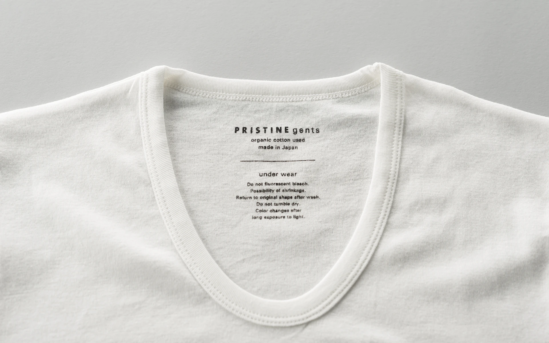
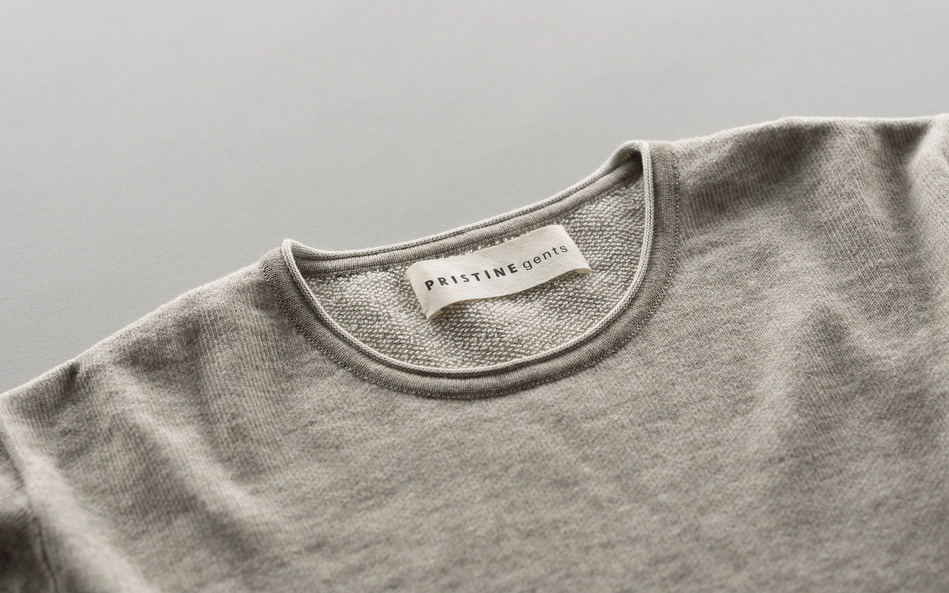
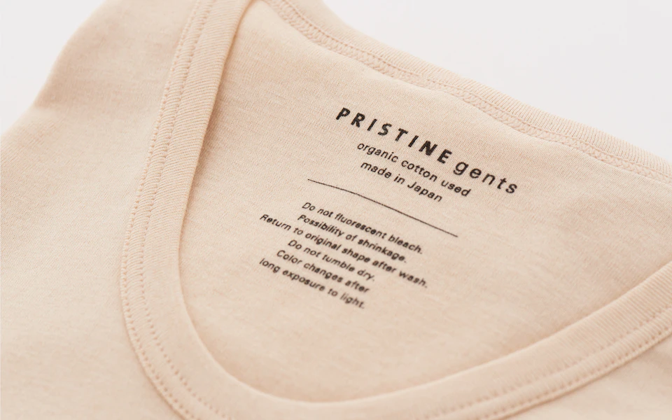
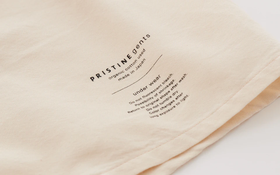
Pristine gents
Packaging for the men’s line sets a more masculine tone by presenting the cotton boll illustration as an etching. The main color is blue-gray, which brings out the subtle, light hue of cotton.
Graphics
Promotional Mailers
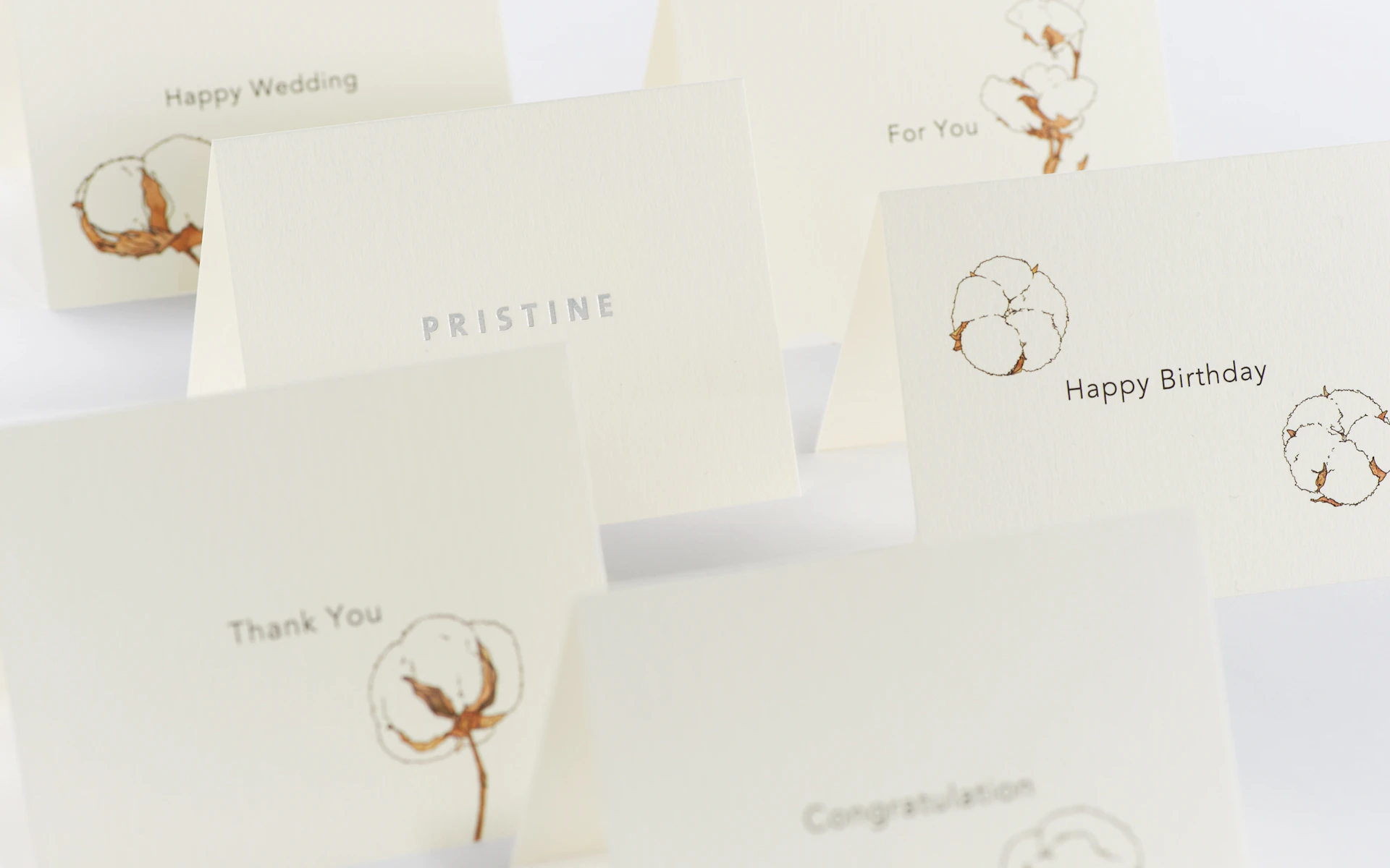
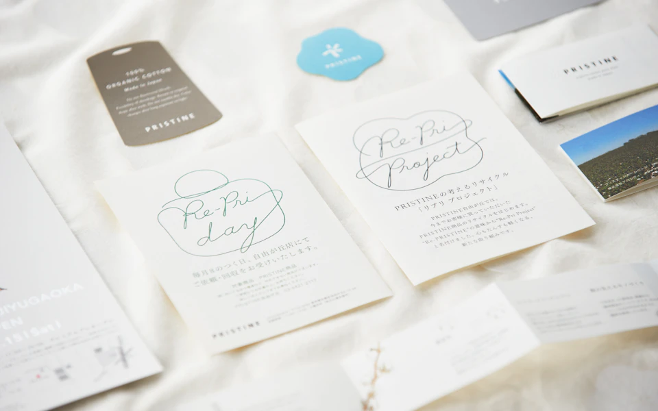
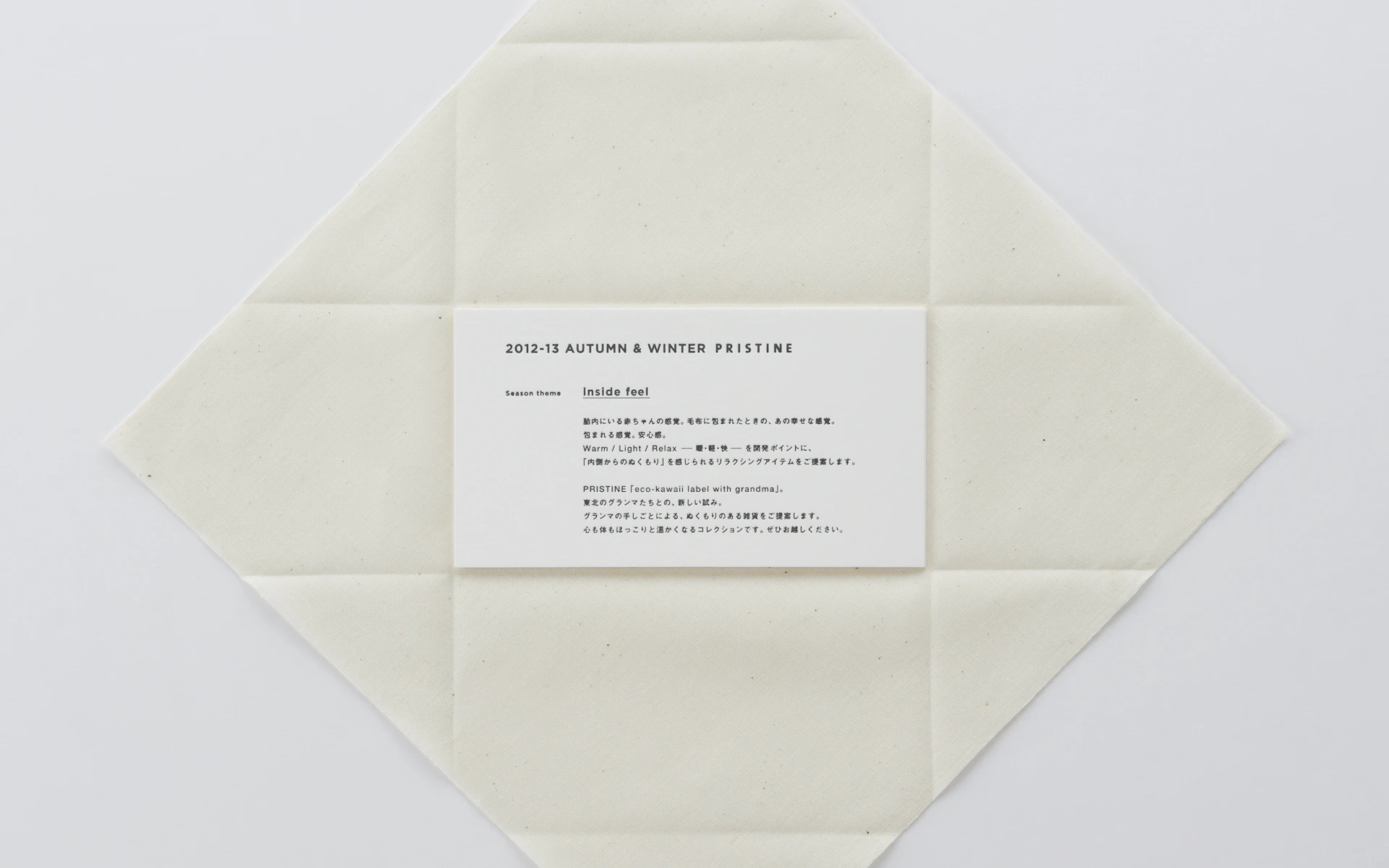
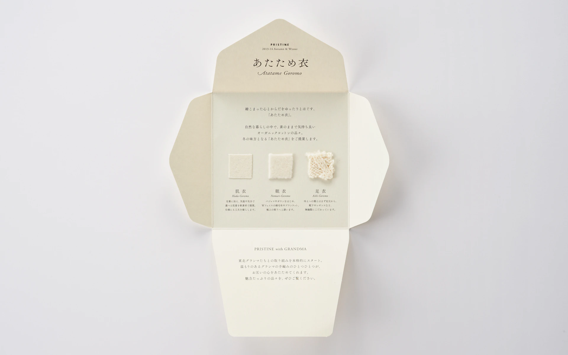
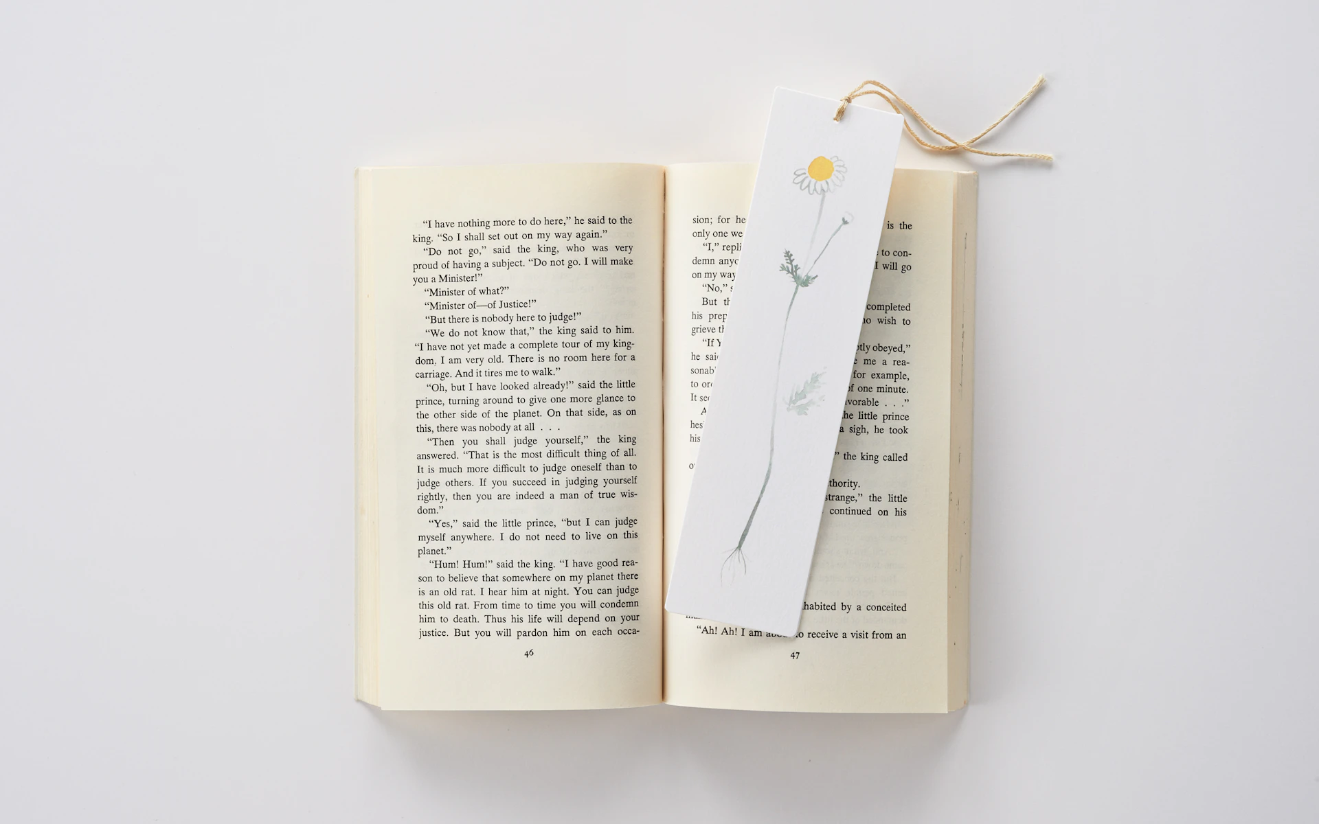
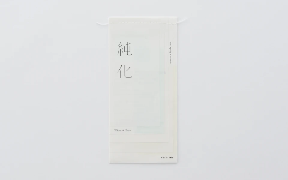
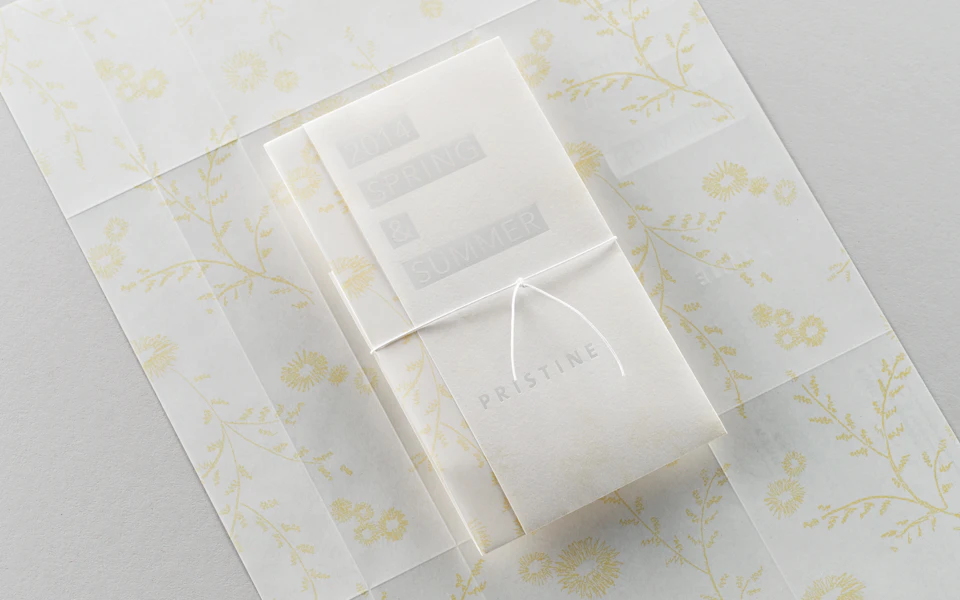
The mailers, designed with a different theme each time, are intended to delight the recipients. Some examples include a mailer wrapped in organic cotton in place of an envelope, an envelope formed from the mailer itself, a mailer wrapped in thin paper, and a mailer that doubles as a bookmark.
Exhibition / Space
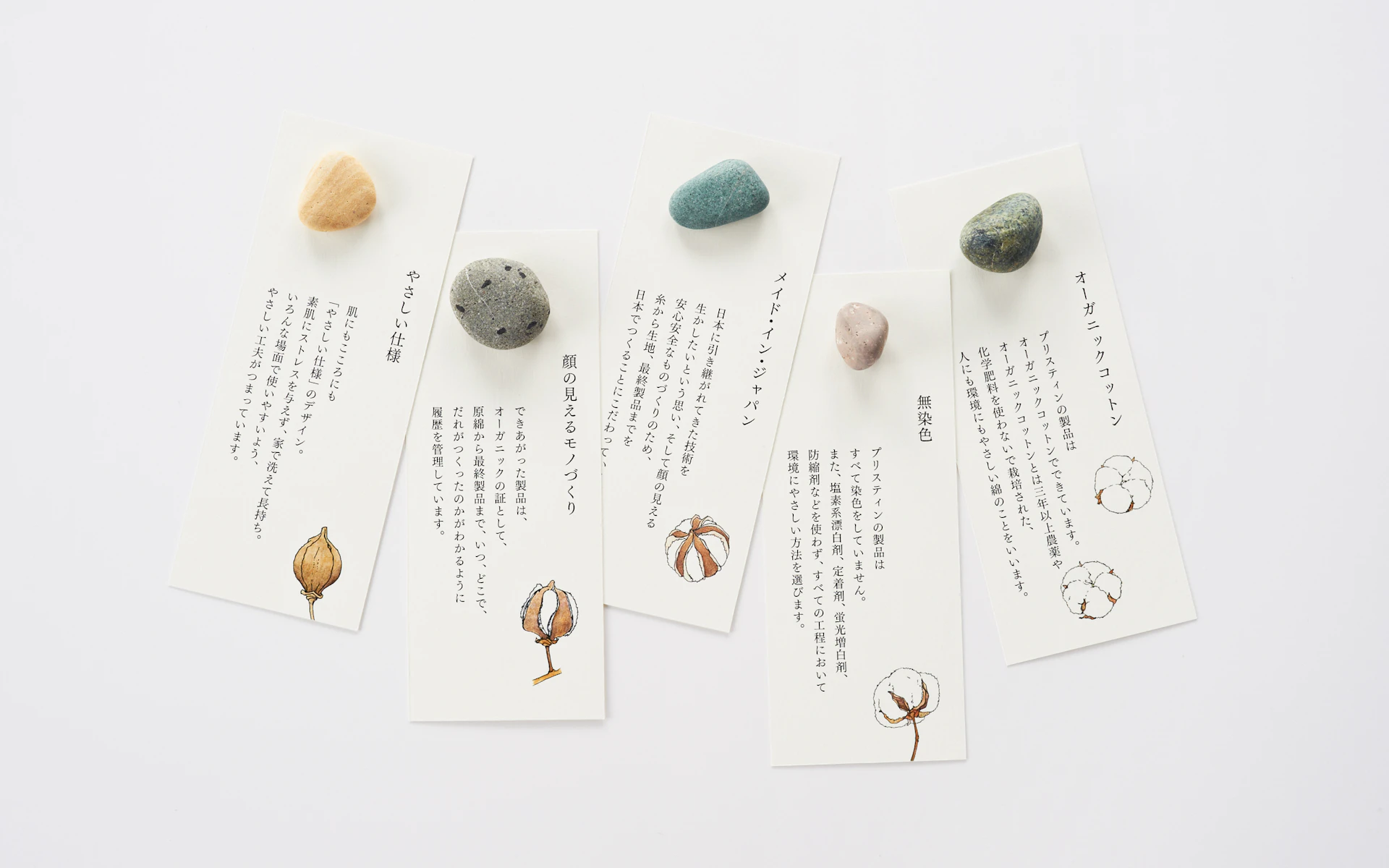
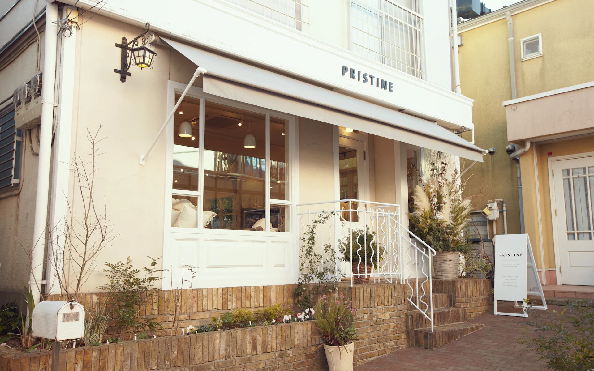
The in-store promotional tools are designed to communicate the keen sincerity with which Pristine creates its products. Avoiding materials such as metals or plastic that detract from the ambiance of the store, the brand’s worldview is expressed through the use of natural materials such as stone.

Credit
- Art Direction
- Design
- Photography
- Produce
Next Project
Enter a World Like Reading a Picture Book
Next Project
The Impact of Discovering Japan, to the World

Next Project
Illustrating the Story Behind Quality and Taste
Next Project
A Fresh Perspective on a Familiar Zoo
Next Project
A Fresh Perspective on a Familiar Zoo

Next Project
The Impact of Discovering Japan, to the World
