Osaka Metro
Setting Osaka in Motion

Osaka Metro is a railway company privatized from the Osaka Municipal Subway in 2018. It connects Osaka, Japan’s energetic second-largest city, through transportation, supporting the activities of residents and visitors alike.
At this significant milestone of transition from public to private management, Osaka Metro needed both to establish a unique brand identity and to create a unifying emblem under which employees could share a common vision—enabling them to continue providing appealing transit experiences for years to come.
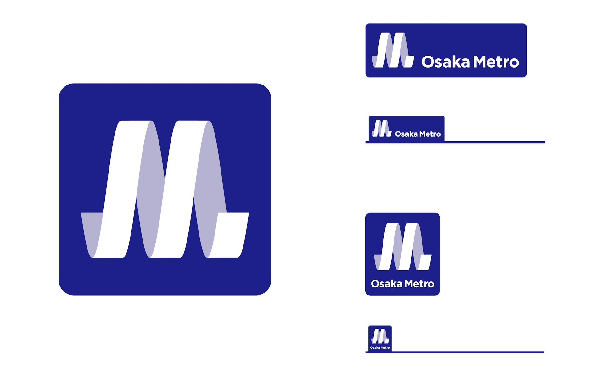
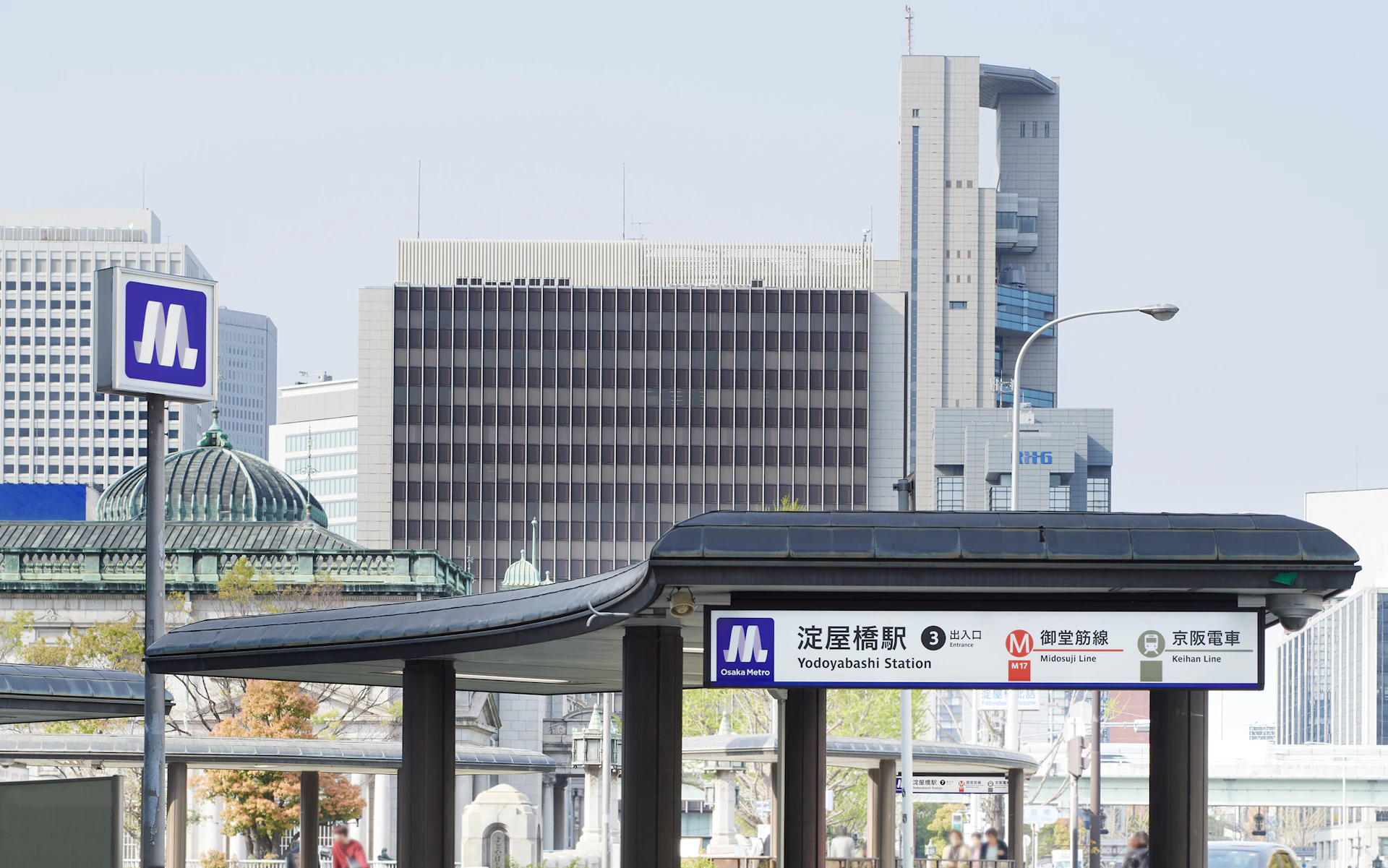
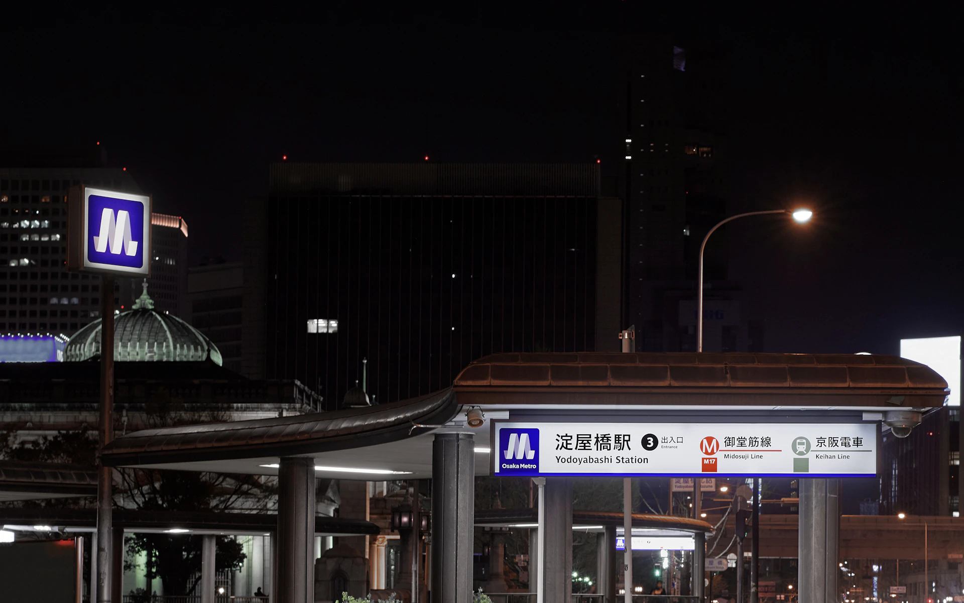
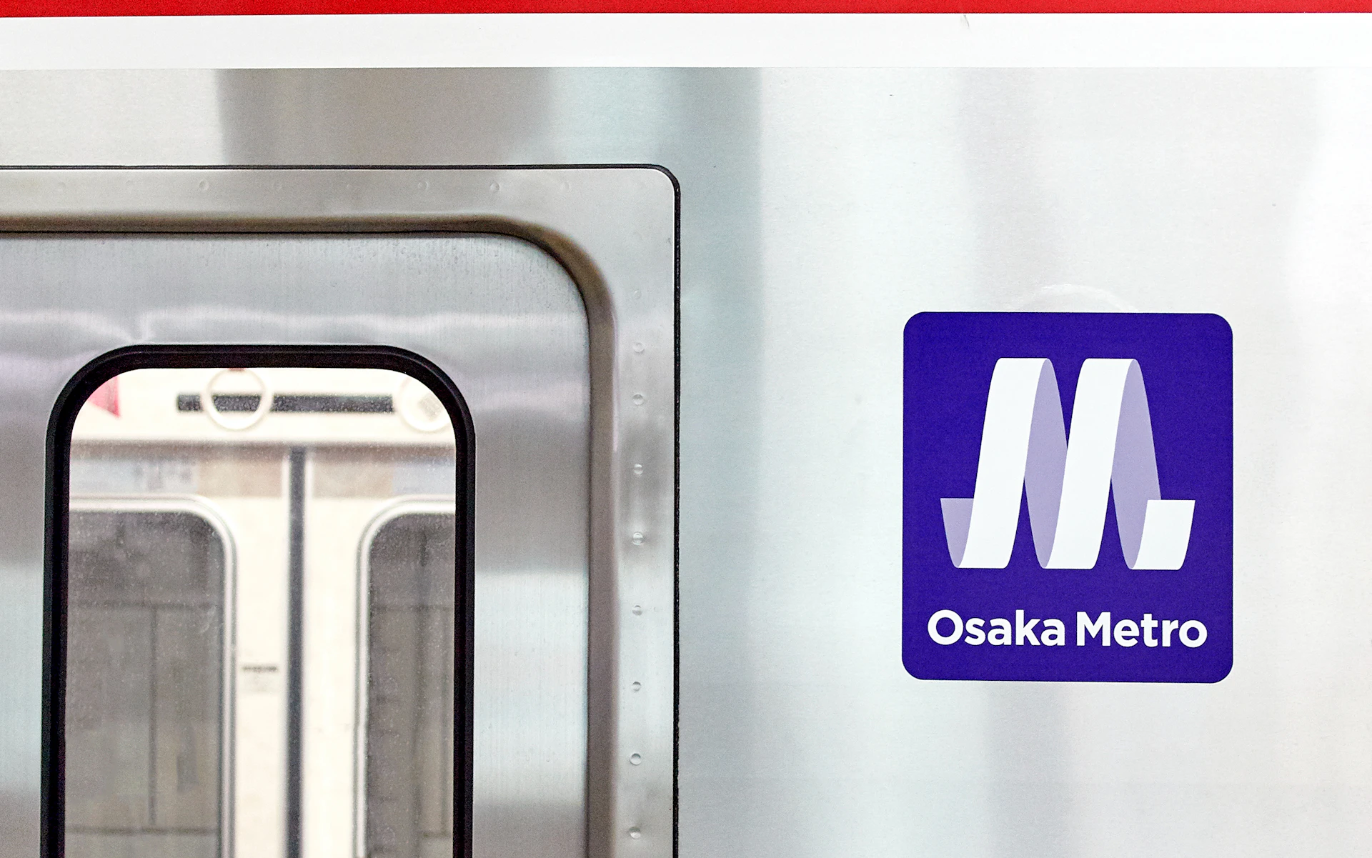
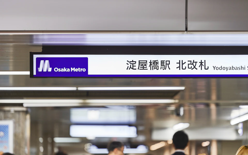
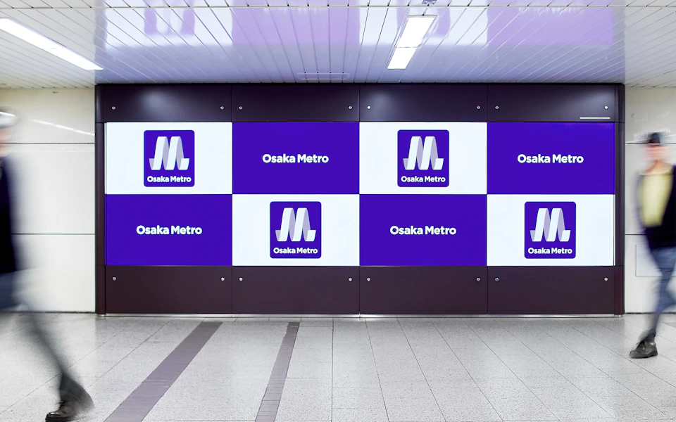
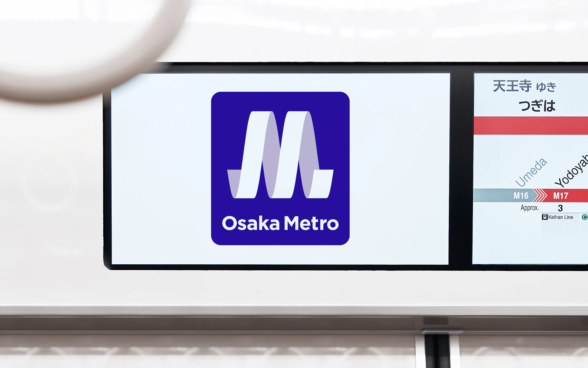
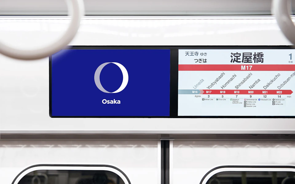
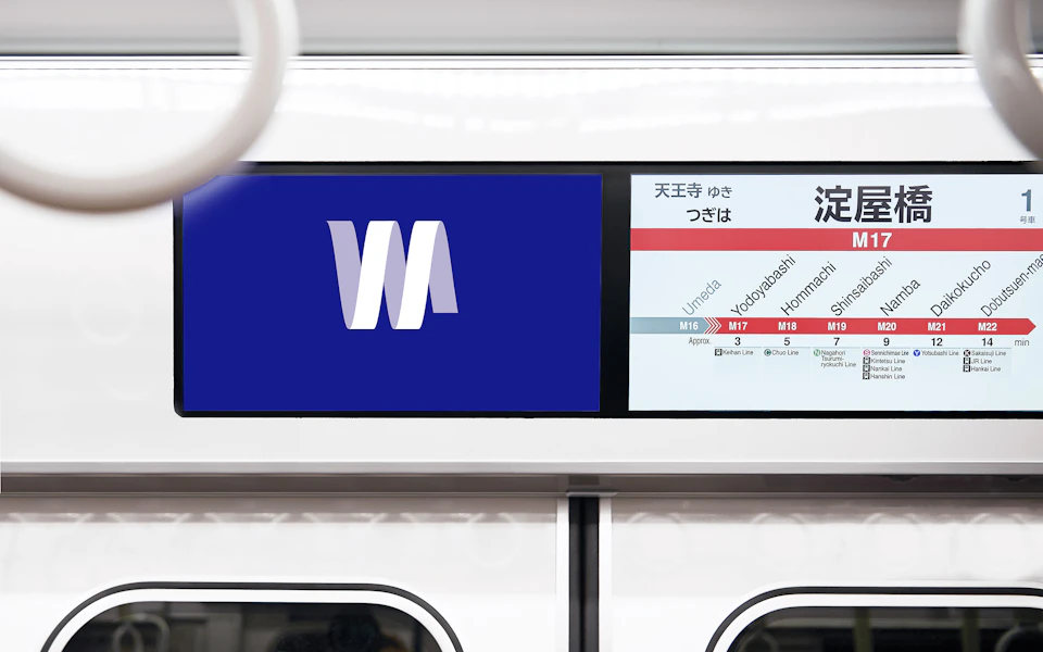
Building upon the Osaka Metro brand identity, we developed a spiral symbol mark that combines the “M” from Metro and the “O” from Osaka. This mark is deployed as a motion logo on in-train and station signage, embodying the brand concept “Continuously running, continuously evolving” at every daily touchpoint with passengers.
Visual Identity
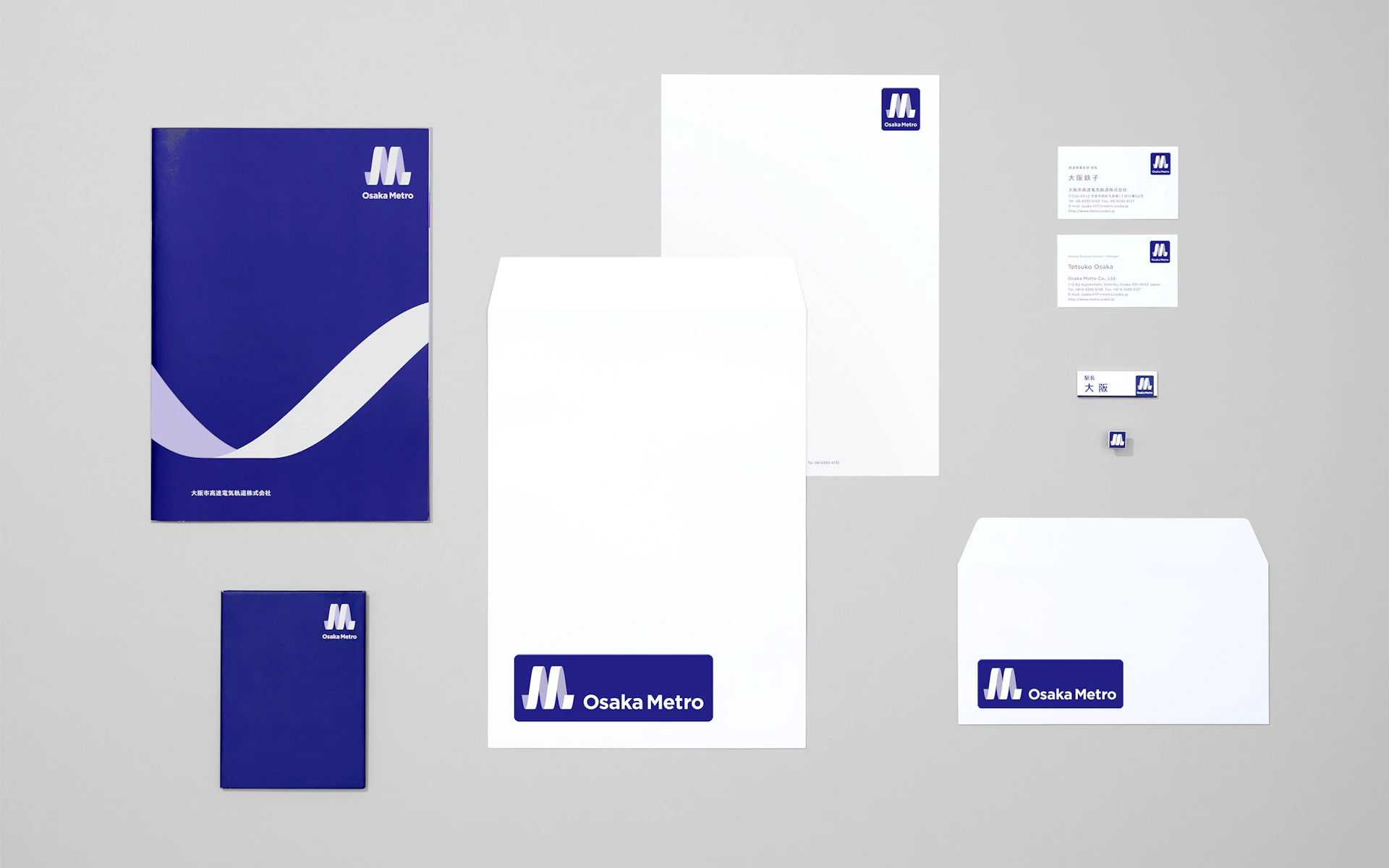
VI planning for Osaka Metro, the formerly municipal system launched as a private subway system. The logo reflects the brand concept “Change to Run. Run and Change.” which is also Osaka Metro’s corporate slogan. The dynamic spiral form (moving M) contains the O from Osaka and M from Metro, and represents the energetic city of Osaka and the dynamism to continue running.
Credit
- Creative Direction
- Art Direction
- Design
-
- Sayoko Matsuda
- Motion Design
- Copy Direction
-
- Ryoko Kawahara
- Copywriting
- Produce
-
- Yasuo Hayasaka
- Akira Hoshinoya
- Agency
-
- "Kansai Branch *


