naturaglace
Programming Package Evolution
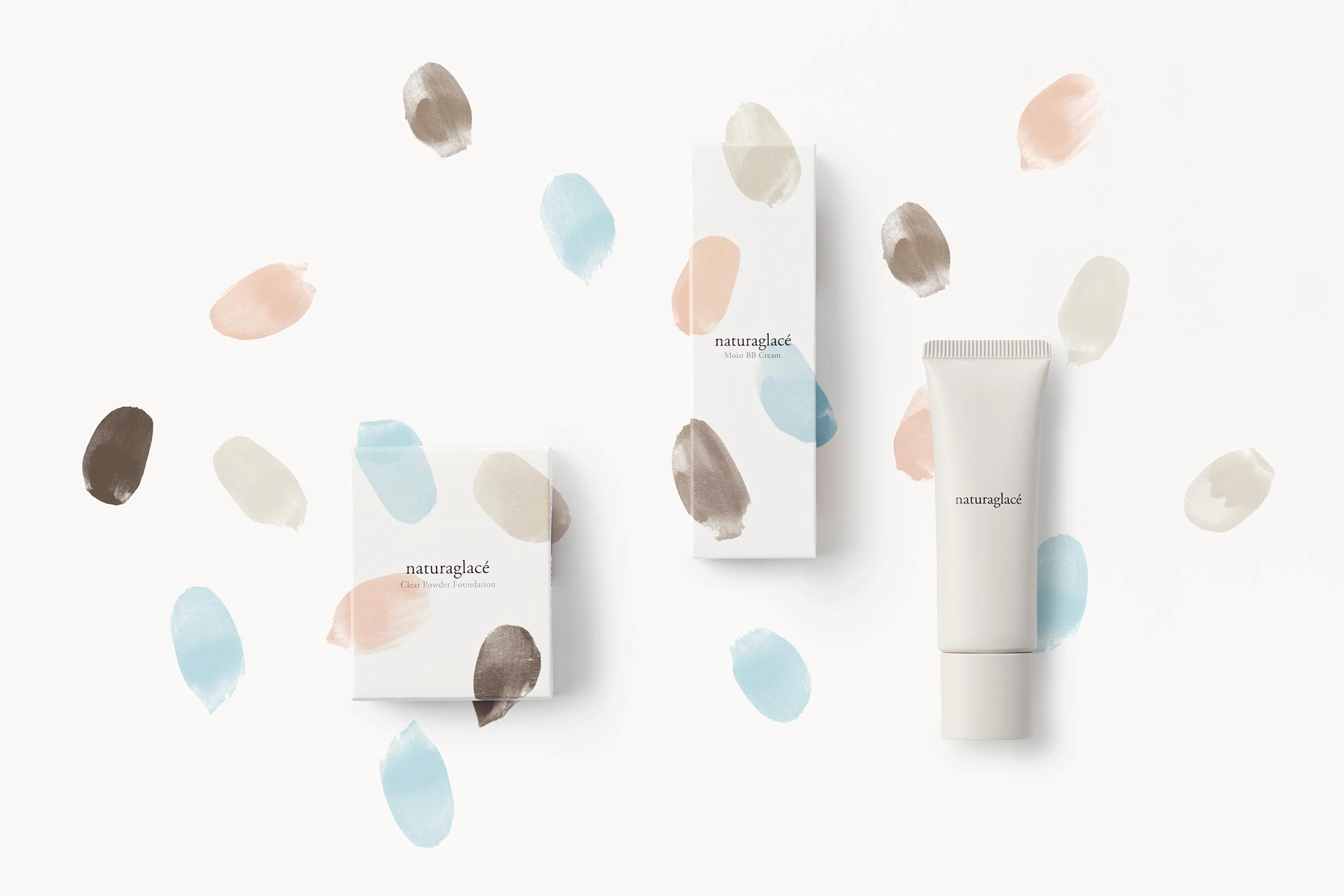
We created packaging for naturaglacé, a Japanese cosmetic brand using naturally-derived ingredients.
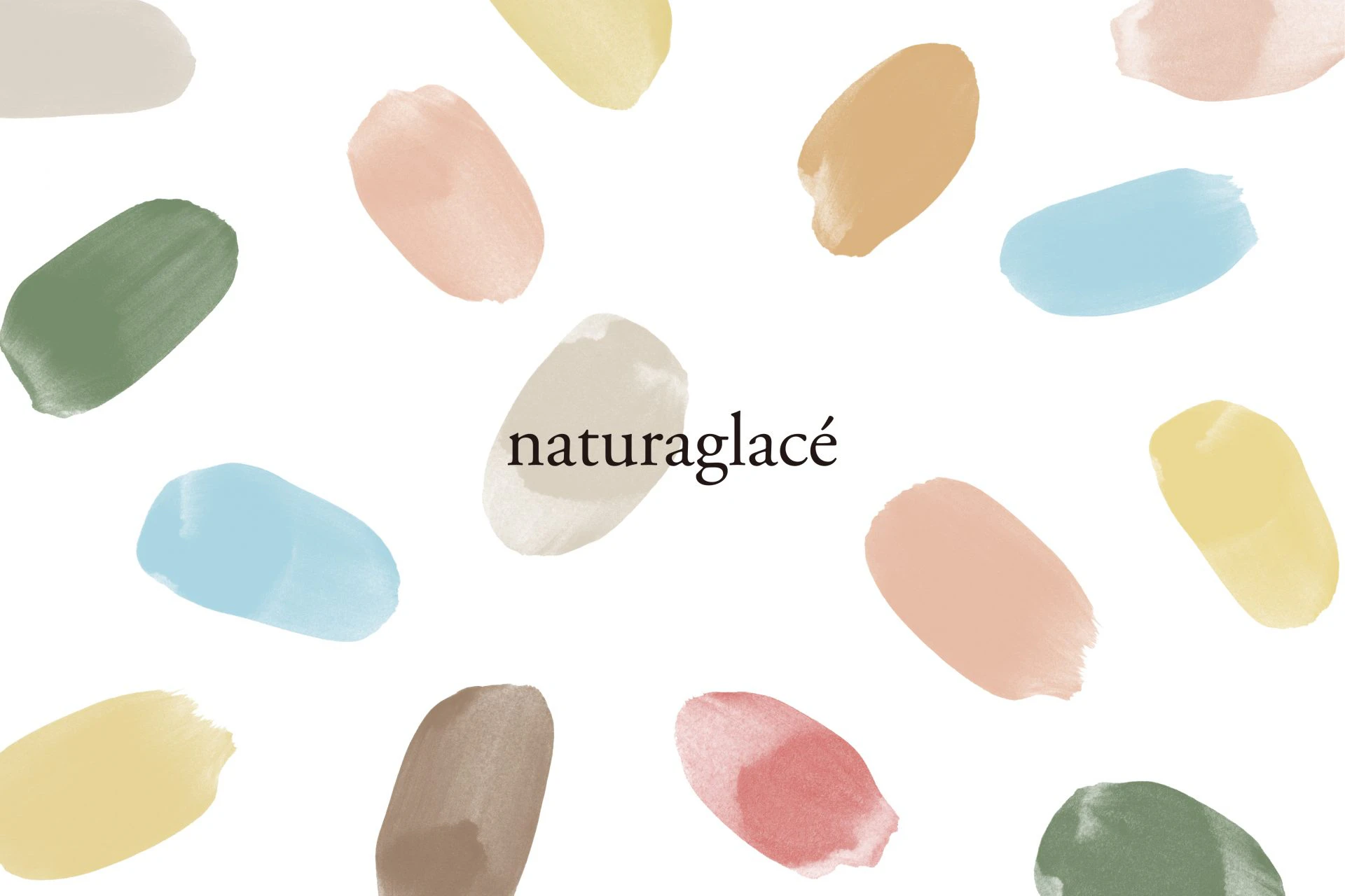
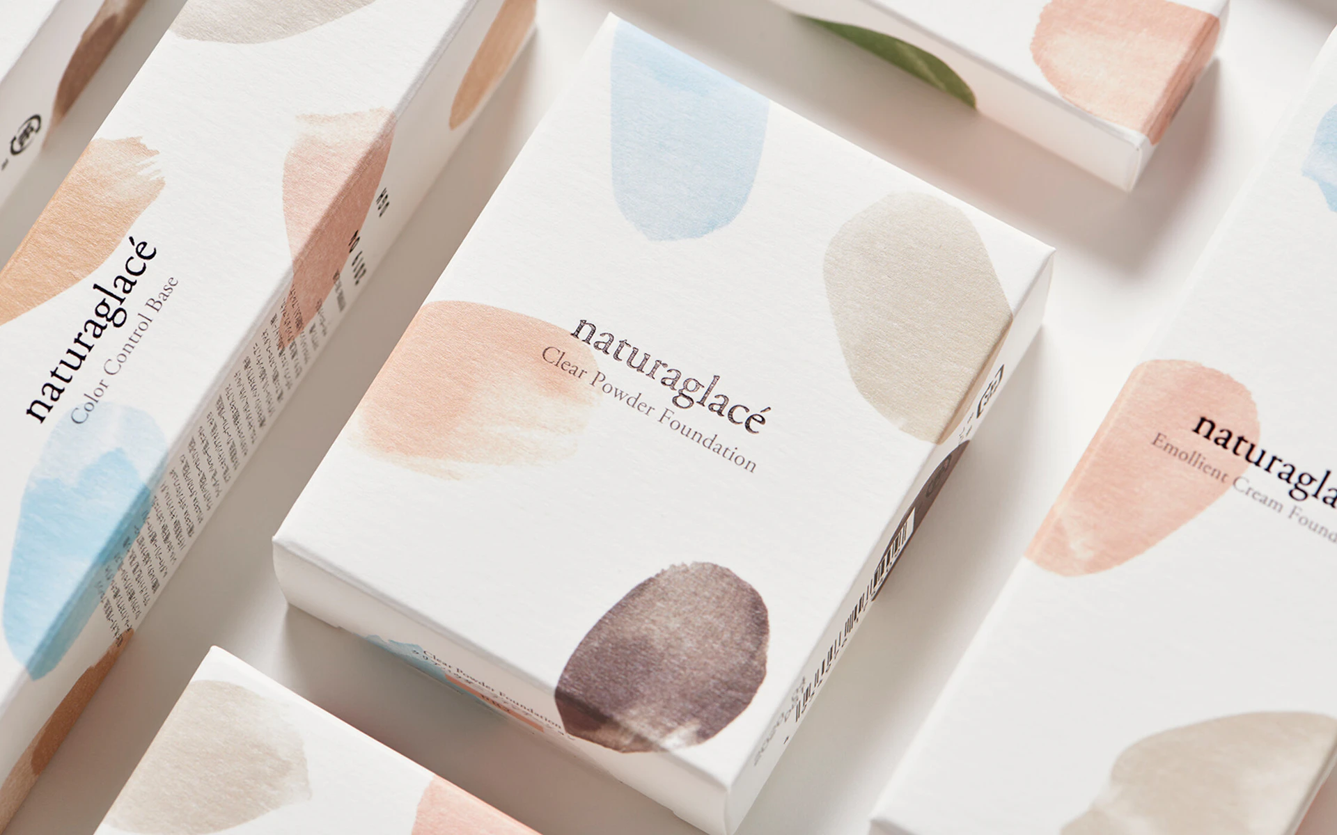
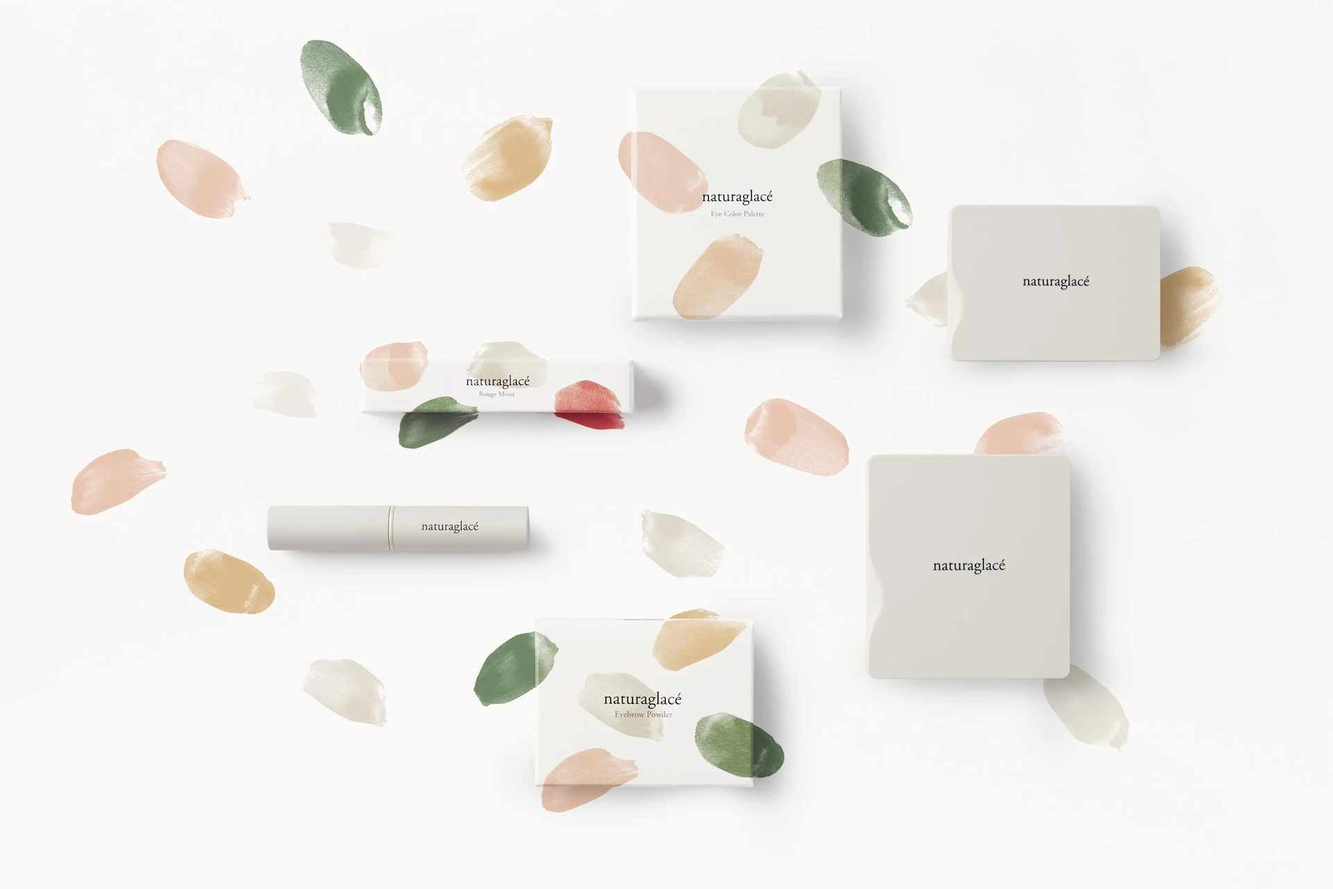
The visual identity, composed of translucent watercolor brushstrokes and a neutral logotype, expresses the gentle feel of natural ingredients. This VI functions as an expandable color system linked to the colors of the ingredients themselves.
We programmed the brand to remain continuously active through a color system with built-in renewability, allowing new and seasonal products to receive semi-automatic color variations.
Package
These cosmetic items are made from carefully selected natural materials including natural minerals and organic plant extracts. The packaging makes use of colors that are linked to the ingredients of each product, such as water, argan, rosehip, and sea buckhorn. The color and gentle feel that come from natural ingredients is expressed with paint brush strokes that have a transparent feel.


Credit
* Non-NDC staff
