Lawson Ticket
Making a Mouth of Excitement the Symbol

LAWSON TICKET is a ticketing service operated by Japan’s major convenience store chain Lawson Group. Handling event tickets for music, sports, theater, and a wide range of other genres, it has achieved high recognition and market share as one of Japan’s most familiar ticket reservation and purchase services.
In the entertainment industry, where diverse content emerges with the times and ticket purchasing methods and locations continue to diversify, LAWSON TICKET needed a logo that would evoke excitement in viewers while maintaining timeless appeal to ensure continued affection for their service.
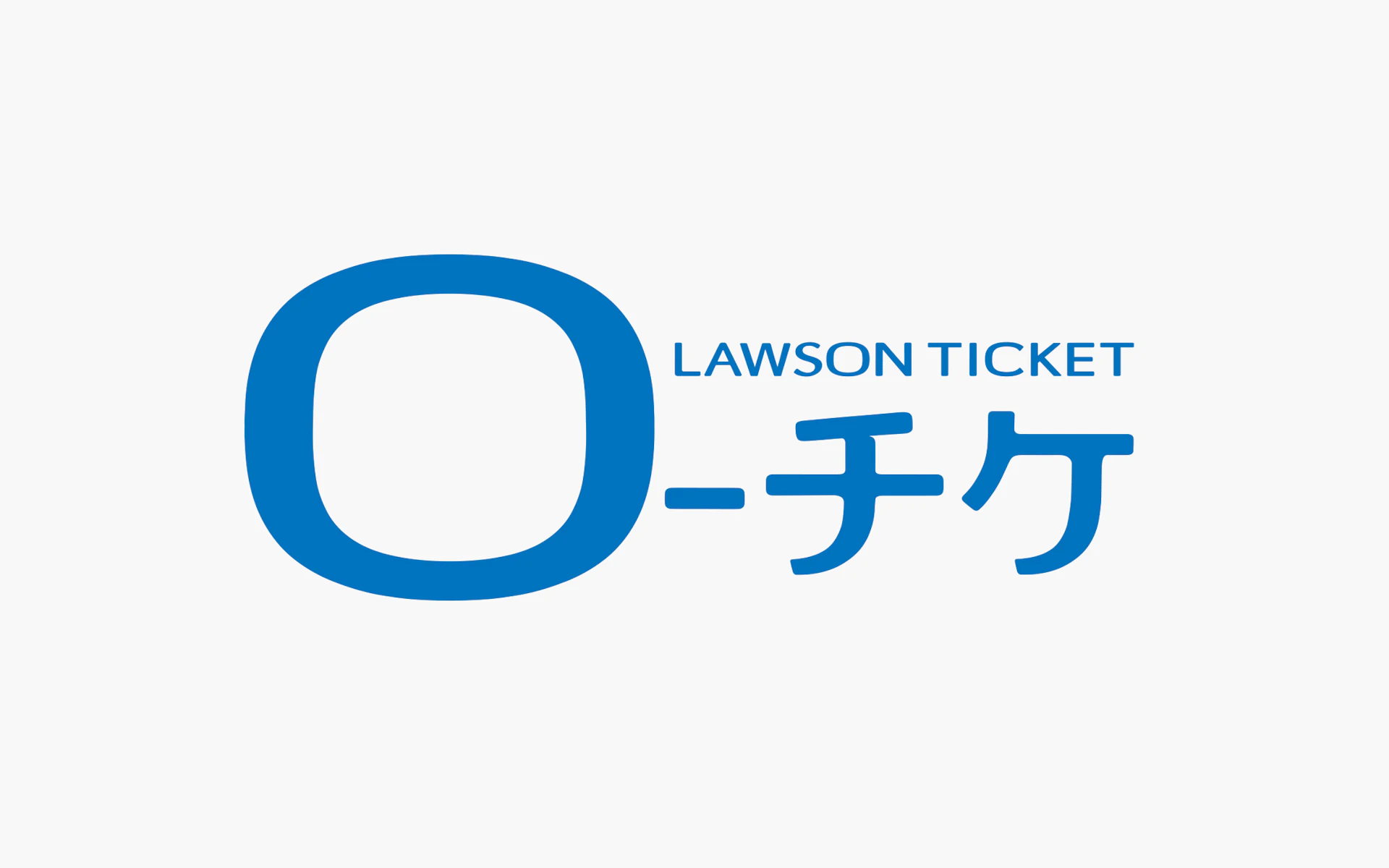
Our proposal was a simple mark based on the Japanese katakana character “ro,” the first letter of LAWSON TICKET. This mark, which can be interpreted as both a person’s mouth shouting in excitement and the shape of a stage or venue, instantly communicates not only Lawson's identity but also the playful impression unique to the entertainment field that enriches people’s hearts.
Visual Identity
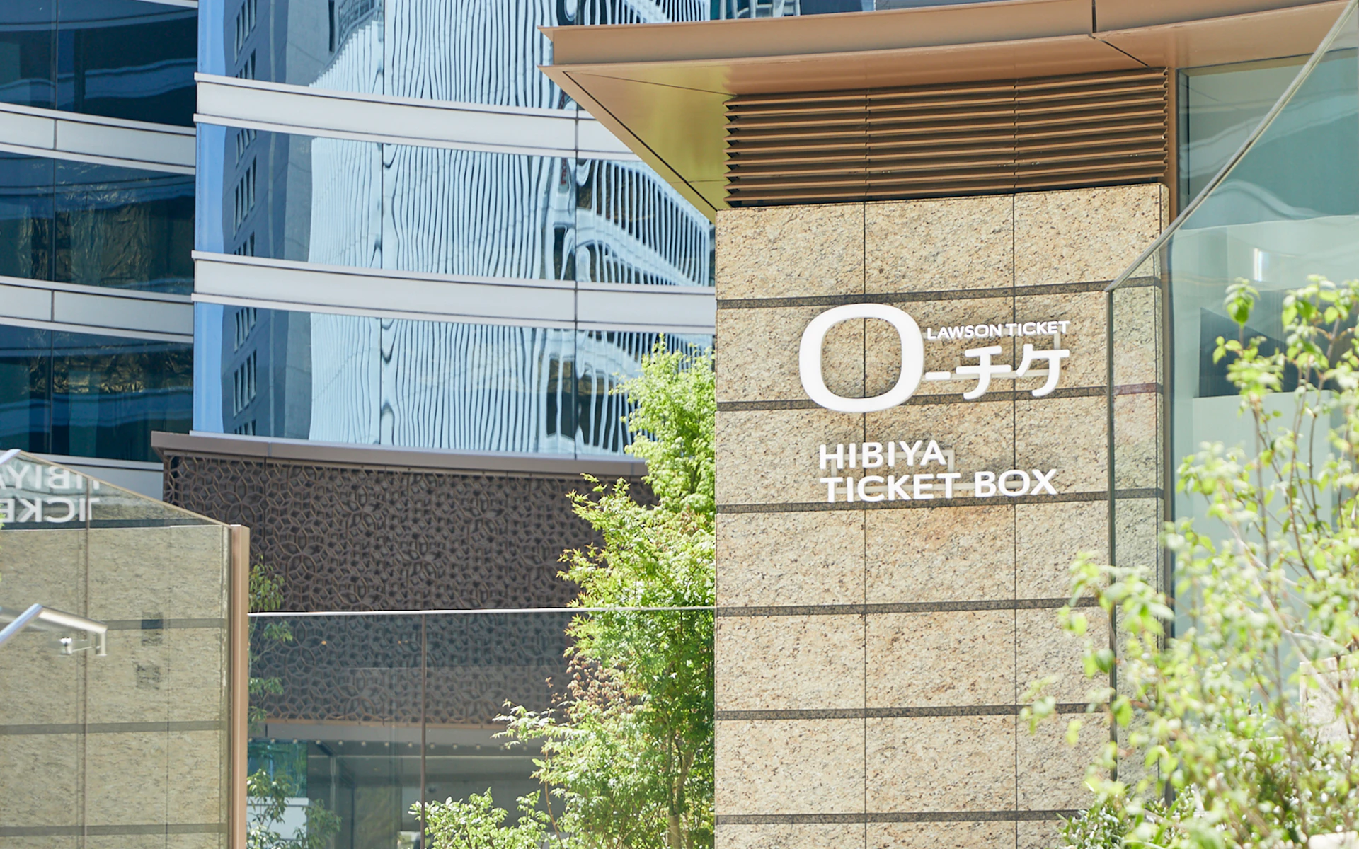
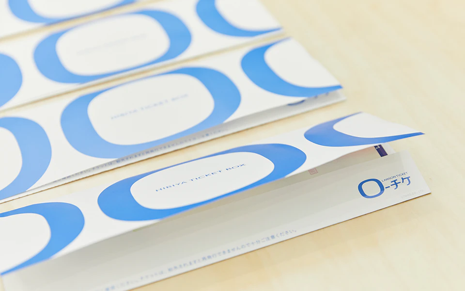
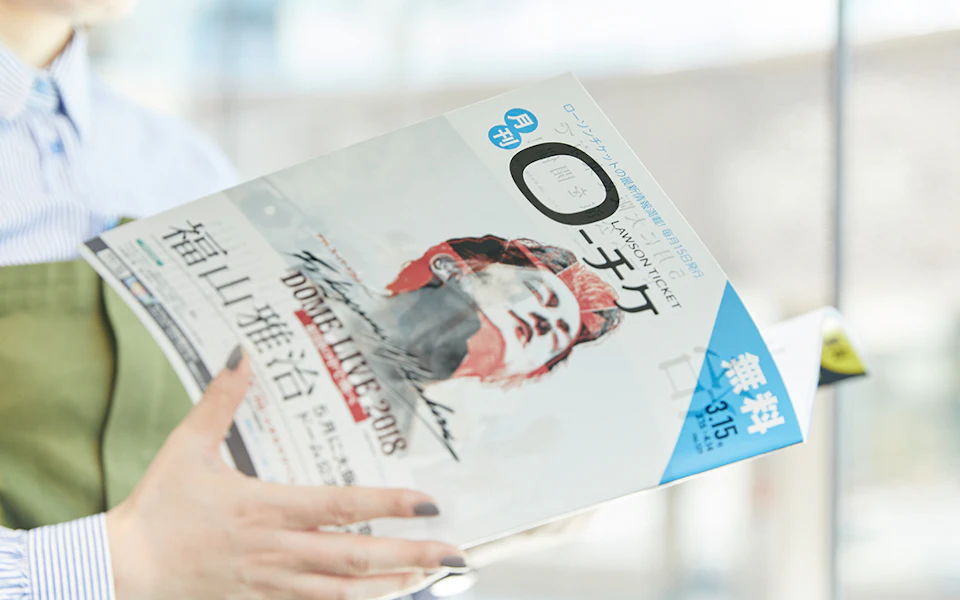
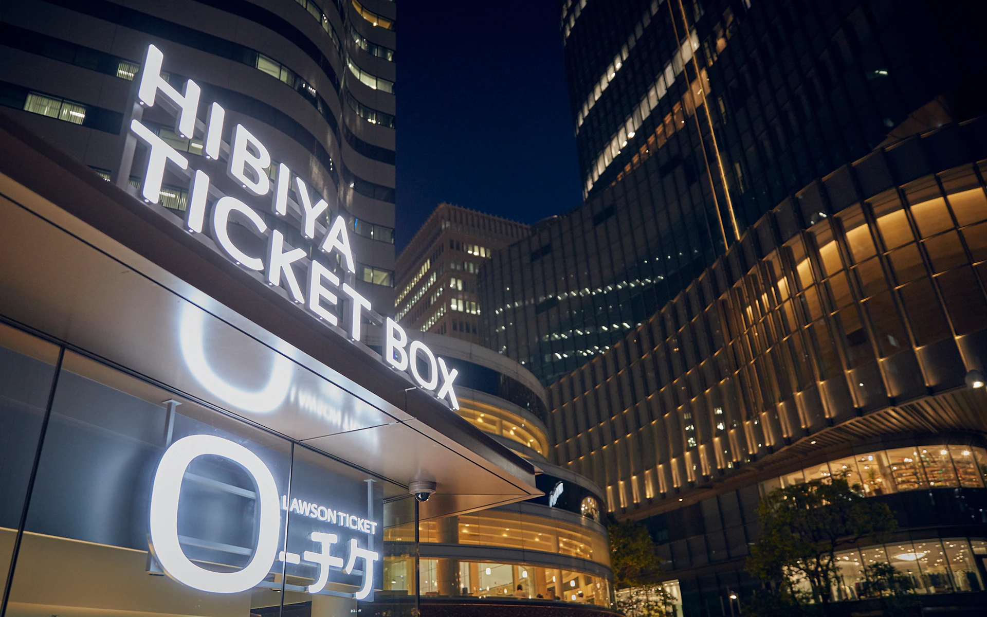
Logo design for Lawson Ticket as well as signage design for Lawson Ticket HIBIYA TICKET BOX.The rounded rectangle of the Japanese katakana Ro can be understood both as the mouth of someone laughing as well as the shape of a stage or venue. By expressing this symbolically, we made the logo highly flexible and well-suited for entertainment.
Signage
Credit
- Art Direction
-
- Nozomi Morisada
- Design
-
- Nozomi Morisada
- Copywriting
- Produce
- Photography
-
- Naomi Circus *
