JR Group CI Design
Creating Both a Mark and Social Impact

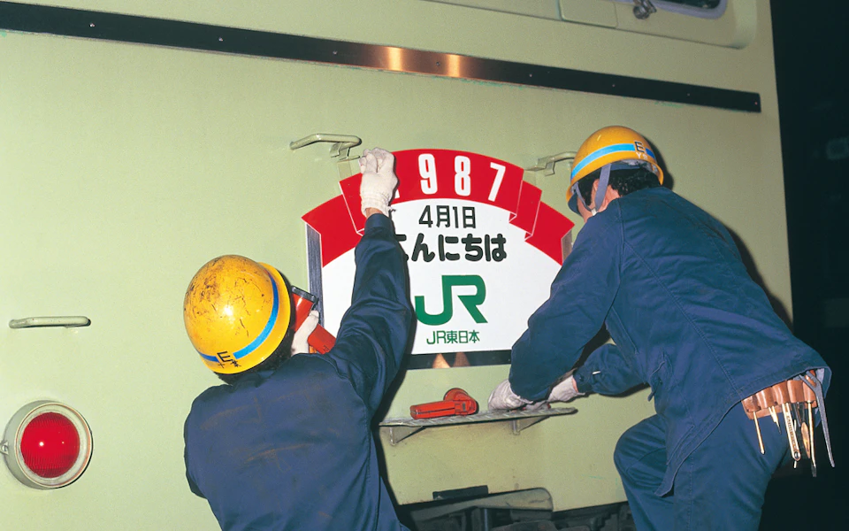
The JR Group emerged in 1987 through the privatization of Japanese National Railways (JNR). When centralized management from Hokkaido to Kyushu became unsustainable, the cabinet approved JNR’s privatization, giving birth to the JR Group — comprising six passenger railway companies and one freight company.
The only requirements for the mark design were to use either “JR” or “NR” (abbreviations of “Japan Railways” and “Nippon Railways” respectively) or to present entirely different concepts. Though stations and trains would remain unchanged after privatization, the logo would be the only visible transformation. The design itself would potentially determine whether "JR" or "NR" would be chosen — truly a mission where design would speak for itself.
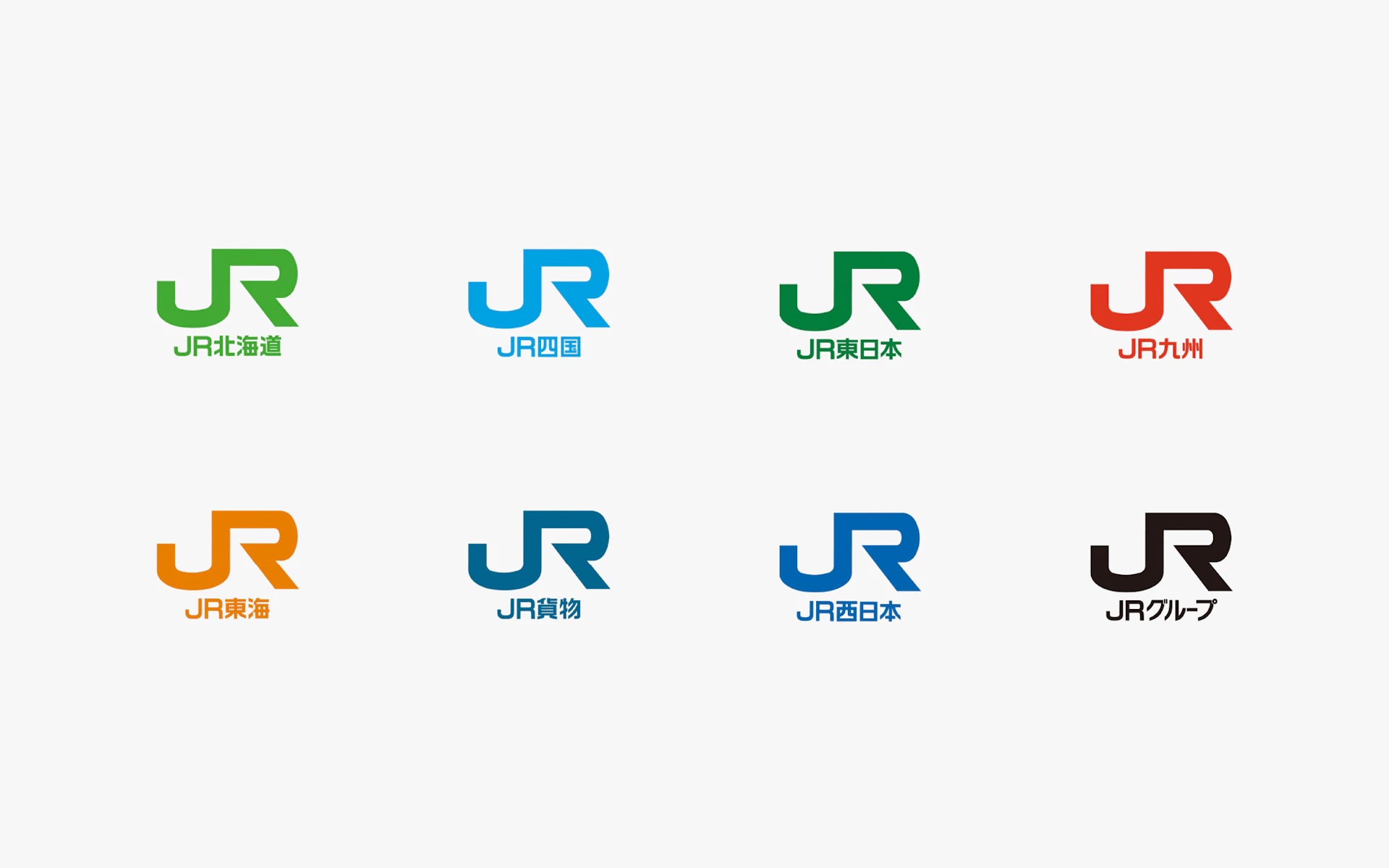
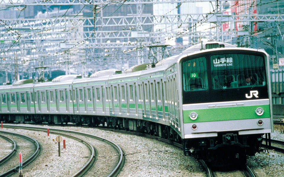
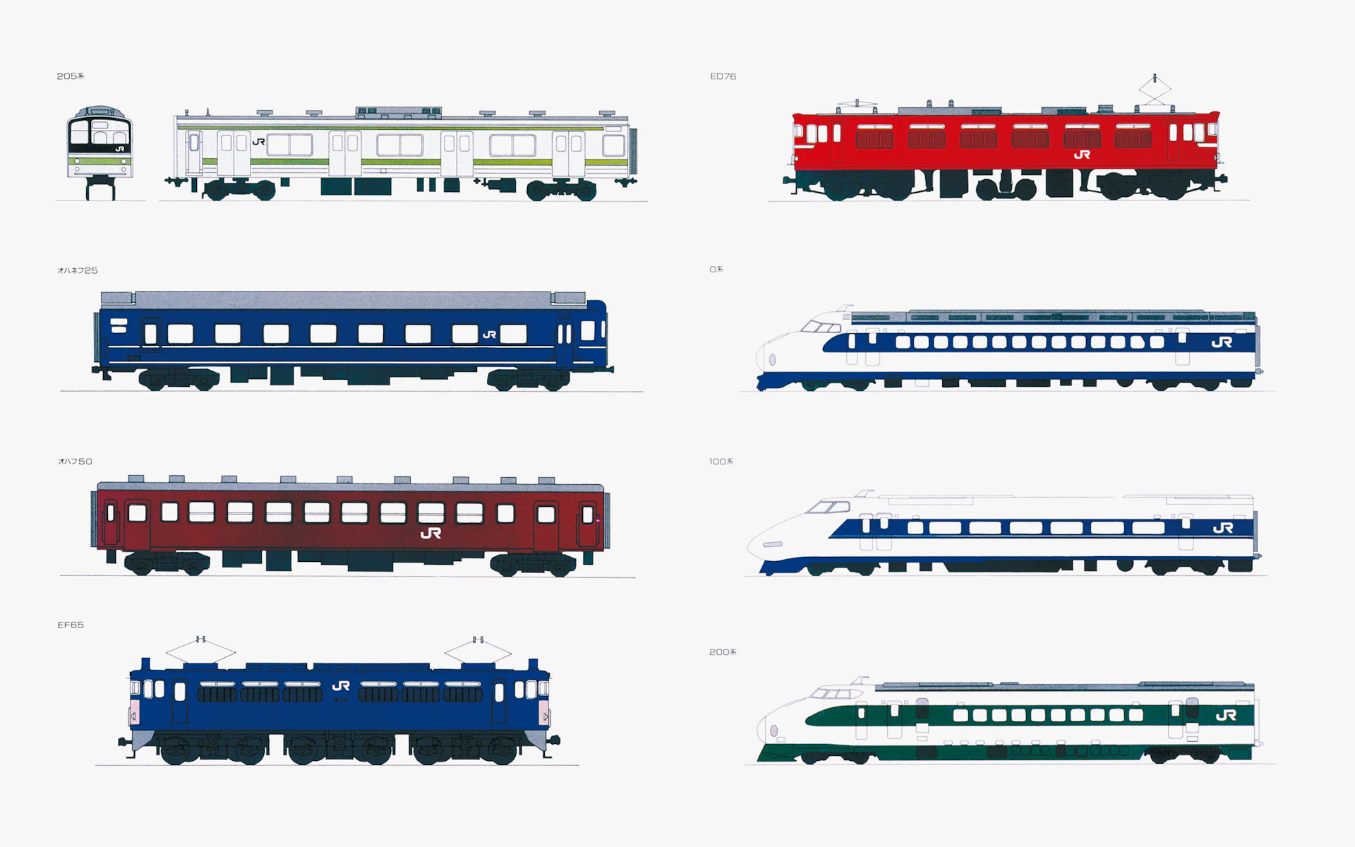
From numerous proposals, the “JR Mark” was selected. It balanced speed and stability while maintaining visibility during train operation, differentiating the seven companies through color. To maximize recognition, we proposed implementing the mark across ten thousand vehicles nationwide from the first day of privatization and created the “JR Mark Vehicle Application Guidelines.” This comprehensive approach created tremendous social impact.
Visual Identity
In 1987, the national railways were privatized, and the JR logo mark was produced. Since the railway cars moved in both directions, the design was made to avoid confusion whether the cars moved to the right or to the left, and wide lettering was used so that it would be recognizable at high speed. The horizontally extending, connected lettering also gives the impression of speed.



Credit
- Creative Direction
-
- Yusuke Kaji
- Art Direction
-
- Yoji Yamamoto
- Design
-
- Yoji Yamamoto
- Supervision (Editorial)
- Produce
-
- Ikuo Kenmori
- Agency
-
- DENTSU *

