Daimaru Matsuzakaya Rebranding Project
One, Two, Three, Four, Hundred.
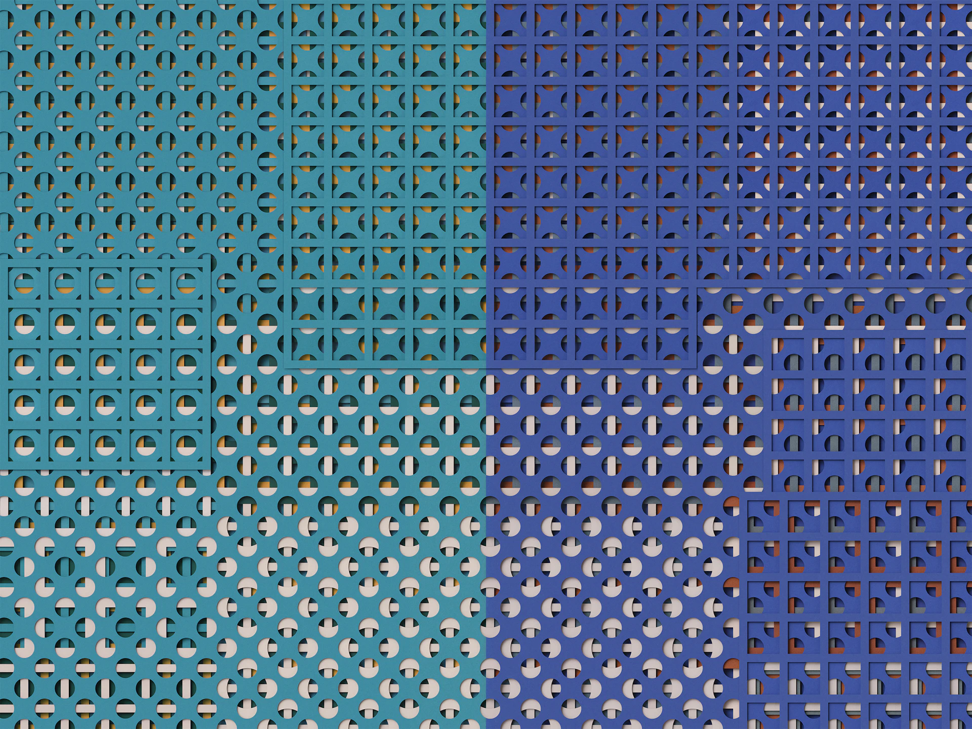
We created “Hyakuyouzu,” a new visual identity for Daimaru Matsuzakaya Department Stores. With a shared philosophy passed down for over three centuries since their founding, Daimaru and Matsuzakaya operate 15 stores nationwide as “a department store without a flagship store,” with each location nurturing its own regional character. Embracing this variation as the brand’s core, “Hyakuyouzu” embodies the rich harmony born from the overlap of diverse values held by every customer.
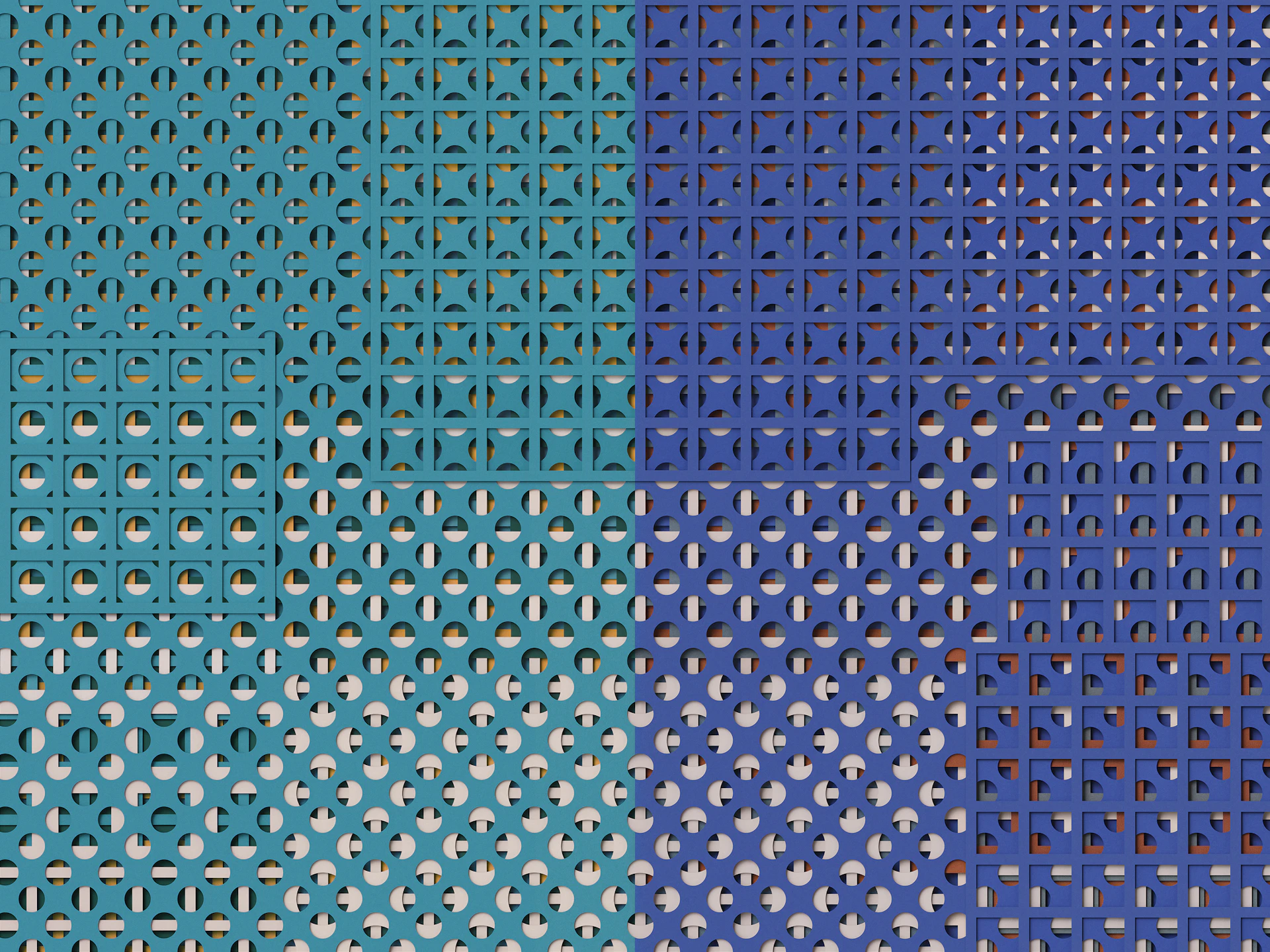
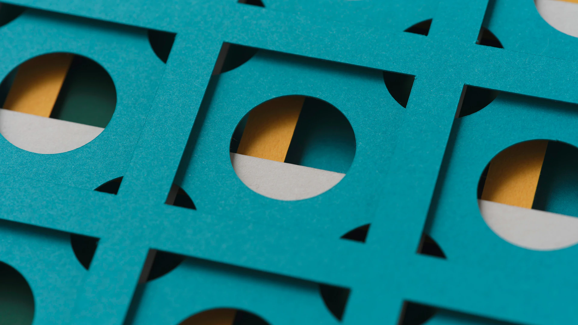
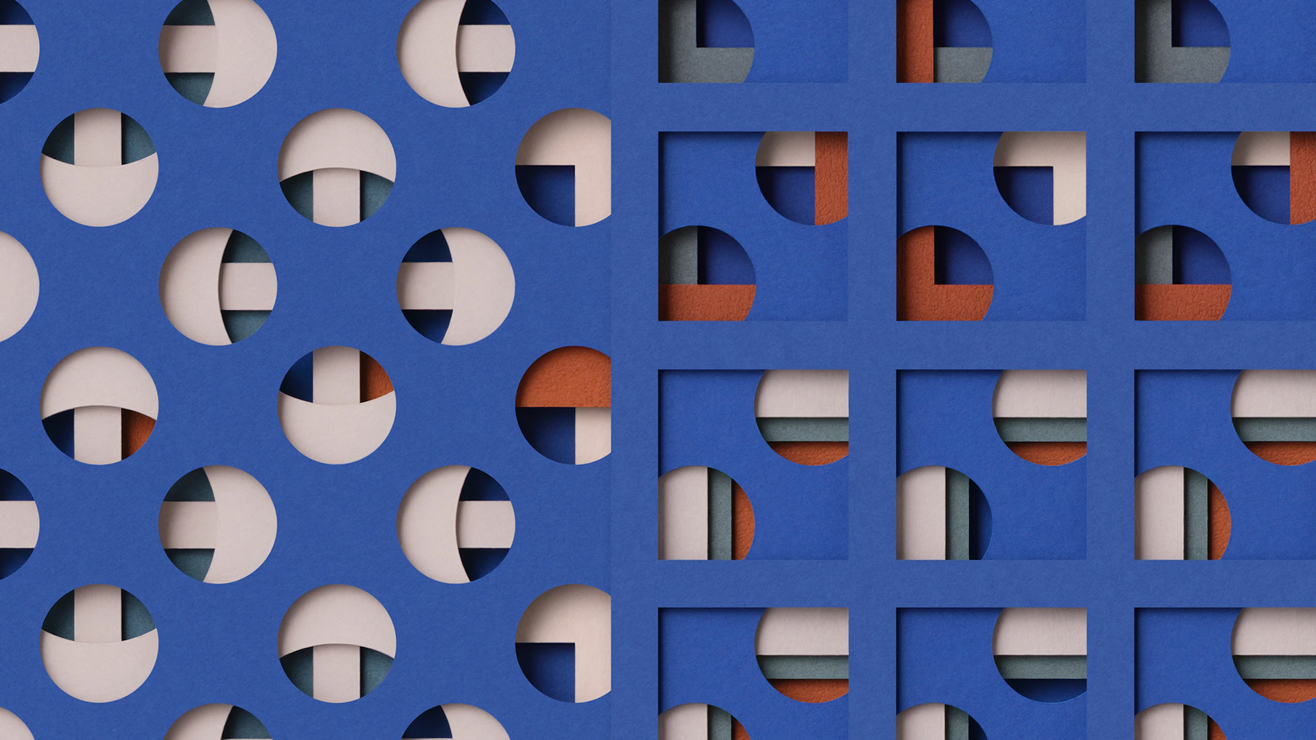
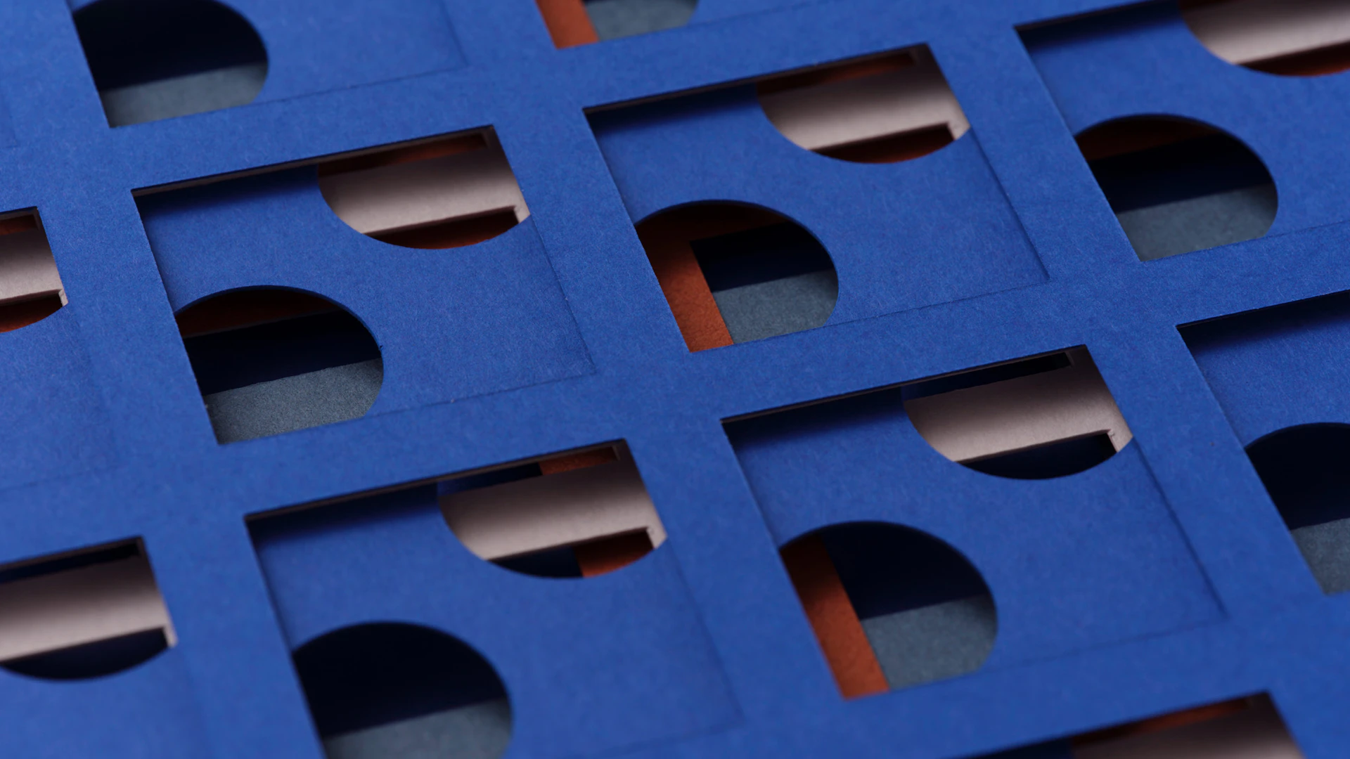
“Hyakuyouzu” is a visual identity formed simply by layering sheets of colored paper with circular and square cutouts. Within these overlapping shapes, endless patterns emerge. Move just one sheet and the entire composition transforms.
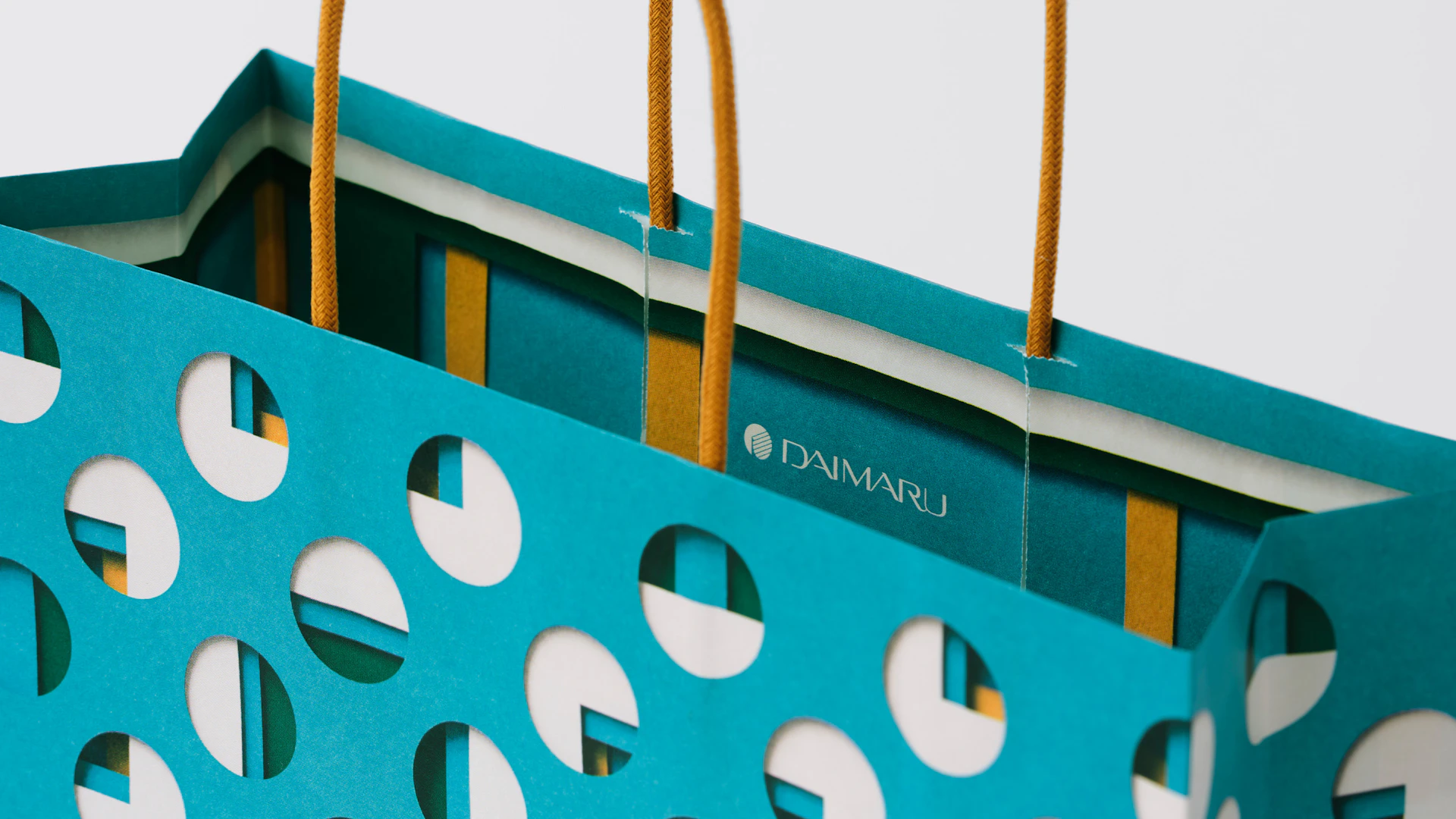
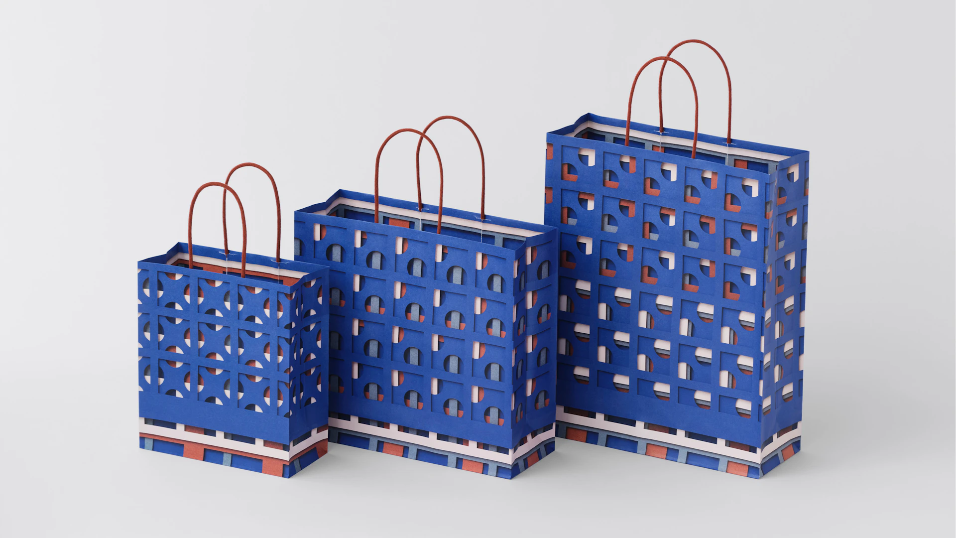
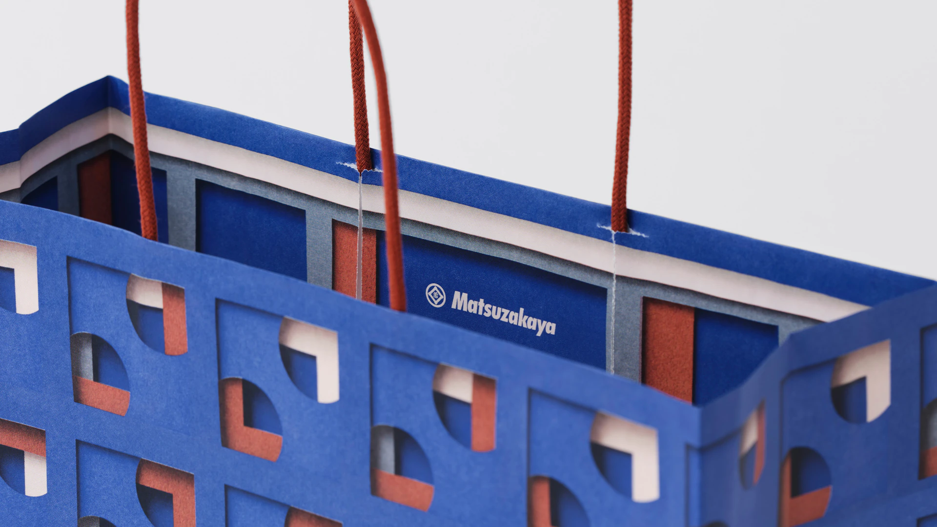
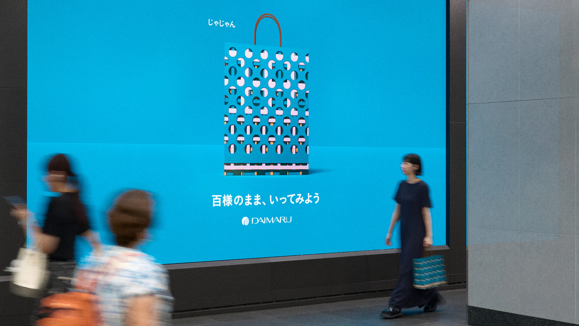
We photographed the layered paper by hand, then translated the resulting patterns into shopping bags. The texture and subtle shadows visible only in actual paper become an integral part of the design.
- Client :
-
- Daimaru Matsuzakaya Department Stores Co.Ltd.
- Year :
-
- 2025
- Industry :
Visual Identity
“Hyakuyouzu” is a visual identity born from human hands layering common materials—paper, circles, and squares—found everywhere. The left side represents Daimaru, the right represents Matsuzakaya, and the patterns in the center symbolize their union. Each section can be extracted and used according to specific needs. The website we created with mount inc. showcases how infinite patterns emerge from common materials, and how moving a single sheet transforms the entire expression, like a kaleidoscope. Interactive elements throughout the experience preserve the unique texture of paper.
Package
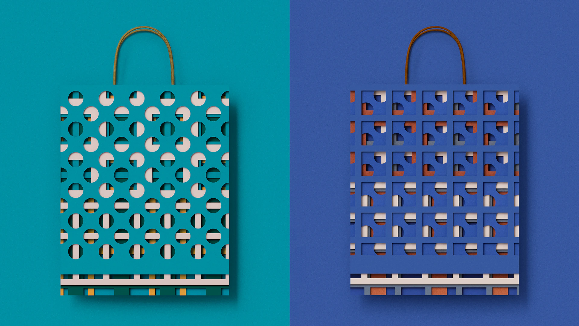
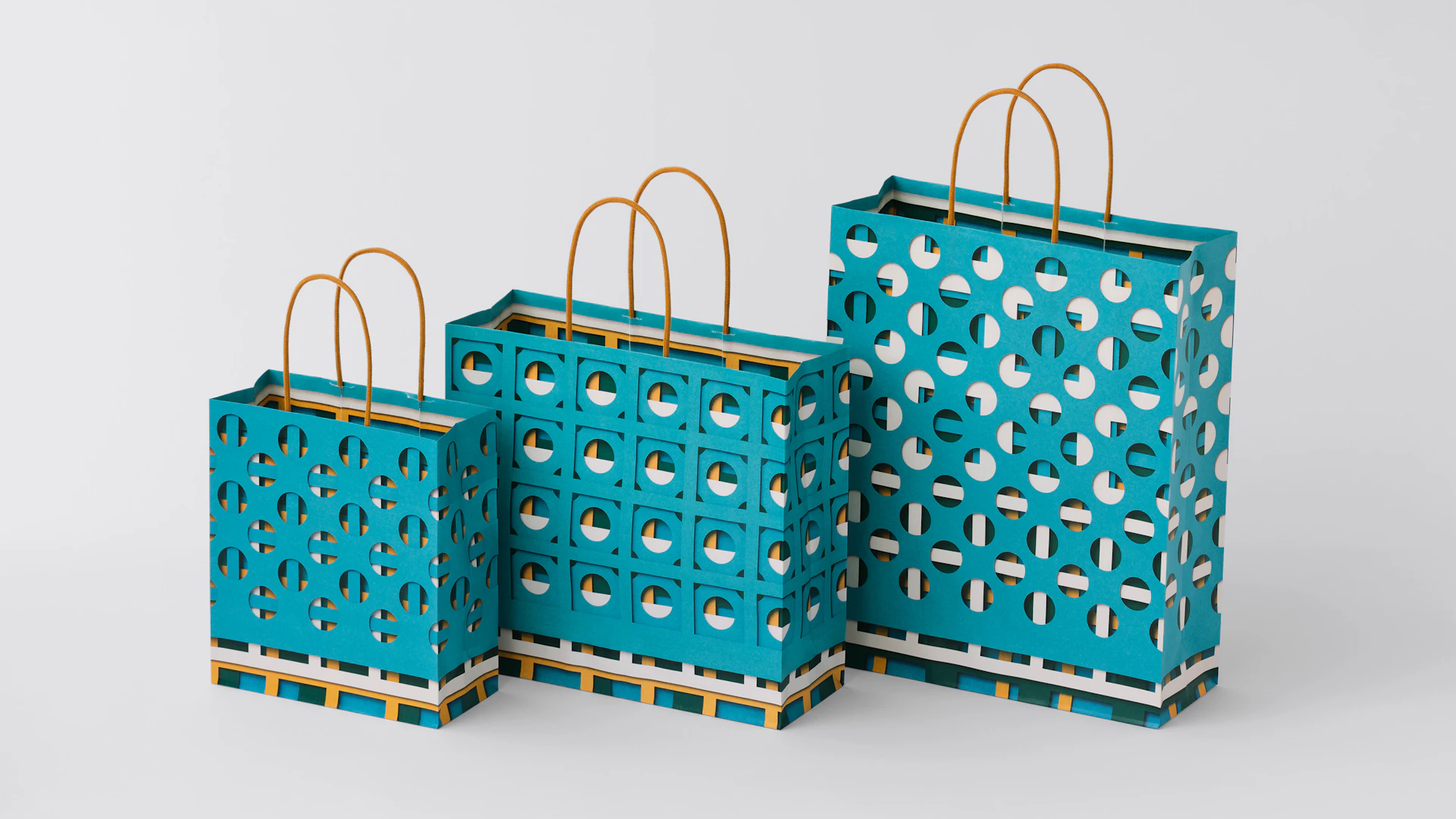
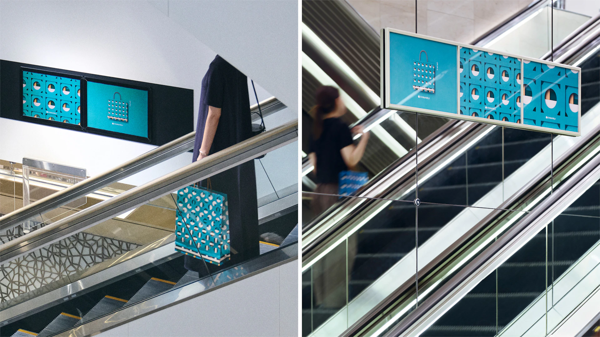
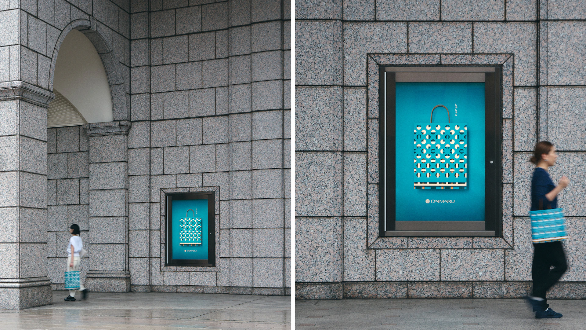
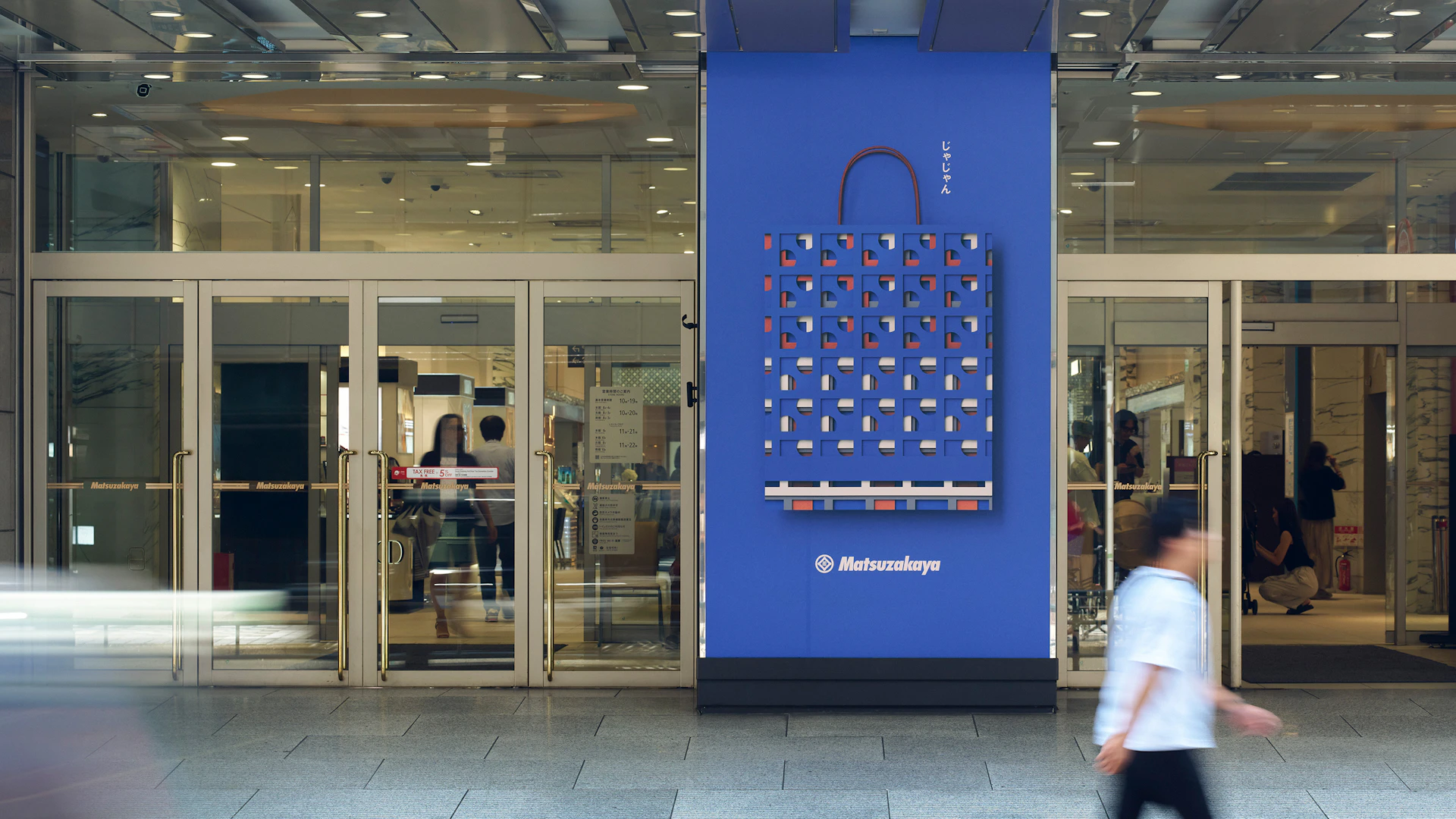
The shopping bag patterns for Daimaru and Matsuzakaya are both taken from “Hyakuyouzu.” These sibling-like designs in two colors appear similar yet different, disparate yet connected—expressing the relationship between Daimaru and Matsuzakaya. Each size (small, medium, large) uses different sections of “Hyakuyouzu,” creating subtle pattern variations. When the three shopping bags are placed side-by-side, their bottom edges form a horizon-like throughline.
Graphics
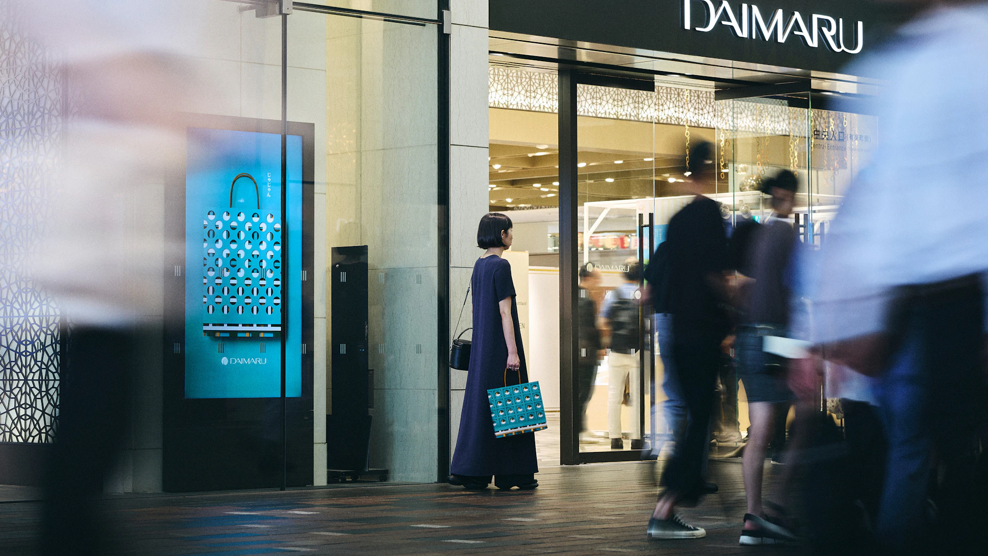
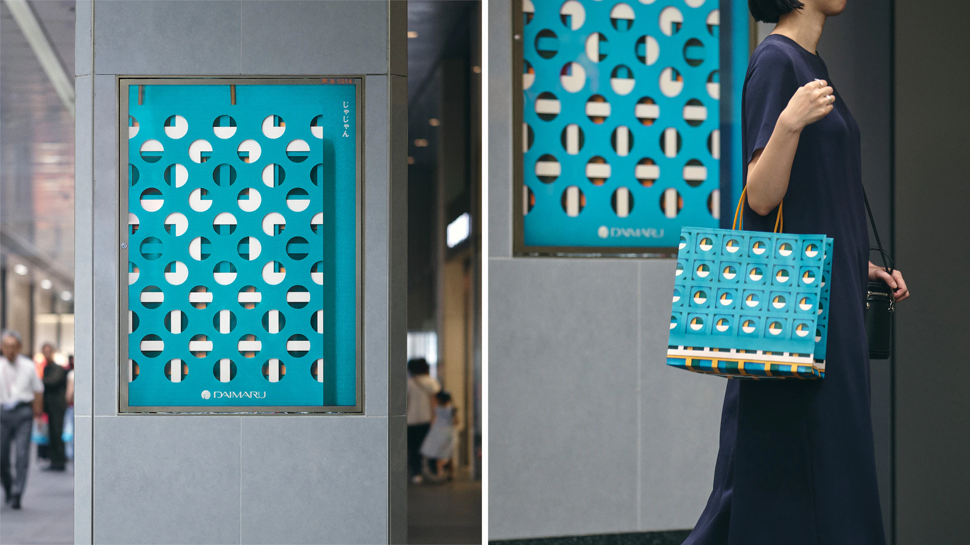
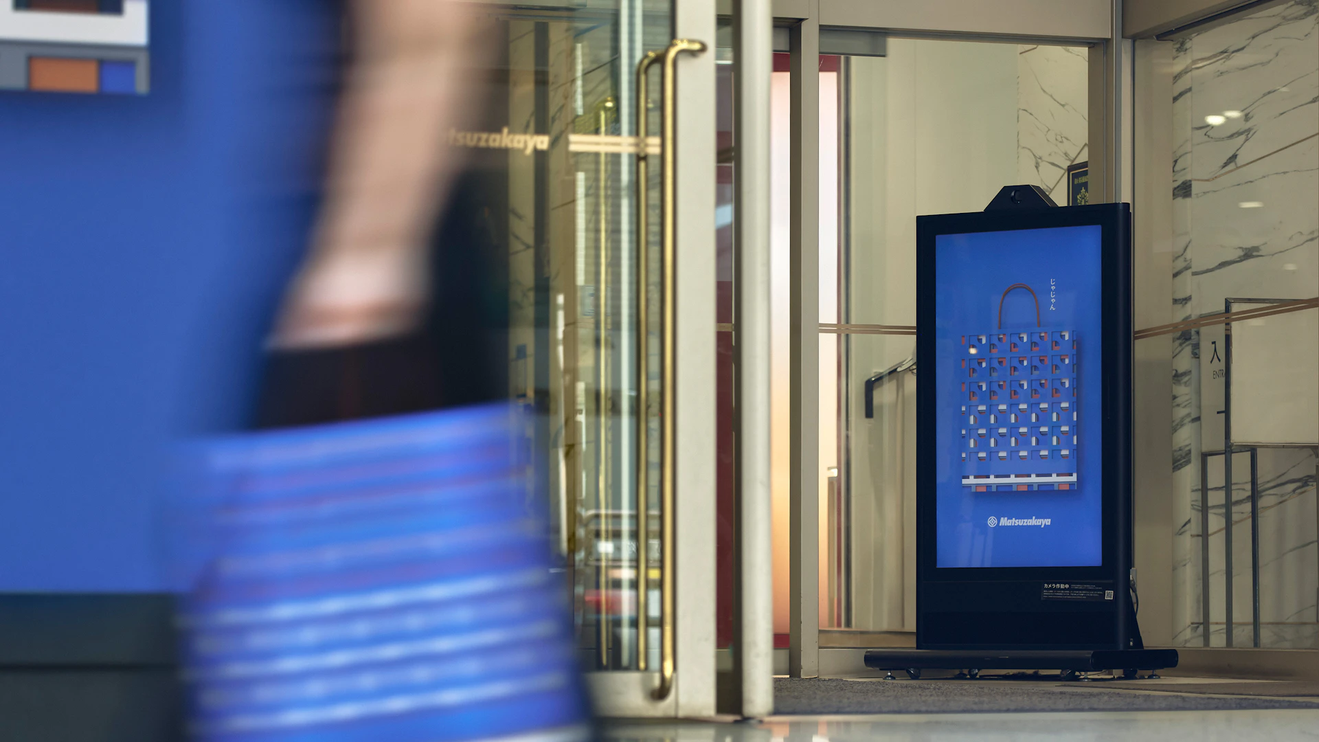
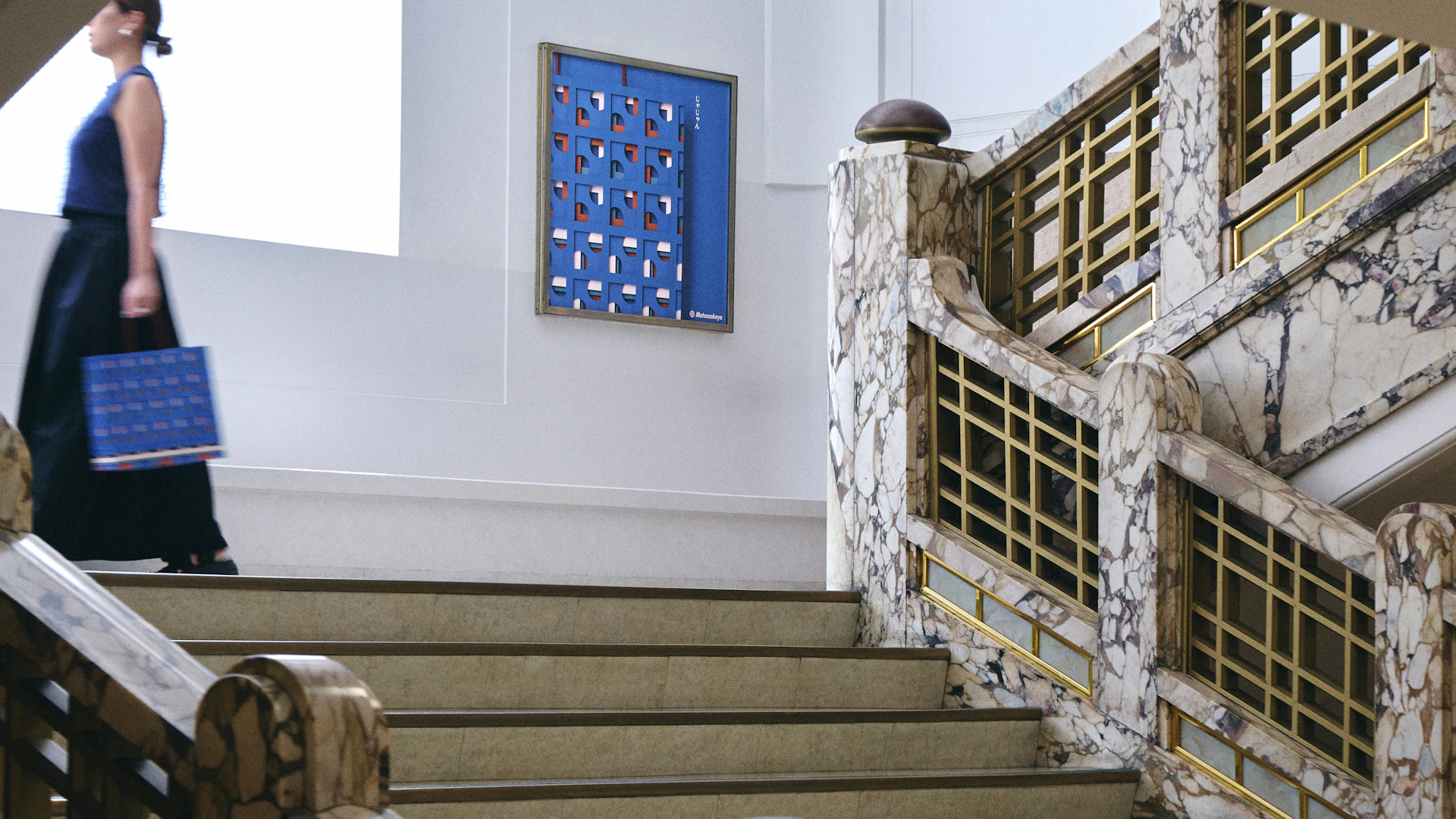
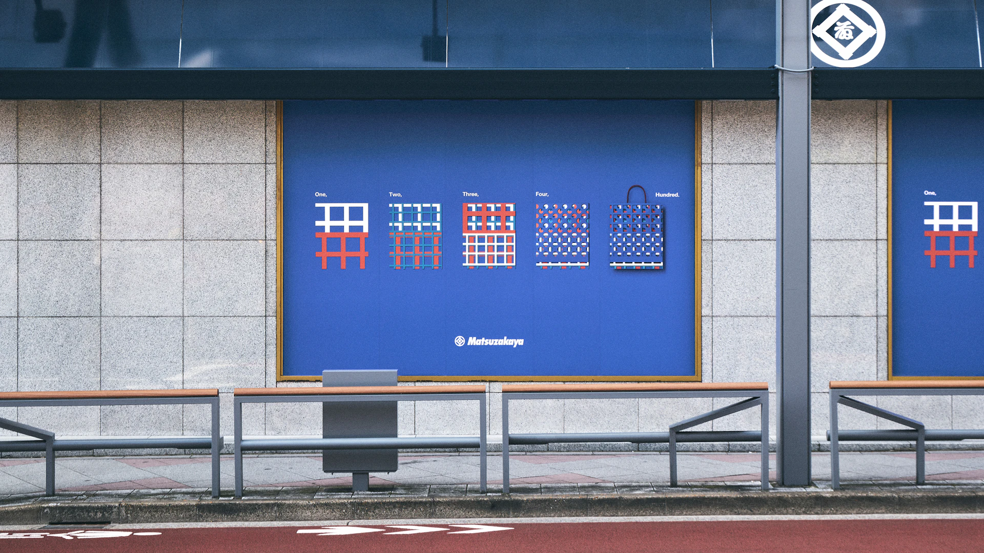
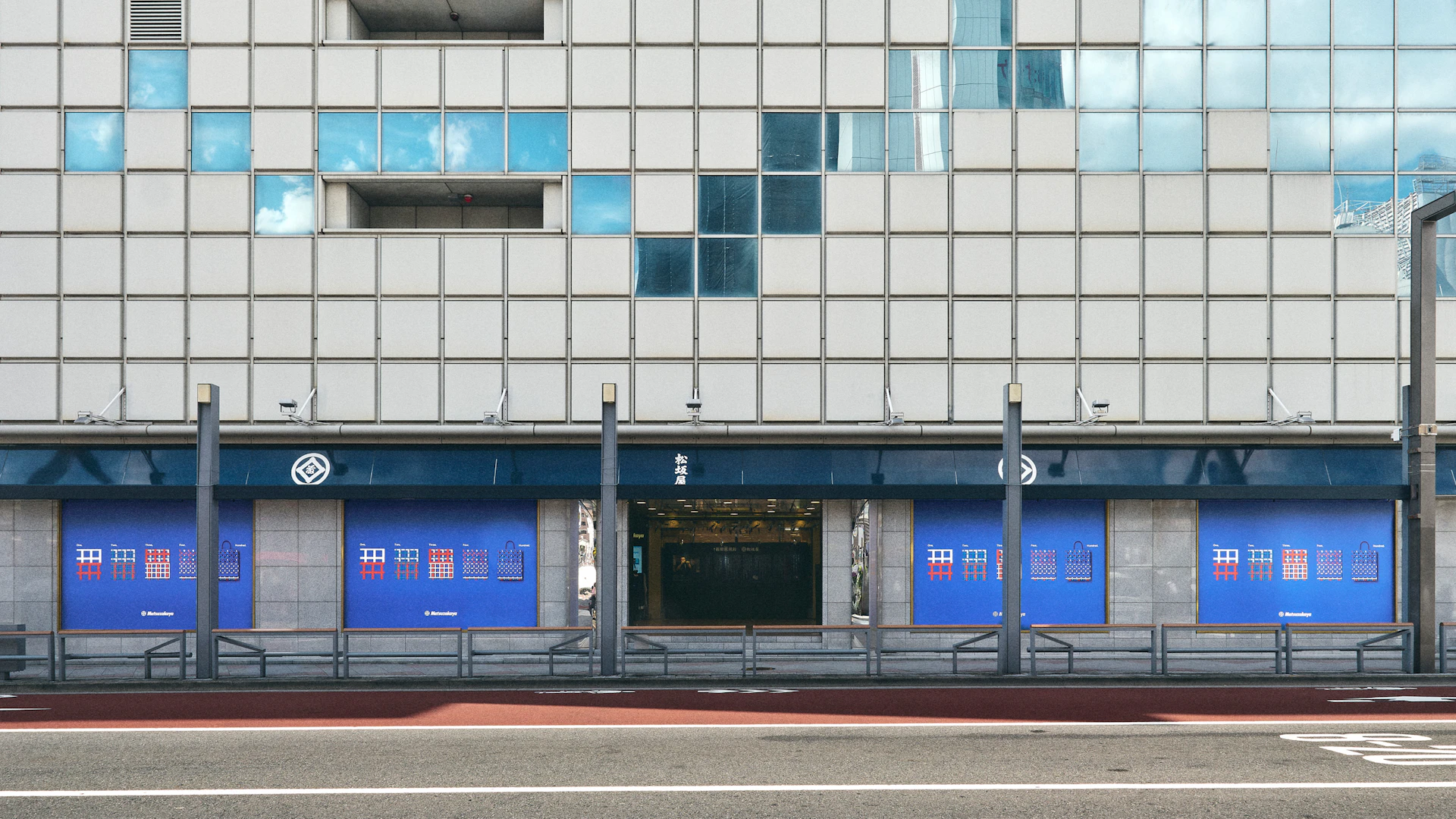
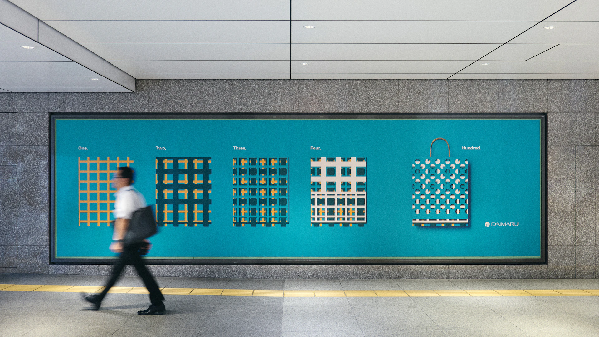
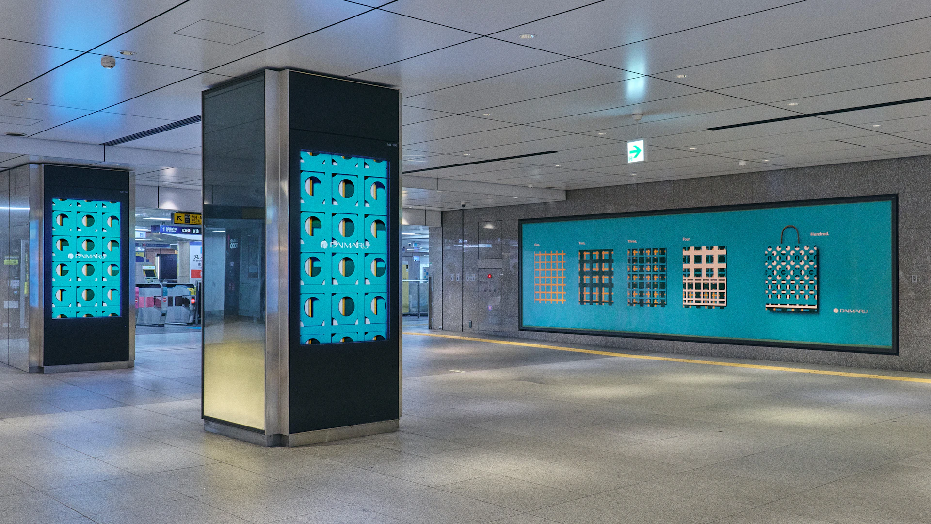
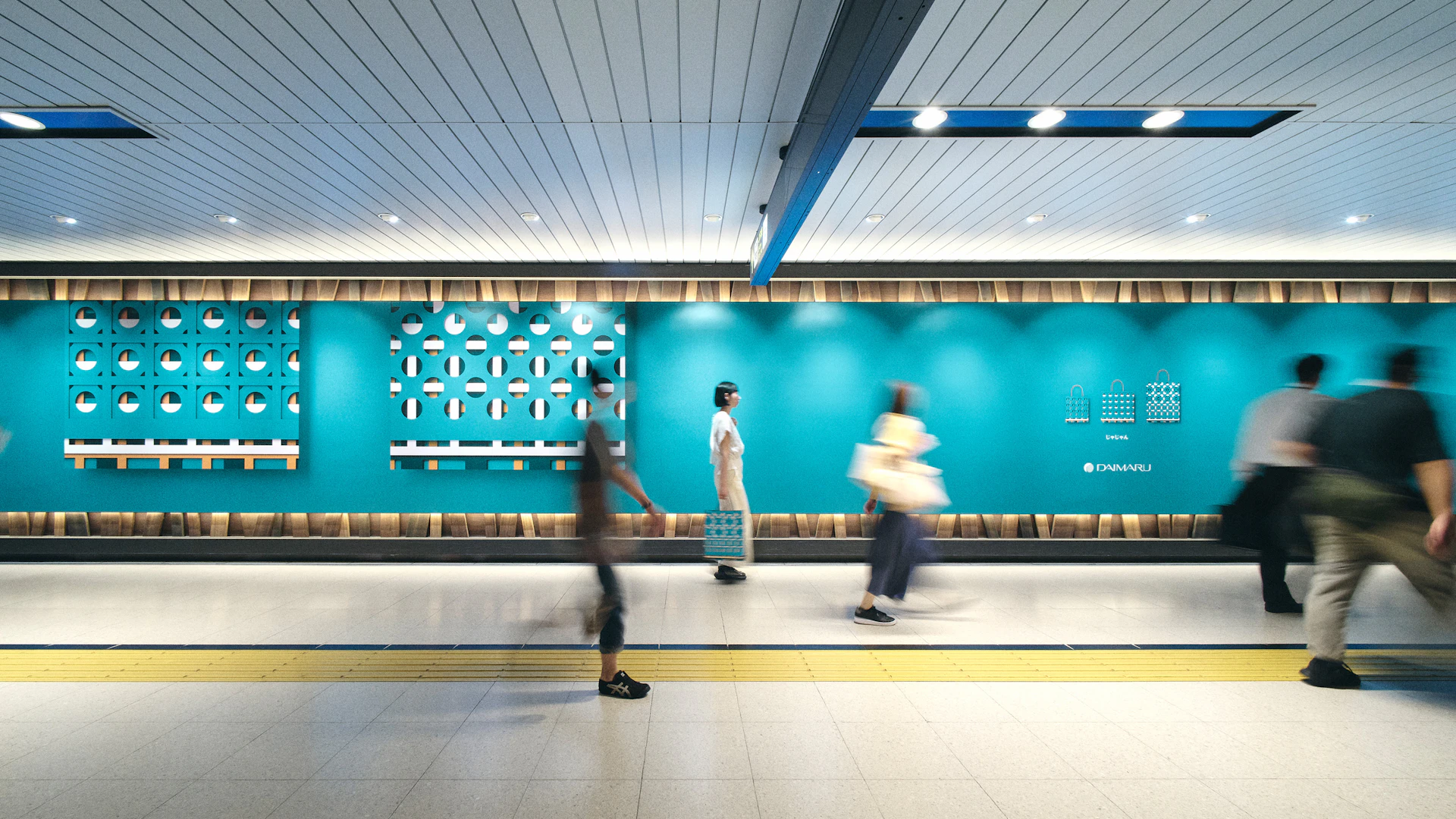
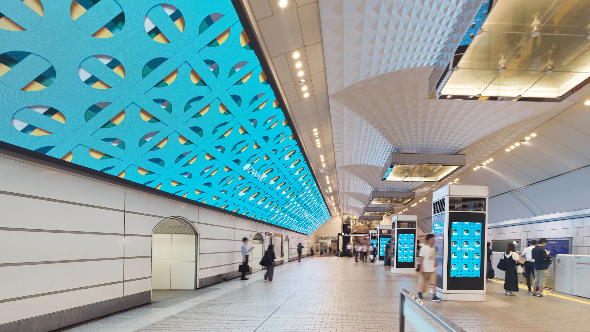
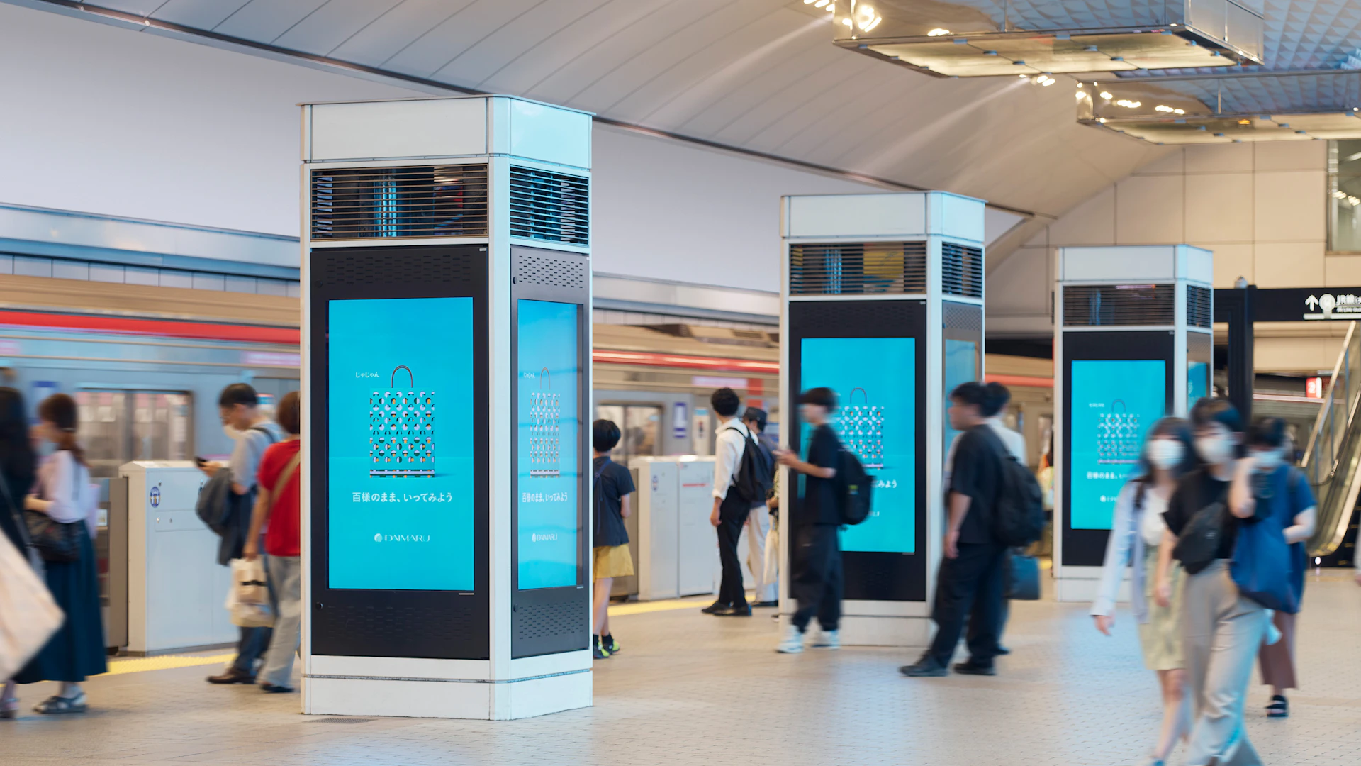
The “Hyakuyouzu” launch promotion reached local customers through all 15 stores nationwide, surrounding station areas, and regional newspapers. Paired with the copy “Ta-da!” and “One, Two, Three, Four, Hundred,” we developed advertising that conveyed the essence of “Hyakuyouzu” through standalone visuals and short-form video.
(*Please refrain from contacting the station or station staff)
Credit
- Art Direction
- Copywriting
- Photography
-
- Keisuke Kitamura *
- Masaki Ogawa *
- Retouching
-
- Yoshiaki Kemmotsu *
- Web Design
-
- mount inc. *
- Movie
-
- mount inc. *
- Music (Movie)
-
- Heima(Noriyuki Sato+Makiko Sato) *
- Music (Web)
-
- Hidekazu Hayashi (mount inc.) *
- Supervision
-
- Yoko Kawashima *
- Asami Sunahara *
- Organize
-
- Takao Terai *
- Tatsuya Kubota *
- Hikari Momota *
- Creative Direction
-
- Satoshi Yoshiizumi (TAKT PROJECT) *
- Produce
Next Project
Turning the Expo into an Opportunity to Reclaim Our Oceans
Next Project
A Century Celebrated with Resonance and Dignity

Next Project
Contemporary Indian Aesthetics for the World

Next Project
Luxury in Roughness
Next Project
Designing the Voice and Spirit of Japan’s Pavilion

Next Project
A Century Celebrated with Resonance and Dignity

Next Project
The Extraordinary Within the Familiar Sea
Next Project
Designing the Voice and Spirit of Japan’s Pavilion

