AOAO SAPPORO
Life Flourishing in Vivid Blue
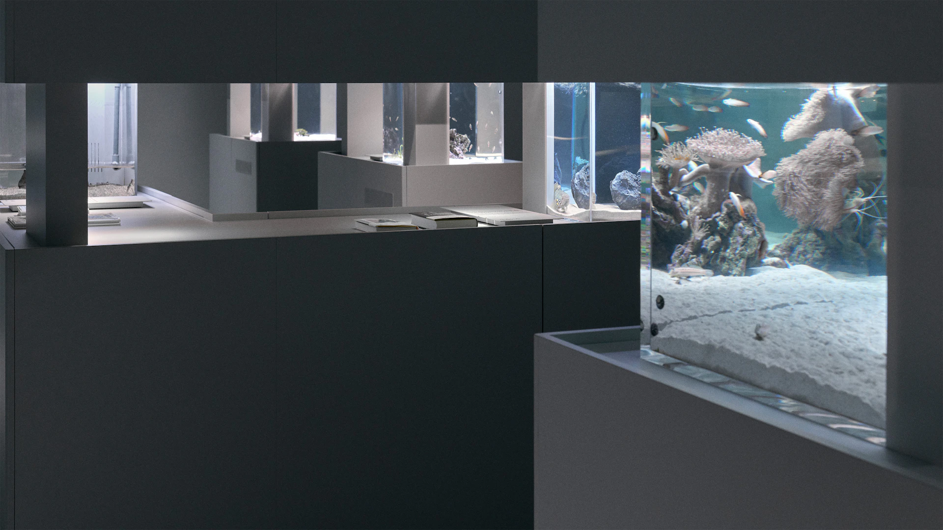
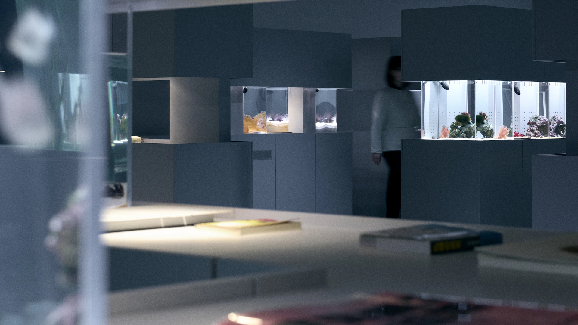
AOAO SAPPORO is an urban aquarium that opened on floors four through six of moyuk SAPPORO, a mixed-use commercial facility facing Susukino’s Tanuki-koji Shopping Arcade in central Sapporo, Hokkaido.
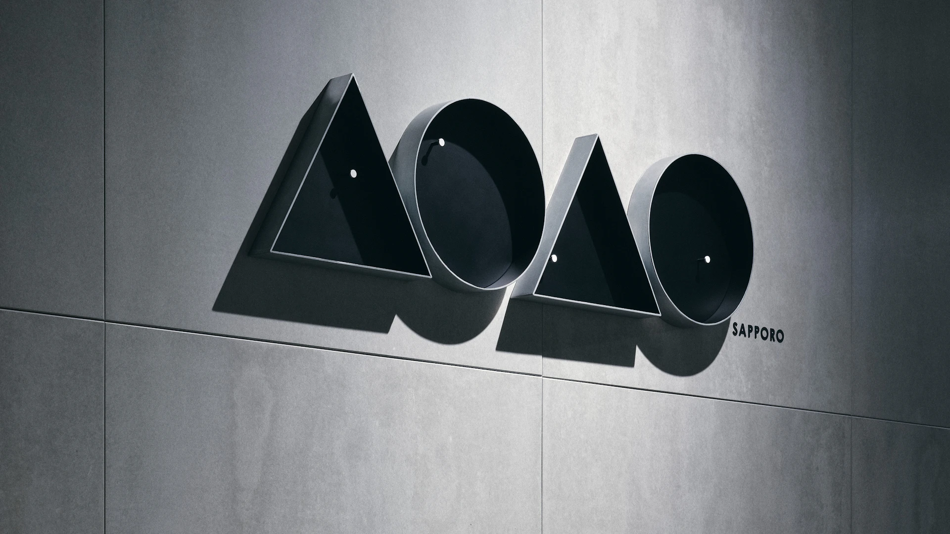
The name derives from “aoao,” a Japanese expression describing the vibrant flourishing of life. This reflects our intention to create a space where visitors can encounter the rich ecosystems of marine life within an urban building setting. We deliberately omitted “aquarium” from the name to signal our commitment to offering experiences unlike existing facilities and expanding what an aquarium can be.
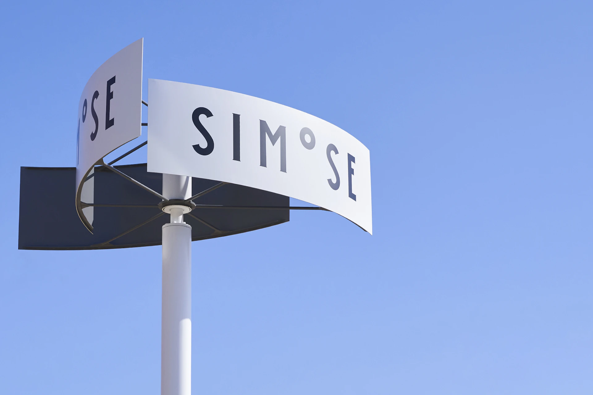
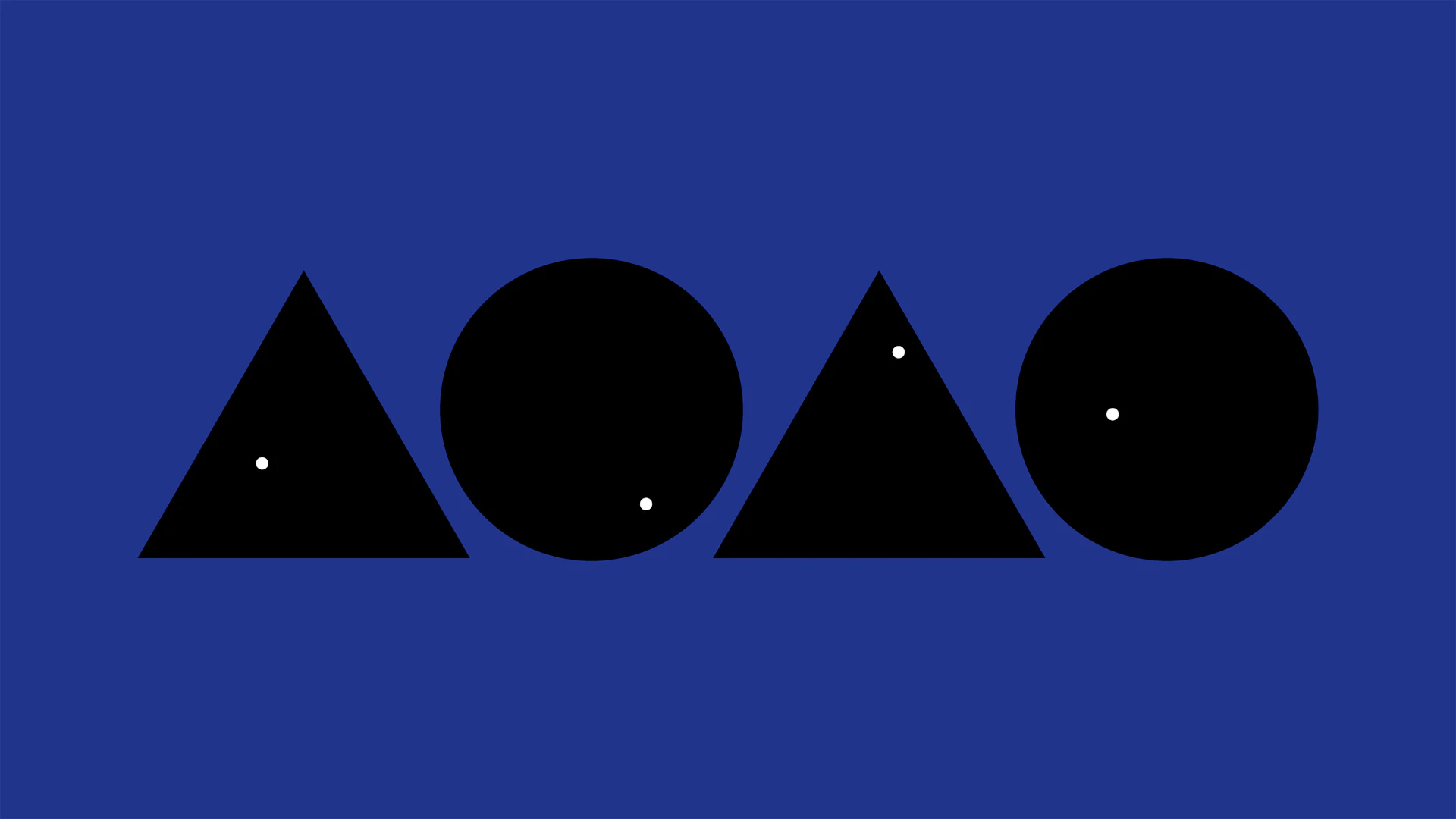
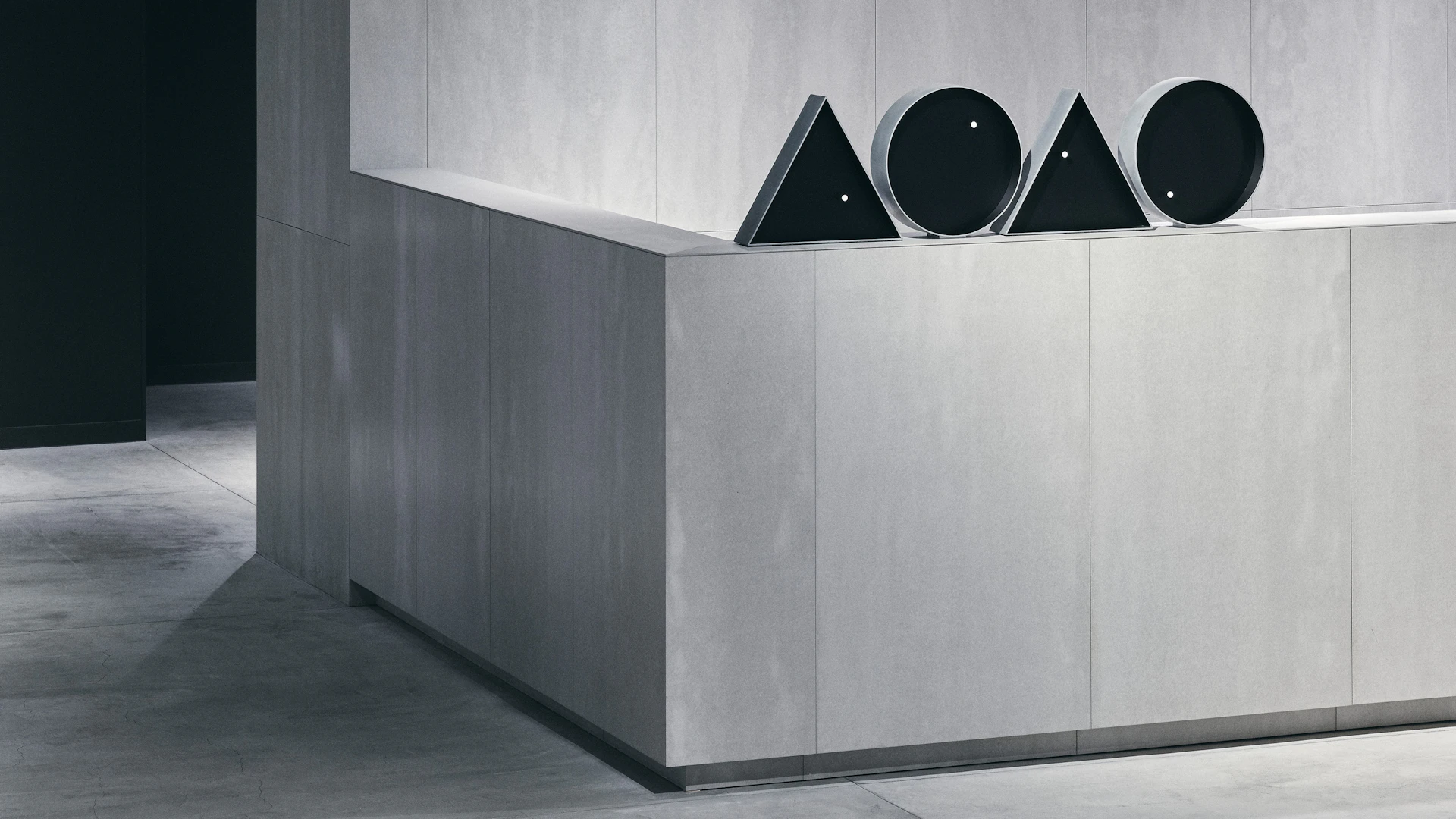
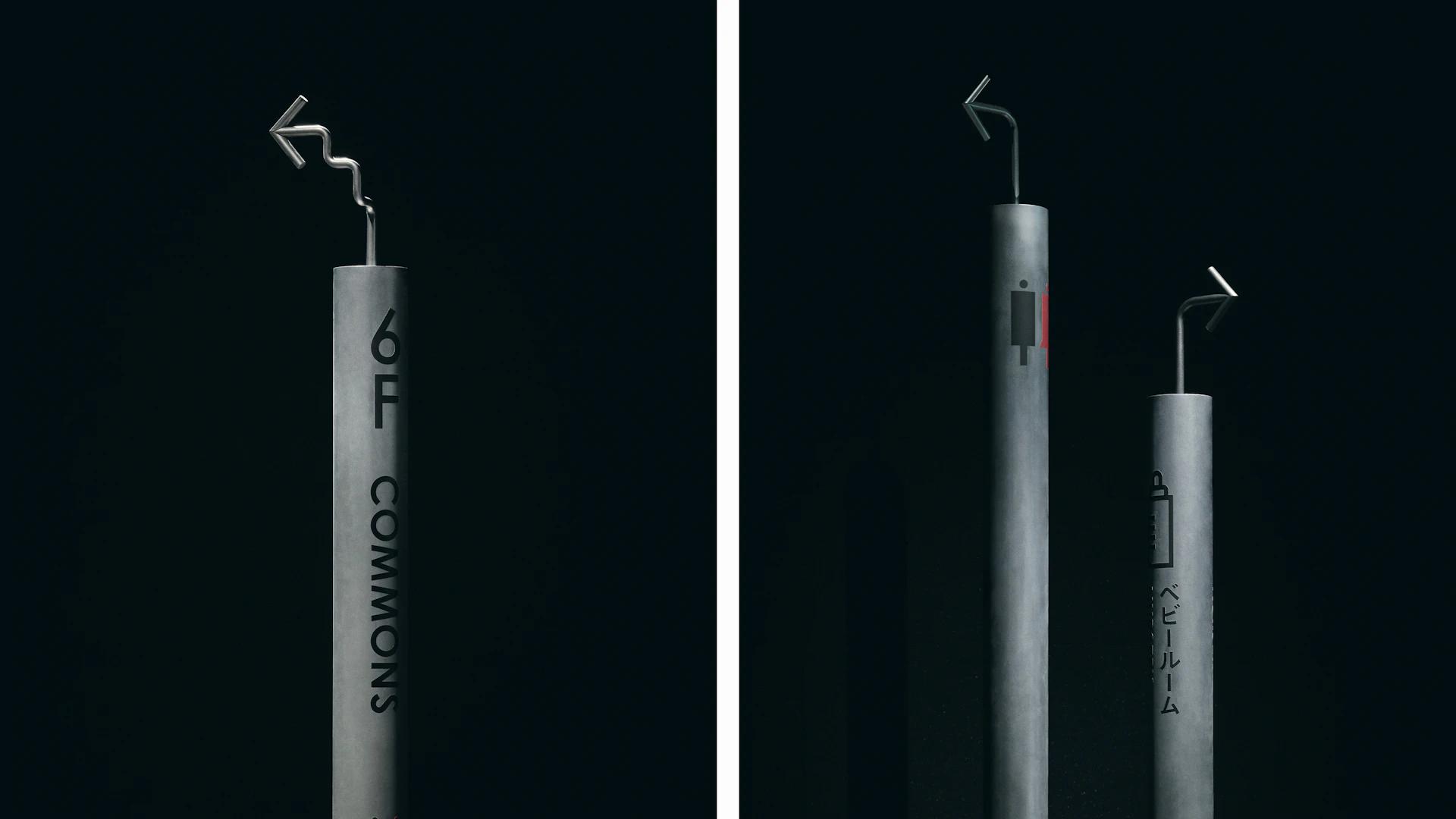
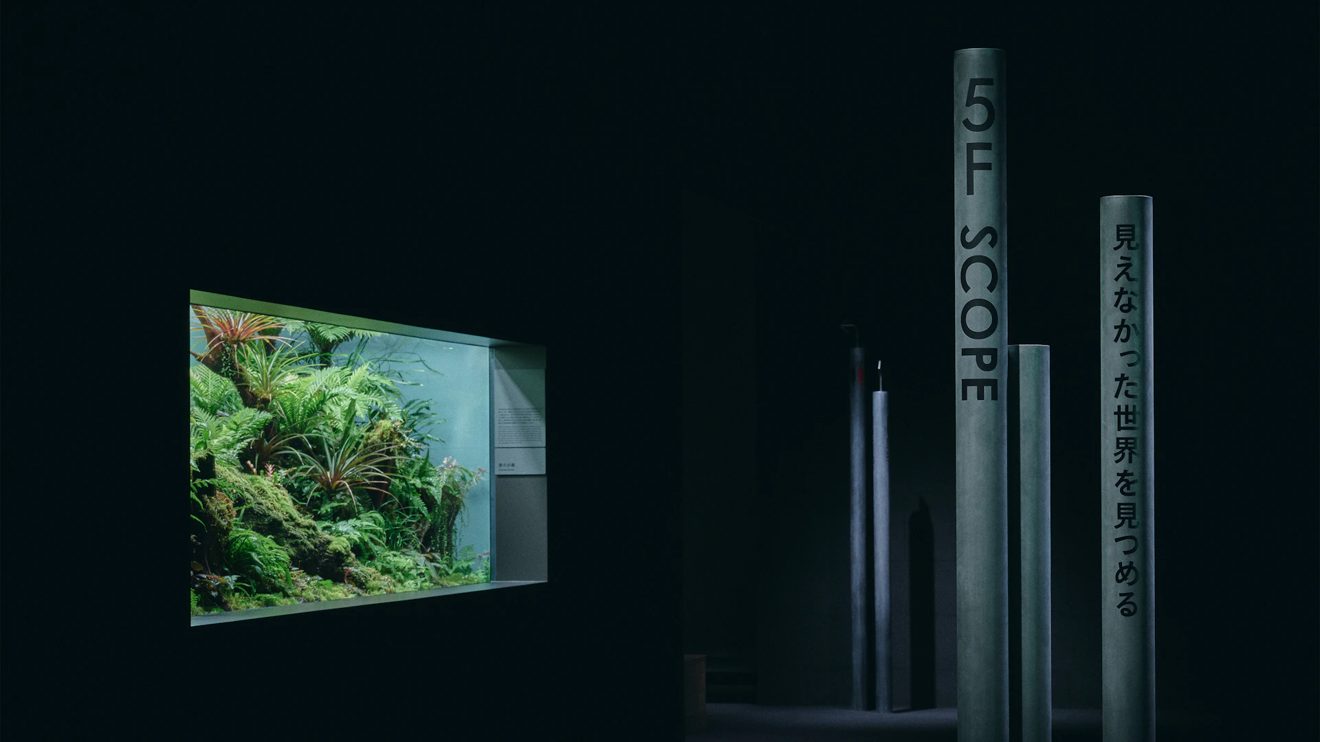
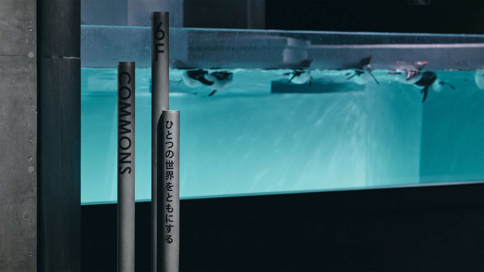
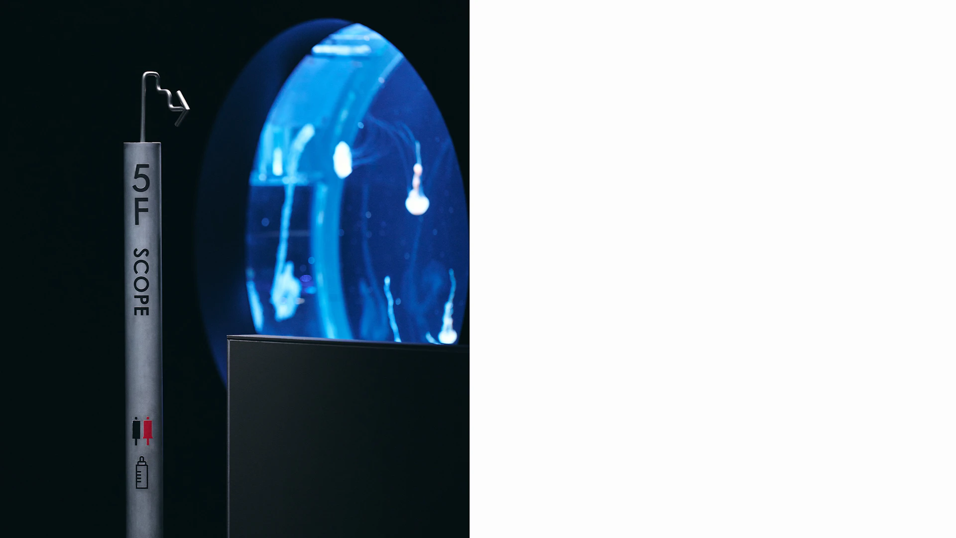
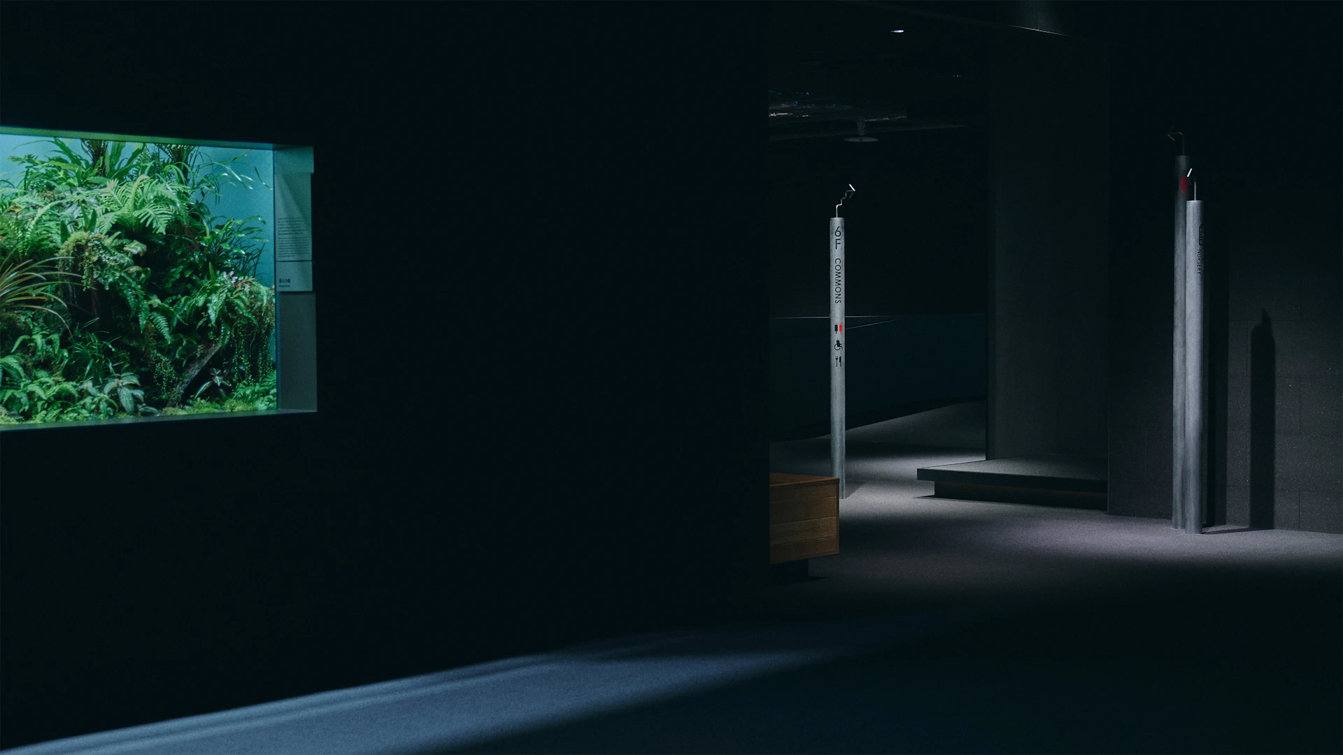
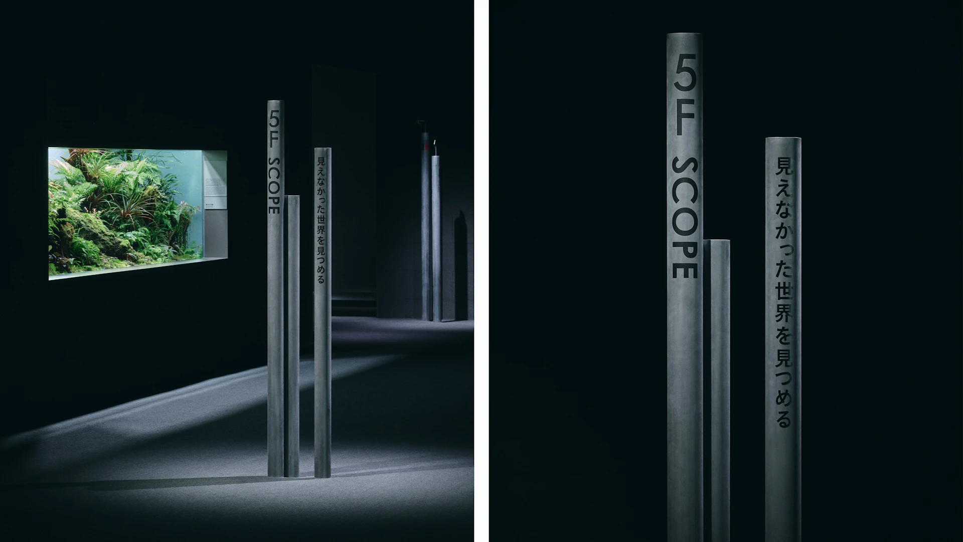
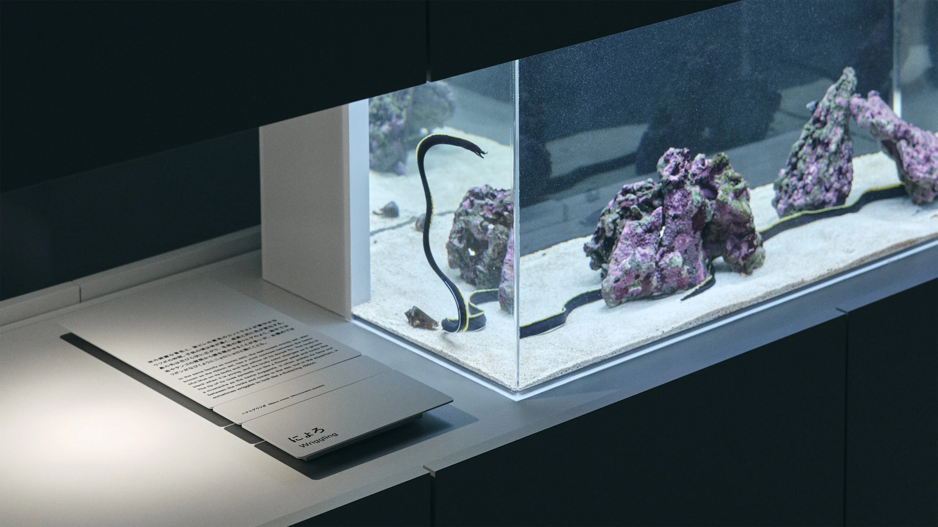
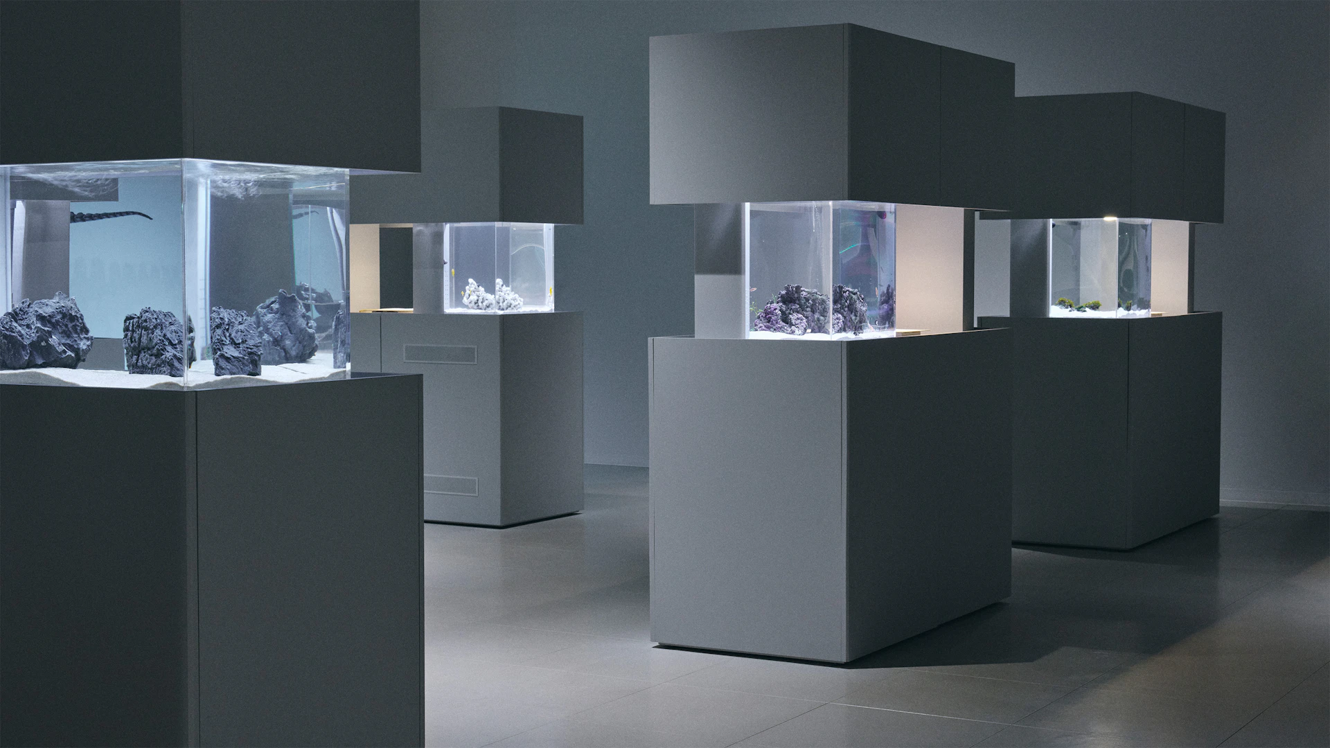
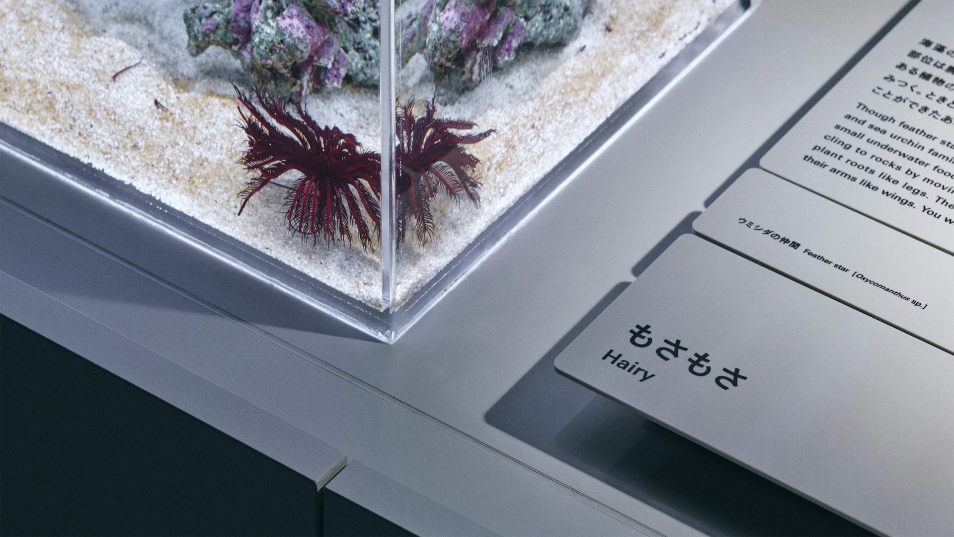
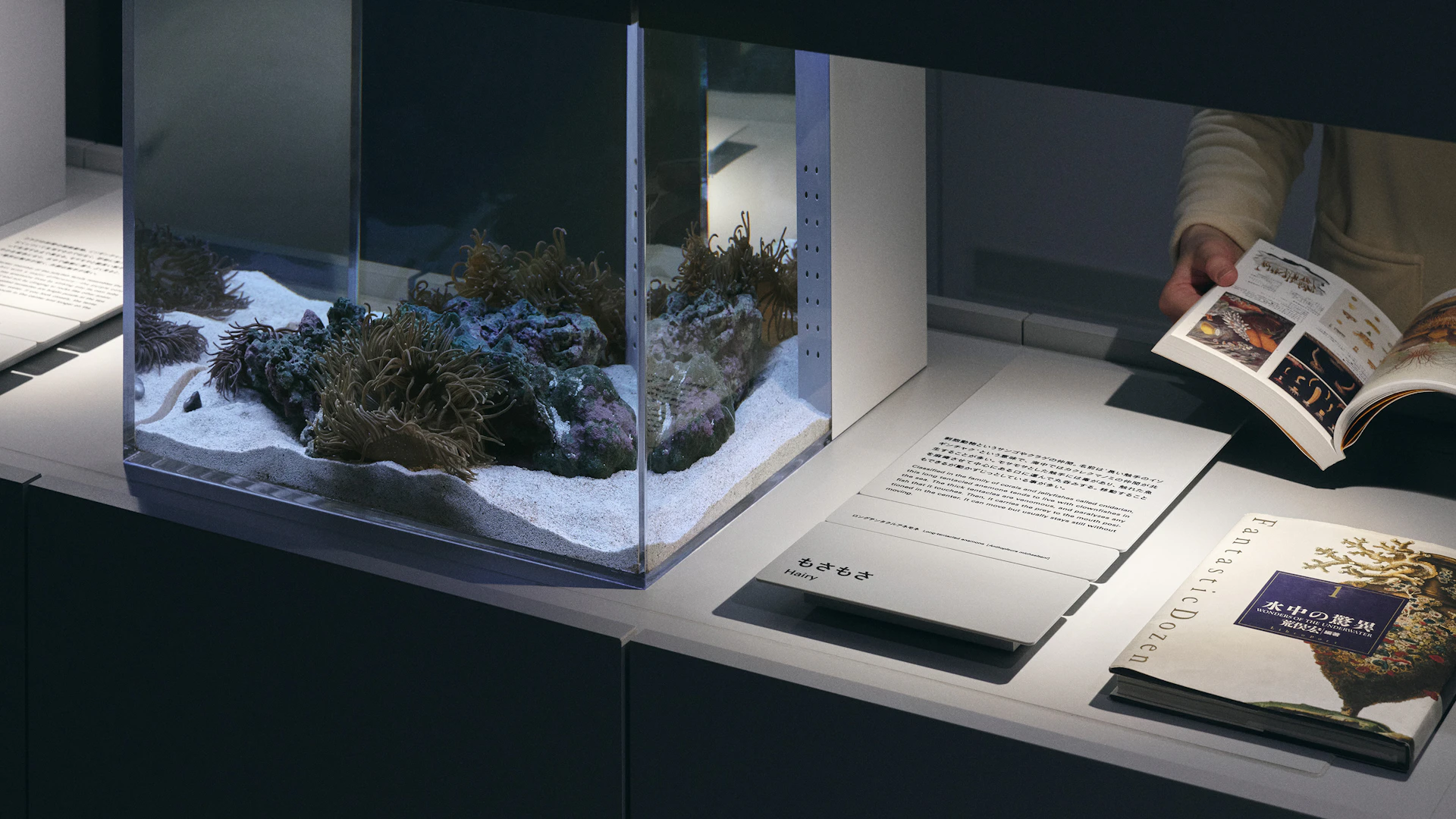
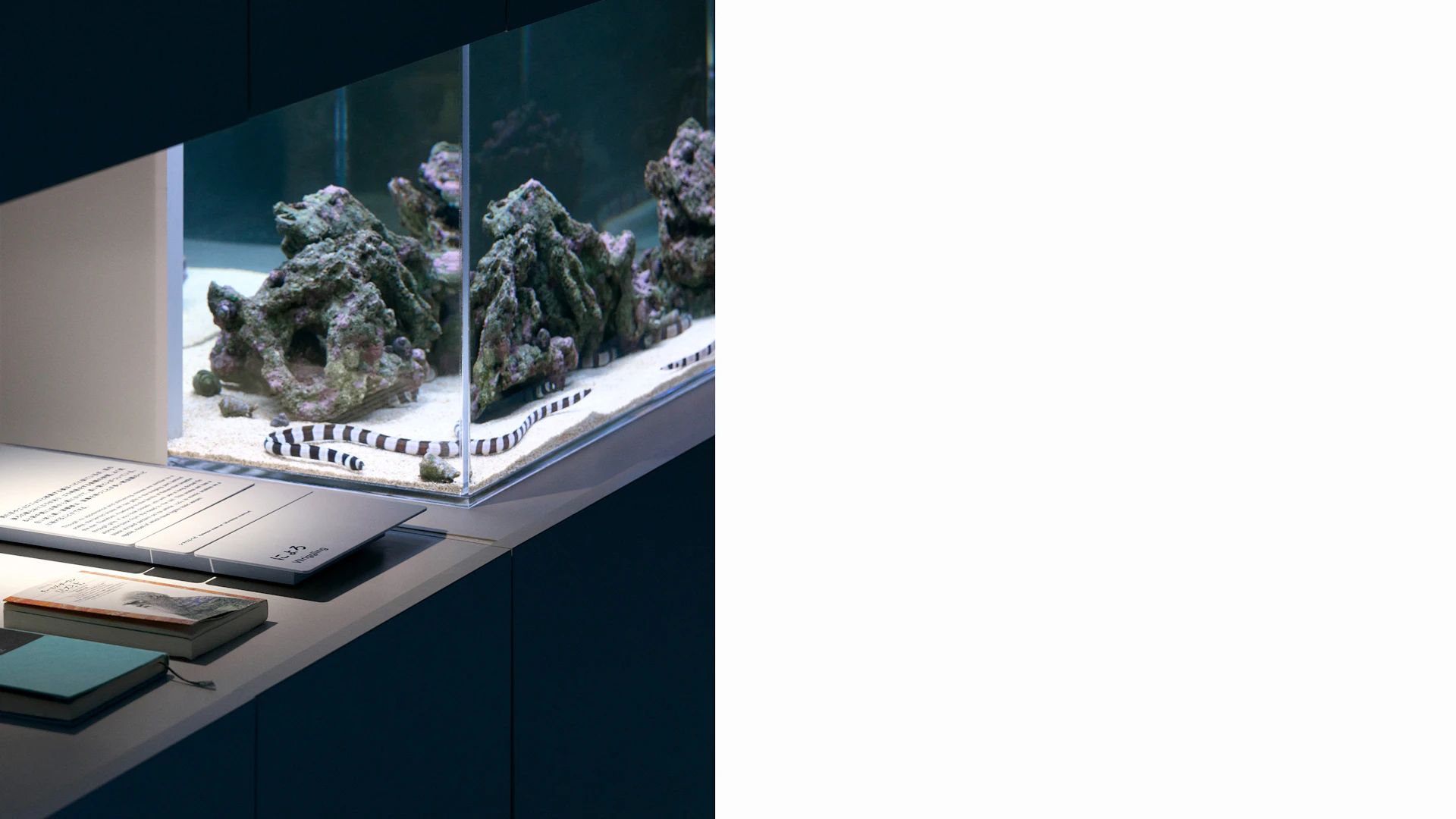
The logo uses triangles and circles that form the letters AOAO, representing both “life within water” and “the observer’s perspective.” The small white dots symbolize the vital spark of creatures living in the tanks, as well as the curious eyes of visitors observing them. We also designed signage, application tools, and select tank fixtures, creating various pathways to guide people toward fresh discoveries in the aquatic world.
Visual Identity
Signage

Exhibition / Space
Credit
- Art Direction
- Naming
- Copywriting
- Photography
-
- Masaki Ogawa *
- Produce
