Mori Building
VI/Experience
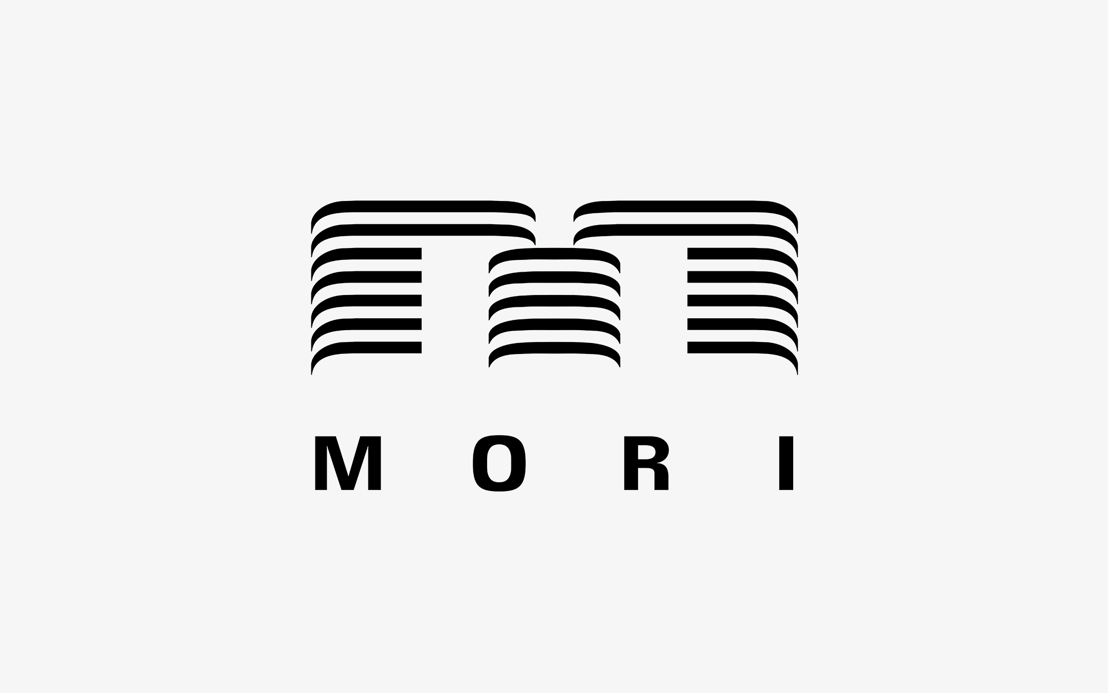
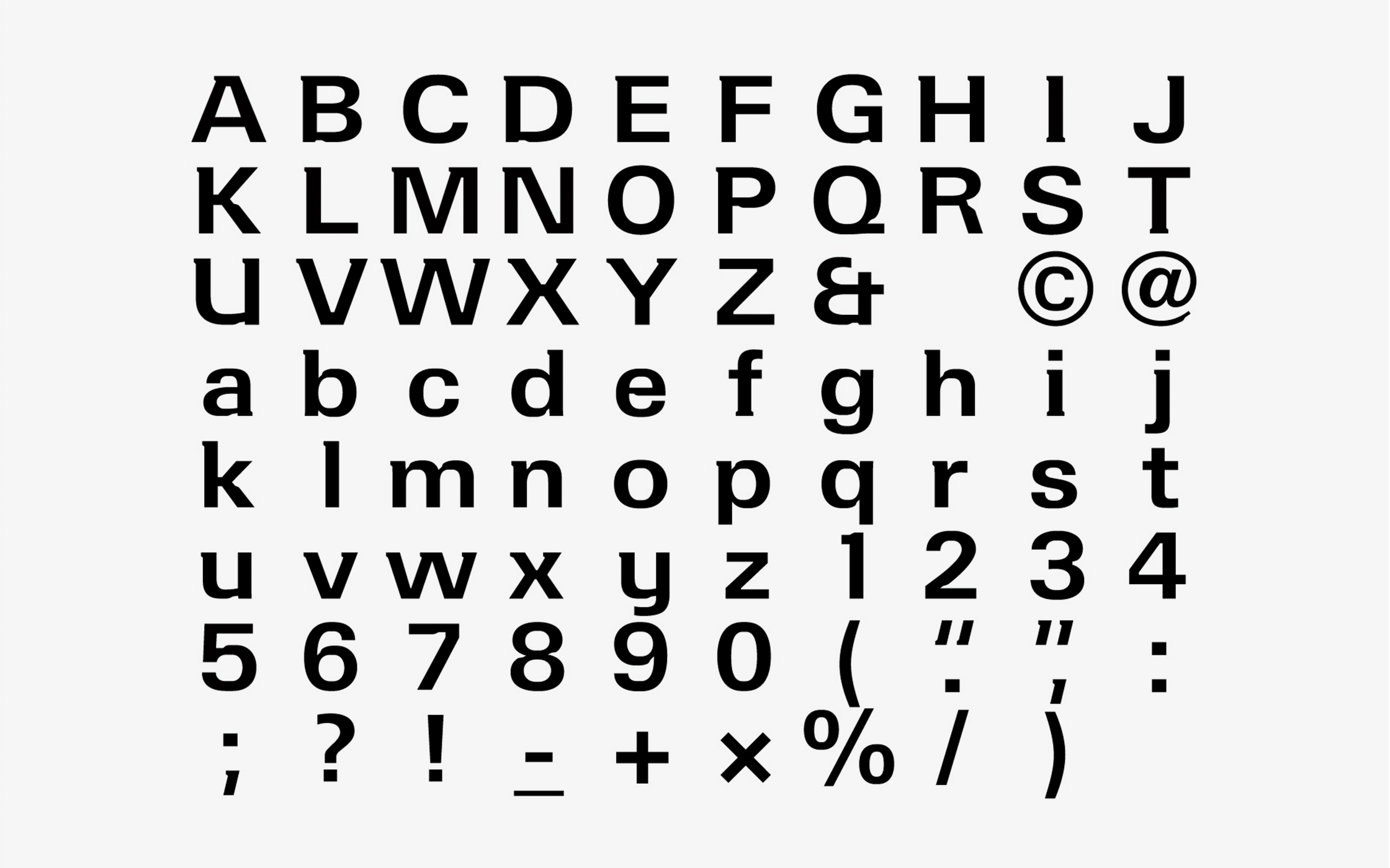
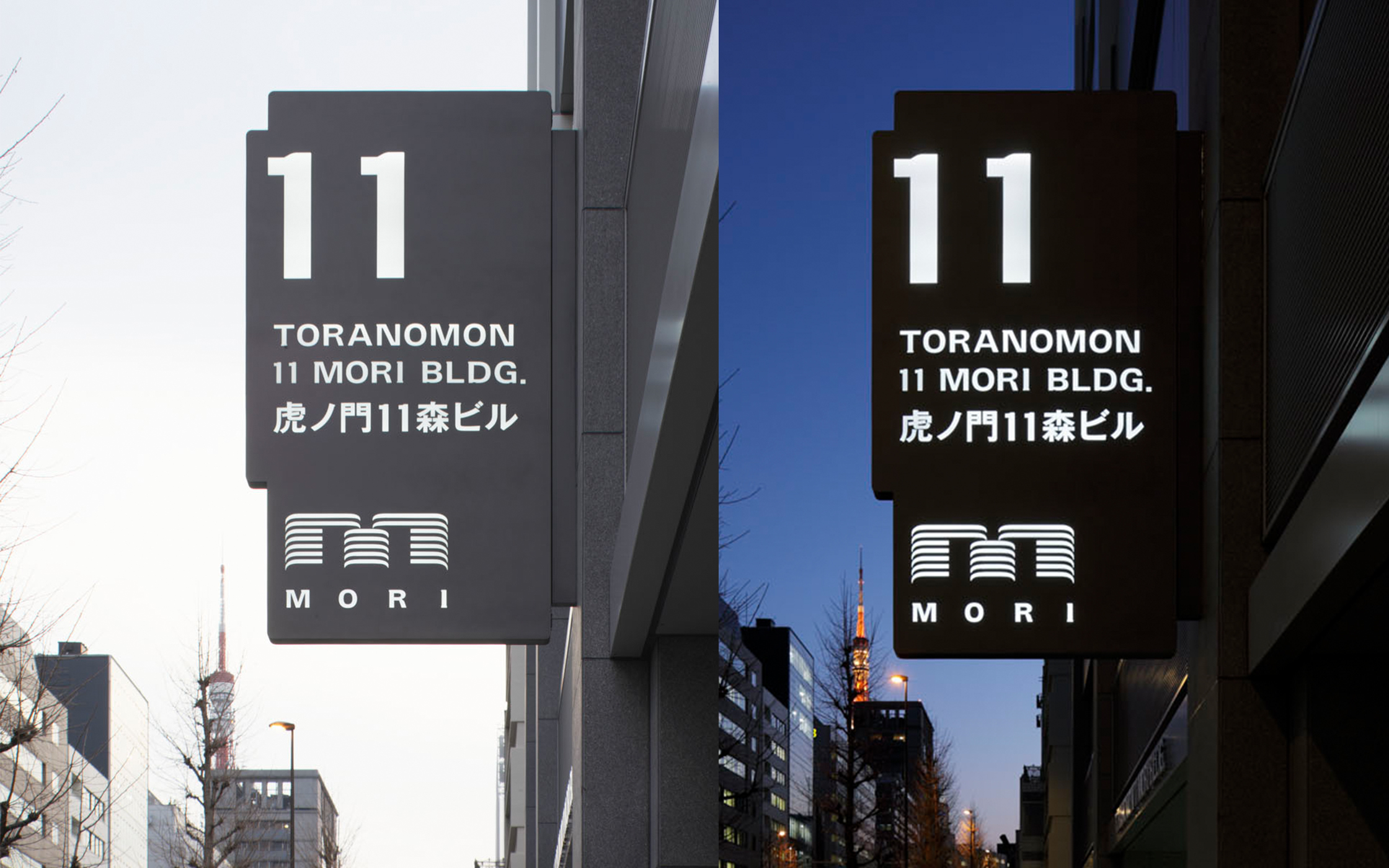
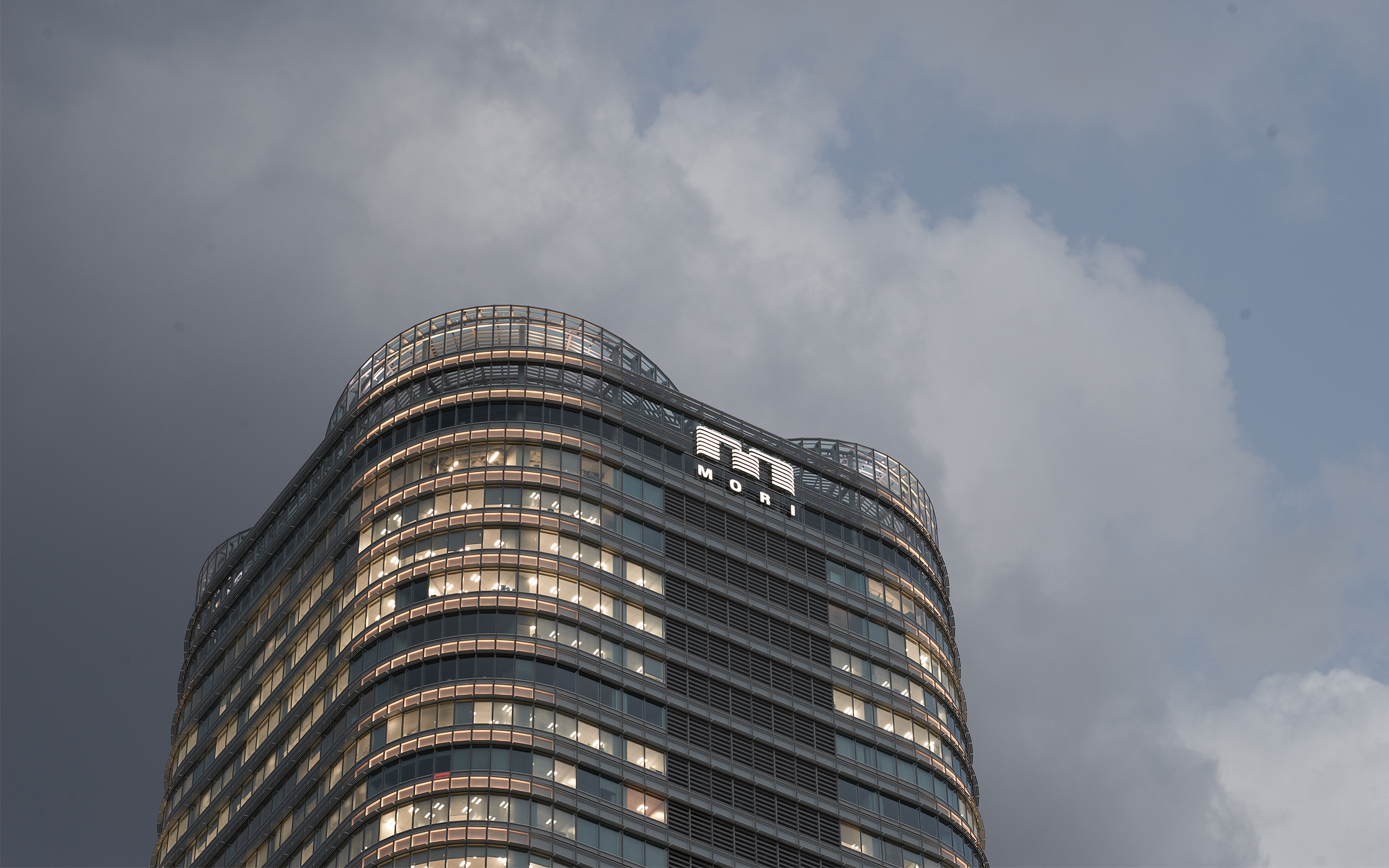
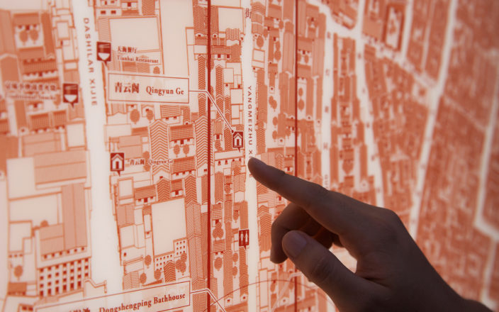
The Mori Building logo mark uses the Mori Building “M” to express the view when looking upwards at a high-rise city, and symbolizes the company’s ideal of creating a “vertical garden city”. The Mori Building font was designed to produce excellent visibility that maintains a sharp appearance even at a distance or at night, and to function as the key to the Mori Building identity for both new and old buildings.
https://www.ndc.co.jp/works/moribuilding/
| Client | Mori Building Co., Ltd. |
|---|---|
| Creative Director | Hara Kenya |
| Art Director | Hara Kenya |
| Designer | Hara Kenya, Inoue Yukie, Shimoda Rie, Uematsu Akiko, Daikoku Daigo, Nakamura Shinpei, Minamidate Takao, Maejima Junya |
| Photographer | Nakatogawa Shimei |
2010